In Chapter 3.1, we learned how to use our knowledge of spans and projections to recast the problem of finding optimal model parameters for the simple linear regression model, h(xi)=w0+w1xi. Along the way, we defined new characters, most importantly, the design matrix
X=⎣⎡11⋮1x1x2⋮xn⎦⎤
Here, we’ll look at how and why to extend X to include multiple input features, in what’s called multiple linear regression.
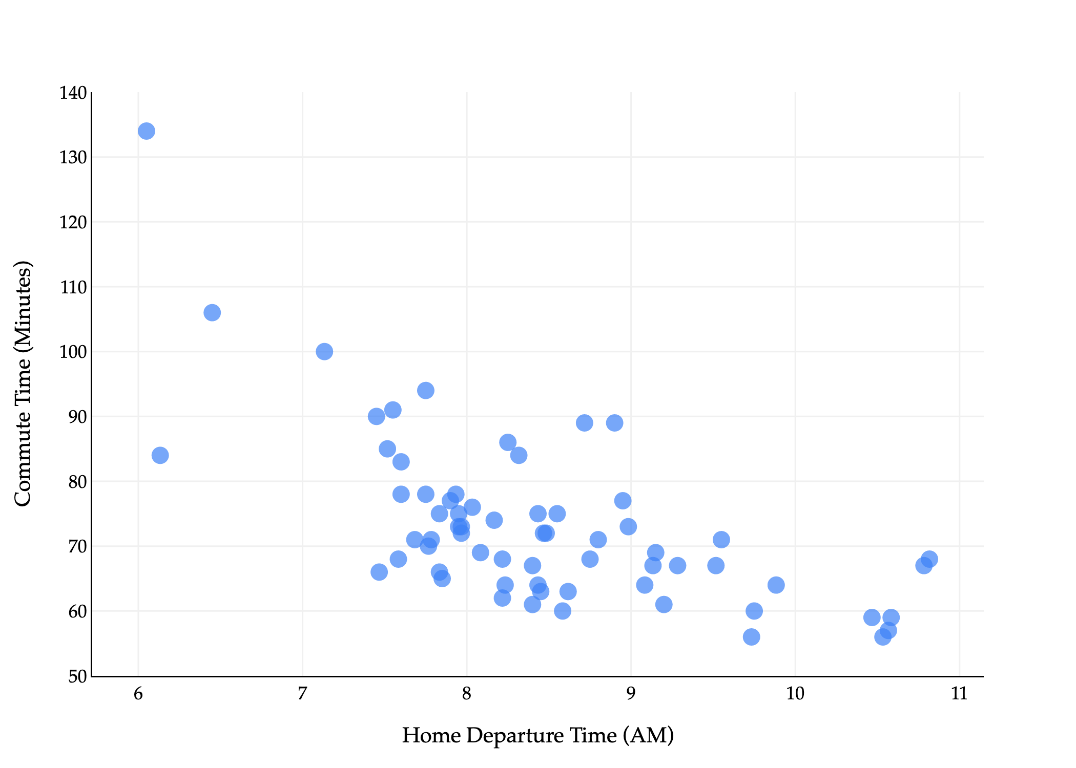
The commute times dataset that we were reintroduced to in Chapter 3.1 has several columns in it, but we’ve only used one – departure_hour – as an input variable.
import pandas as pd
import numpy as np

commutes_full = pd.read_csv('data/commute-times.csv')
commutes_full['day_of_month'] = pd.to_datetime(df['date']).dt.day
# df[['departure_hour', 'day_of_month', 'minutes']].head()
For example, the first row above tells us that the first recorded commute was on a Monday, which was the 15th of that month.
Using day seems like it would be a good idea, since traffic patterns likely differ based on the day of the week. But, it’s not clear how to use strings, like 'Tue', in a linear model. We’ll address this in a moment. For now, suppose we’d like to fit a linear model that predicts commute time in minutes using bothdeparture_hour and day_of_month (“dom” for short).
which is a plane in R3. Once we figure out how to find w0∗, w1∗, and w2∗, we’ll visualize the resulting plane, not to worry.
(To be crystal clear, the ⋅’s in the above equations refer to “regular” scalar multiplication, not the dot product. There are no vectors in the equation above.)
But, how do we find these three optimal model parameters? If we consult the modeling recipe, and choose squared loss, we need to find the values of w0∗, w1∗, and w2∗ that minimize
The solution is to use what we know about spans, projections, and the design matrix. The design matrix for this problem will have 3 columns: a column of 1’s for the intercept, a column of departure_hour values, and a column of dom values.
Let me try and state this problem in slightly more general terms, where we have d features rather than just 1 or 2.
As before, subscripts distinguish between individuals (rows) in our dataset, and we will try and use superscripts (in parentheses) to distinguish between features (columns). Specifically, we’ll use the notation xi(j) to represent the j-th feature for the i-th individual. In the example above, x5(1) is the departure hour for the 5th row in the dataset. Think of x(1), x(2), ... as new variable names, like new letters.
There are n=3 rows, each of which has d=2 features (minutes is not a feature, it’s what we’re trying to predict).
We can represent each row (day) with a feature vector, xi=[xi(1)xi(2)]. A feature vector contains all of the information we’re using to make predictions for the i-th individual.
x1=[10.81666715],x2=[7.7516],x3=[8.4522]
In general,
xi=⎣⎡xi(1)xi(2)⋮xi(d)⎦⎤
Note that if our model has d features, then there are d+1 parameters, w0, w1, w2, ..., wd. There is one parameter for each feature, plus one for the intercept. So, the generalized multiple linear regression model has a hypothesis function of the form
h(xi)=w0+w1xi(1)+w2xi(2)+…+wdxi(d)
It’d be great if we could express our hypothesis function h as a dot product between a parameter vector w and a feature vector xi, but we can’t: w has d+1 components while xi has d components.
To address this issue, we’ll define the augmented feature vector, Aug(xi), which is the vector obtained by adding a 1 to the front of feature vector xi (much like the design matrix X has a column of 1’s).
Aug(xi)=⎣⎡1xi(1)xi(2)⋮xi(d)⎦⎤
Then, the multiple linear regression model can be written as
Now we can finally state the problem of multiple linear regression in its most general form. Suppose we have n data points, (x1,y1),(x2,y2),…,(xn,yn), where each xi is a feature vector of d features:
By good, we mean that we’d like to find optimal parameters w0∗, w1∗, ..., wd∗ that minimize mean squared error:
all equivalent ways of writing mean squared error!Rsq(w)=n1i=1∑n(yi−h(xi))2=n1i=1∑n(yi−(w0+w1xi(1)+w2xi(2)+…+wdxi(d)))2=n1i=1∑n(yi−w⋅Aug(xi))2=n1∥y−Xw∥2
The solution is to define the n×(d+1) design matrix X and n-dimensional observation vector y:
and to solve the normal equation to find the optimal parameter vector, w∗:
XTXw∗=XTy
The w∗ that satisfies the equations above minimizes mean squared error, Rsq(w), so use this w∗ to make predictions in h(xi)=w∗⋅Aug(xi). Once you find that w∗,
p=Xw∗ is a prediction vector of predicted y-values for the entire dataset. It is also the projection of y onto the span of the columns of X.
h(xi)=w∗⋅Aug(xi) is the predicted y-value for just the input xi.
The outputs above tell us that the “best way” (according to squared loss) to make commute time predictions using a linear model is using:
pred. commutei=141.86−8.22⋅departure houri+0.06⋅day of monthi
This is the plane of best fit given historical data; it is not a causal statement.
from plotly import graph_objects as go

XX, YY = np.mgrid[5:14:1, 0:31:1]
Z = model_multiple.intercept_ + model_multiple.coef_[0] * XX + model_multiple.coef_[1] * YY
plane = go.Surface(x=XX, y=YY, z=Z, colorscale='Reds')

fig = go.Figure(data=[plane])
fig.add_trace(go.Scatter3d(
    x=commutes_full['departure_hour'],
    y=commutes_full['day_of_month'],
    z=commutes_full['minutes'],
    mode='markers',
    marker={'color': '#3d81f6'}
))

fig.update_layout(
    scene=dict(
        xaxis_title='Departure Hour',
        yaxis_title='Day of Month',
        zaxis_title='Minutes',
        xaxis=dict(
            backgroundcolor='white',
            gridcolor='#f0f0f0',
            showbackground=True,
            zerolinecolor='#f0f0f0',
            title_font=dict(family="Palatino"),
            tickfont=dict(family="Palatino")
        ),
        yaxis=dict(
            backgroundcolor='white',
            gridcolor='#f0f0f0',
            showbackground=True,
            zerolinecolor='#f0f0f0',
            title_font=dict(family="Palatino"),
            tickfont=dict(family="Palatino")
        ),
        zaxis=dict(
            backgroundcolor='white',
            gridcolor='#f0f0f0',
            showbackground=True,
            zerolinecolor='#f0f0f0',
            title_font=dict(family="Palatino"),
            tickfont=dict(family="Palatino")
        ),
        dragmode='orbit'
    ),
    title={
        'text': 'Commute Time vs. Departure Hour and Day of Month',
        'font': dict(family="Palatino")
    },
    font=dict(family="Palatino"),
    width=1000,
    height=500,
    paper_bgcolor='white',
    plot_bgcolor='white'
)
fig.show()
Loading...
Fit LinearRegression objects have a predict method, which can be used to predict commute times given a departure_hour and day_of_month.
# What if I leave at 9:15AM on the 26th of the month?
# To supress the warning below, we should convert X and y to numpy arrays before calling .fit.
model_multiple.predict([[9.25, 26]])
/Users/surajrampure/miniforge3/envs/pds/lib/python3.10/site-packages/sklearn/base.py:493: UserWarning:

X does not have valid feature names, but LinearRegression was fitted with feature names
While it’s not difficult to implement ourselves, sklearn has a built-in mean_squared_error function.
from sklearn.metrics import mean_squared_error
mean_squared_error(commutes_full['minutes'], model_multiple.predict(commutes_full[['departure_hour', 'day_of_month']]))
96.78730488437492
So, the mean squared error of our plane of best fit is 96.78 minutes2.
Throughout this section, we’ll fit various different models to the commute times dataset, and it’ll be useful to keep track of their mean squared errors in one place. I’ll do so in a Python dictionary. (I’m intentionally showing you more code than I typically have, so you have some sense of how to do this all yourself – I hope you don’t mind!)
As you can see, adding day_of_monthbarely reduced our model’s mean squared error, which matches our intuition that knowing whether it’s the 15th or 19th or 3rd of the month doesn’t seem like it would be helpful in predicting commute time. The activity below has you think about why the mean squared error still did decrease, and whether this is always the case.
So far, we’ve limited ourselves to using departure_hour and day_of_month, two features that already came to us in the dataset. In practice, we’ll often need to engineer features, which means creating new features from existing ones, or “transforming” raw data into good features. We might do this to improve model performance, for example, in case the relationship between the features and output variable isn’t truly linear, or maybe even to enable the use of categorical features.
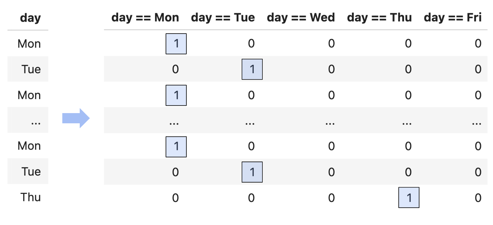
One naive approach would be to convert each day value to a number, e.g. "Mon" is 1, "Tue" is 2, "Wed" is 3, etc. The reason this is a bad idea is that this approach implies that Monday is somehow “less than” Tuesday and should impact our model’s predictions less than Tuesday (remember that this column will be multiplied by a parameter in order to make predictions). This is what’s called an ordinal encoding, and these only make sense when the features have some inherent order that is meaningful to the prediction problem.
Instead, we’ll perform one hot encoding, which turns a categorical feature into several binary features: one per unique value of the categorical feature.
Since day has 5 unique values, we’ll need to create 5 new binary features.
# pandas Series have a value_counts method, which describes the frequency of each unique value in the Series.
commutes_full['day'].value_counts()
Suppose we want to build a model that predicts minutes using departure_hour, day_of_month, and one hot encoded day. That model would have 1+1+5=7 features, so its design matrix would have 7+1=8 columns!
The actual process of one hot encoding can be done efficiently using sklearn.preprocessing.OneHotEncoder. You’ll see how to use this in Homework 8.
Question: What is the rank of the design matrix above?
You might notice that among the 5 binary columns, in a particular row, exactly one of them is 1, and the other 4 are 0. This means that if we sum together the 5 binary columns, we’ll get a column of 1’s – which is already the first column in our design matrix!
This means that, by default, when we perform one hot encoding, the design matrix doesn’t have full rank. This doesn’t stop us from projecting y onto colsp(X), but it does mean that there are infinitely many possible optimal parameters w∗. Again, all of these would give us the same predictions and same mean squared error, but it’s annoying to have to deal with this setting.
So, a common solution when performing one hot encoding is to drop one of the binary columns. This doesn’t change the information conveyed by the other features, and doesn’t change colsp(X), which is what matters for the quality of the model’s predictions. And intuitively, even if we don’t have the value of day == Fri, we know it’s Friday if day == Mon, day == Tue, day == Wed, and day == Thu are all 0.
Now that we’ve converted day to a numerical variable, we can use it as input in a regression model. Here’s the model we’ll try to fit:
Notice that below, I’ve set fit_intercept=False, because I manually added a column of 1’s to the design matrix, so I don’t need sklearn to add another one.
While this model has 6 features, and thus requires 7 dimensions to graph, it’s really a collection of five parallel planes in 3D, all with slightly different z-intercepts! Remember that dayi==Mon, dayi==Tue, etc. aren’t all free variables: if one of them is 1, the others must be 0. There are 5 cases to consider, and each one corresponds to one of these 5 parallel planes. You’re exploring this idea in Homework 7, Question 3.
If we do want to visualze the model in R2, we need to pick a single feature to place on the x-axis.
Despite being a linear model, this model doesn’t look like a straight line, since it’s linear in terms of all 6 features, but when you project it into 2D, it no longer appears linear.
How does this new model compare to our previous models?
Below, we’ll apply this thinking to the departure_hour feature. We’ll create these features manually, though in Homework 8 you’ll see how to do this easily and more efficiently using sklearn.preprocessing.PolynomialFeatures.
The above tells me that my best-fitting degree 3 polynomial model is
h(xi)=816.09−227.63xi+23.33xi2−0.809xi3
This is a linear model, even though the features themselves are made up of non-linear functions. If we could visualize in R4, with one axis for departure hour, one for departure hour2, one for departure hour3, and one for commute time, we’d see that the model’s predictions lie on a higher-dimensional plane.
But, when we visualize in R2, the model doesn’t look linear, it looks cubic!
fig = go.Figure()
fig.add_trace(go.Scatter(
    x=df['departure_hour'], y=df['minutes'],
    mode='markers',
    name='Actual Data',
    marker=dict(color='#3d81f6', size=8)
))
# To ensure the polynomial curve is smooth and x/y points are matched up,
# sort both X_for_polynomial and its index by 'departure_hour' before plotting
sorted_idx = X_for_polynomial['departure_hour'].argsort()
sorted_departure_hour = X_for_polynomial['departure_hour'].iloc[sorted_idx]
sorted_X_for_polynomial = X_for_polynomial.iloc[sorted_idx]

fig.add_trace(go.Scatter(
    x=sorted_departure_hour,
    y=model_polynomial.predict(sorted_X_for_polynomial),
    mode='lines',
    name='Predicted Commute Times<br>(Degree 3 Polynomial)',
    line=dict(color='orange', width=4)
))

fig.update_layout(
    showlegend=True,
    title='',
    xaxis_title='Departure Hour',
    yaxis_title='Minutes',
    width=700,
    plot_bgcolor='white',
    font=dict(family='Palatino'),
    xaxis=dict(gridcolor='#f0f0f0'),
    yaxis=dict(gridcolor='#f0f0f0'),
)
Loading...
Is this model better than the simple linear regression model we fit earlier? Well, it has certainly has a lower mean squared error than the simple linear regression model:
mse_dict['departure_hour with cubic features'] = mean_squared_error(
    commutes_full['minutes'],
    model_polynomial.predict(X_for_polynomial)
)

mse_dict
75.27, the mean squared error of this cubic model, is lower than the simple linear regression model’s mean squared error of 97.04 (but worse than we got when one hot encoding day).
Keep in mind that adding complex features doesn’t always equate to a “better model”, even if it lowers the mean squared error on the training data. To illustrate what I mean, what if we fit a degree 10 polynomial to the data?
# Create a polynomial feature DataFrame for degree 10, with 'departure_hour' between 6 and 11 (smooth curve)
import numpy as np

# 200 points between 6 and 11 for smoothness
departure_hour_grid = np.linspace(6, 11, 200)
X_poly_grid = pd.DataFrame({'departure_hour': departure_hour_grid})
# Add polynomial features up to degree 10
for i in range(2, 11+1):
    X_poly_grid[f'departure_hour^{i}'] = X_poly_grid['departure_hour'] ** i

# Fit on the full data as before
X_for_polynomial = commutes_full[['departure_hour']].copy()
for i in range(2, 11+1):
    X_for_polynomial[f'departure_hour^{i}'] = X_for_polynomial['departure_hour'] ** i

model_polynomial = LinearRegression()
model_polynomial.fit(X=X_for_polynomial, y=commutes_full['minutes'])

fig = go.Figure()
fig.add_trace(go.Scatter(
    x=df['departure_hour'], y=df['minutes'],
    mode='markers',
    name='Actual Data',
    marker=dict(color='#3d81f6', size=8)
))
# Plot polynomial curve using linspace grid
fig.add_trace(go.Scatter(
    x=departure_hour_grid,
    y=model_polynomial.predict(X_poly_grid),
    mode='lines',
    name='Predicted Commute Times<br>(Degree 10 Polynomial)',
    line=dict(color='orange', width=4)
))

fig.update_layout(
    showlegend=True,
    title='',
    xaxis_title='Departure Hour',
    yaxis_title='Minutes',
    width=700,
    plot_bgcolor='white',
    font=dict(family='Palatino'),
    xaxis=dict(gridcolor='#f0f0f0'),
    yaxis=dict(gridcolor='#f0f0f0'),
)
Loading...
Without computing it, we can tell this model’s mean squared error is lower than that of the cubic or simple linear regression models, since it passes closer to the training data. But, this model is overfit to the training data. Remember, our eventual goal is to build models that generalize well to new data, and it seems unlikely that this degree 10 polynomial reflects the true relationship between departure hour and commute time in nature.
The question, then, is how to choose the right model, e.g. how to choose the right polynomial degree, if we’re committed to making polynomial features. The solution is to intentionally split our data into training data and test data, and use only the training data to pick the features we’d like to include (e.g. polynomial degree). Then, we pick the combination of features that performed best on the test data, since that combination of features seems most likely to generalize well on unseen data. You’ll explore this paradigm in Homework 8.
In the above examples, I created polynomial features out of departure_hour only, but there’s nothing stopping me from creating features out of day_of_month too, or out of both of them simultaneously. A perfectly valid model is
You may wonder, how do I know which features to create? Through a variety of techniques:
Domain knowledge
Trial and error
By visualizing the data
In the polynomial examples above, the data didn’t particularly look like it was quadratic or cubic, so a linear model sufficed. But if we’re given a dataset that clearly has some non-linear relationship, visualization can help us identify what features might improve model performance.
# # import plotly.express as px
# # import seaborn as sns

# # mpg = sns.load_dataset('mpg').dropna()
# # fig = px.scatter(
# #     mpg,
# #     x='horsepower',
# #     y='mpg',
# #     title='Horsepower vs. MPG',
# # )
# # fig.update_traces(marker=dict(color='#3d81f6', size=8))
# # fig.update_layout(
# #     showlegend=False,
# #     font=dict(family='Palatino'),
# #     plot_bgcolor='white',
# #     xaxis=dict(gridcolor='#f0f0f0', title='Horsepower'),
# #     yaxis=dict(gridcolor='#f0f0f0', title='MPG'),
# #     width=700,
# # )
# # fig.show()

# plots like the one below – which uses a totally new dataset, not tied to our commute times example – can give us a clue as to what features to create.

# Here, we're looking at a dataset of cars from the 1970s, and we're trying to model `mpg` (miles per gallon) given `horsepower`.
As the dimensionality of our data increases, though, visualization becomes less possible. (How do we visualize a dataset with 100 features?) Strategies for reducing the dimensionality of our data will be explored in Chapter 5.
What is the extent to which I can use linear regression to fit a model? As long as a model can be expressed in the form
h(xi)=w⋅Aug(xi)
for some parameter vector w and some feature vector xi, then it can be fit using linear regression (i.e. by creating a design matrix X and finding w∗ by solving the normal equations). We say such a model is linear in the parameters. The choice of features to include in xi is up to us.