At times, Chapter 2 may have seemed like a bit of a detour from the main storyline of the course. It’s now time to apply our understanding of vectors and matrices to the problem of linear regression.
That function was called a hypothesis function, denoted h(xi). Remember, the output of h is a predicted y-value.
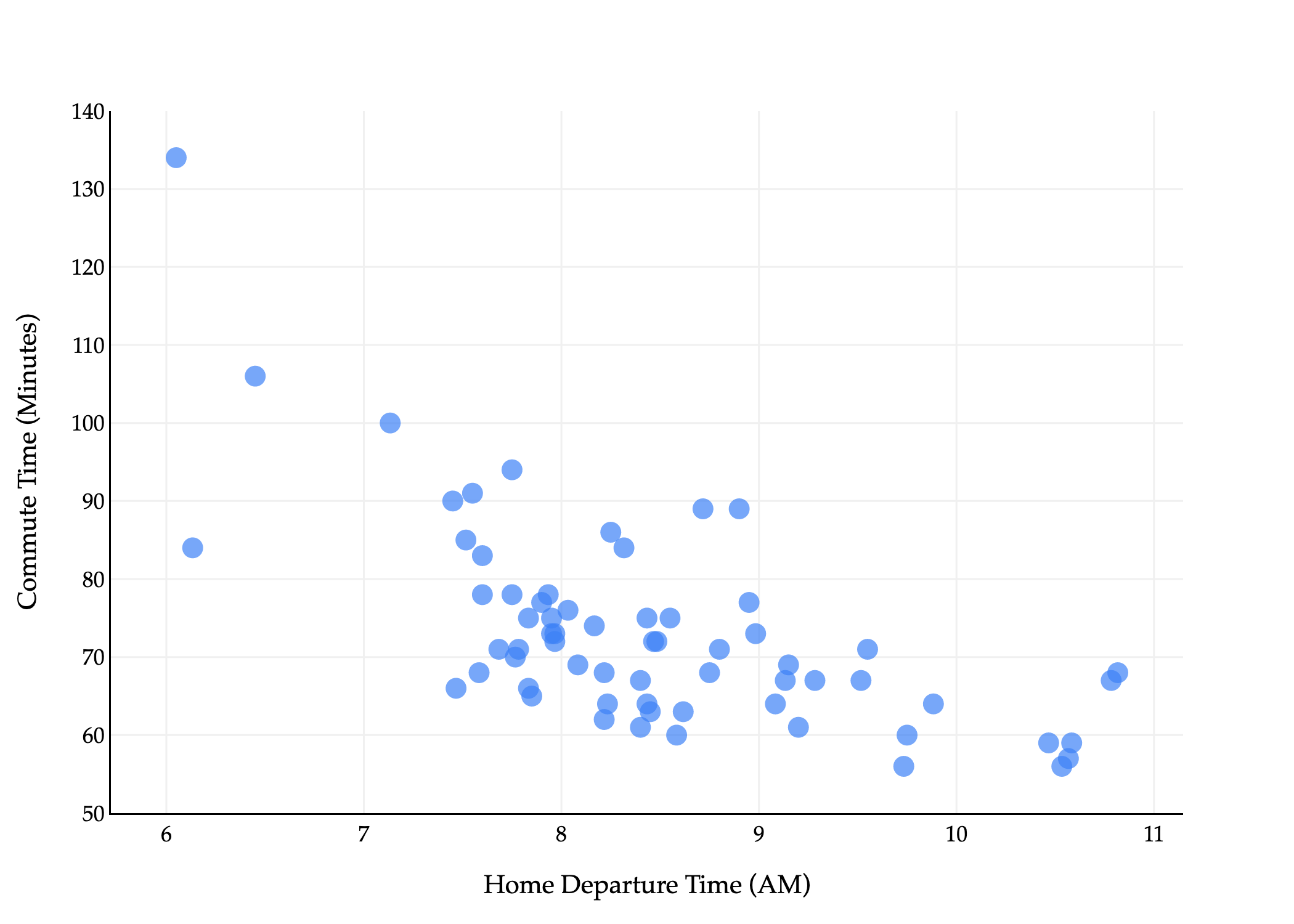
predicted commute timei=h(departure houri)
We looked at two types of hypothesis function:
The constant model, h(xi)=w
The simple linear regression model, h(xi)=w0+w1xi
We’ll focus on the latter, which was first introduced in Chapter 1.4. To find optimal model parameters, w0∗ (the best intercept) and w1∗ (the best slope), we followed the three-step modeling recipe:
1. Choose a model.
h(xi)=w0+w1xi
2. Choose a loss function.
Our default choice has been squared loss:
Lsq(yi,h(xi))=(yi−h(xi))2
3. Minimize average loss (also known as empirical risk) to find optimal parameters.
Average squared loss – also known as mean squared error – for any hypothesis function h, takes the form:
n1i=1∑n(yi−h(xi))2
For the simple linear regression model, this becomes:
Rsq(w0,w1)=n1i=1∑n(yi−(w0+w1xi))2
In Chapter 1.4, we used calculus to minimize Rsq(w0,w1) to find the optimal parameters, w0∗ and w1∗. This involved taking two partial derivatives, ∂w0∂Rsq and ∂w1∂Rsq, setting them equal to zero, and solving the resulting system of equations. At the end of that process, we found
where r is the correlation coefficient between x and y, and σx and σy are the standard deviations of x and y, respectively.
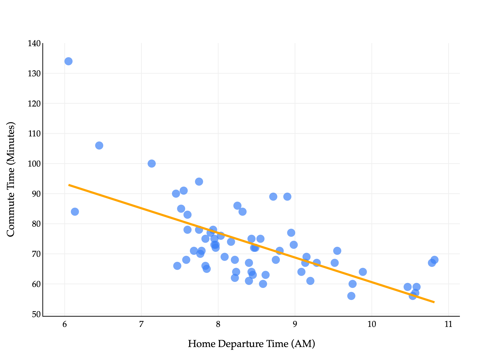
Those formulas, when applied to the dataset of commute times, describe the following line.
import pandas as pd
import numpy as np
import plotly.express as px
import plotly.graph_objects as go

df = pd.read_csv('data/commute-times.csv')

# Compute means
x = df['departure_hour'].values
y = df['minutes'].values
x_bar = np.mean(x)
y_bar = np.mean(y)

# Compute slope (w1) and intercept (w0) using the closed-form solution
w1 = np.sum((x - x_bar) * (y - y_bar)) / np.sum((x - x_bar) ** 2)
w0 = y_bar - w1 * x_bar

# Prepare regression line points
x_line = np.array([x.min(), x.max()])
y_line = w0 + w1 * x_line

# Create scatter plot
fig = px.scatter(
    df,
    x='departure_hour',
    y='minutes',
    size=np.ones(len(df)) * 50,
    size_max=8
)
fig.update_traces(marker_color="#3D81F6", marker_line_width=0)

# Add regression line in orange
fig.add_traces(go.Scatter(
    x=x_line,
    y=y_line,
    mode='lines',
    line=dict(color='orange', width=3),
    name='Regression Line'
))

fig.update_xaxes(
    title='Home Departure Time (AM)',
    gridcolor='#f0f0f0',
    showline=True,
    linecolor="black",
    linewidth=1,
)
fig.update_yaxes(
    title='Commute Time (Minutes)',
    gridcolor='#f0f0f0',
    showline=True,
    linecolor="black",
    linewidth=1,
)
fig.update_layout(
    plot_bgcolor='white',
    paper_bgcolor='white',
    margin=dict(l=60, r=60, t=60, b=60),
    width=700,
    font=dict(
        family="Palatino Linotype, Palatino, serif",
        color="black"
    ),
    showlegend=False
)
scatter_fig = fig
scatter_fig.show(renderer='png', scale=3)
Here’s the plan:
In Chapter 3.1 (that’s here), we’ll see another way to find w0∗ and w1∗ that doesn’t involve calculus, but rather leverages our new knowledge of vectors and matrices.
In Chapter 3.2, we’ll look at how to use this linear algebraic approach to add multiple input variables to our model. The orange line above only uses one input variable, departure time, but we might want to incorporate day of the week, weather, etc.
In Homeworks 8 and 9, we’ll give you a taste of how to approach the process of adding new features, and why adding lots of features doesn’t necessarily lead to better predictions on real-world, unseen data.
in terms of vectors and matrices? If we can do so, then perhaps there will be another way to find w0∗ and w1∗ without needing to take partial derivatives. This will make our life a lot easier when we add more features to our model.
Remember that if x∈Rn, then ∥x∥2=∑i=1nxi2. In the formula for Rsq above, I’ve colored ∑i=1n and ⋅2 in red to try and make the case that Rsq looks a lot like the squared norm of vector that contains the errors of our predictions. Let’s try and define this vector.
Consider a dataset of n points, (x1,y1),(x2,y2),…,(xn,yn), on which we’d like to fit a simple linear regression model h(xi)=w0+w1xi.
The observation vector, y, is a vector in Rn with the ny-values from the dataset.
y=⎣⎡y1y2⋮yn⎦⎤=for the commute times example⎣⎡actual commute time1actual commute time2⋮actual commute timen⎦⎤
This vector contains our “right answers” that we are trying to predict as best as we can.
The prediction vector, p, is a vector in Rn with the n predicted values from the model.
X, called the design matrix, is an n×2 matrix with its first column being all 1s and its second column being the inputs x1,x2,…,xn. It’s the most important among these definitions, hence why this section is titled “The Design Matrix”.
X=⎣⎡11⋮1x1x2⋮xn⎦⎤=for the commute times example⎣⎡11⋮1departure time1departure time2⋮departure timen⎦⎤
I haven’t been able to find a good reason for why this is called the design matrix; my best explanation is that it has to do with how we designed our model. The column of 1s is there for our intercept term, w0.
The parameter vector, w, is a 2×1 vector containing our model’s parameters, w0 and w1.
w=[w0w1]
We’re trying to find the best choice of w.
Remember, our goal is to convert
Rsq(w0,w1)=n1i=1∑n(yi−(w0+w1xi))2
into an expression that involves vectors and matrices. Using our new definitions, we’re almost there! Rsq involves a sum of squared errors. So, let’s define the error vector, e, as the difference between y and p=Xw.
The components of e are the quantities being summed and squared in Rsq. How do we get that sum and square? By taking the norm, as I alluded to earlier.
∥e∥2=i=1∑nei2=i=1∑n(yi−(w0+w1xi))2
∥e∥2 is almostRsq, it’s just missing a n1 up front. So,
Rsq(w)=n1∥e∥2=n1∥y−Xw∥2
We’ve completed our “conversion” of Rsq into a vector-based expression.
Now, our goal is to find the vector w∗ that minimizes
Rsq(w)=n1∥y−Xw∥2
This sounds like a familiar problem. Xw is a vector in colsp(X), so it looks like we want to find the vector in colsp(X) that is closest to y. The extra n1 up front doesn’t change the optimization problem; as we studied in our calculus review at the start of the semester (and in the examples in Chapter 0.2), the minimizer of cf(w) is the same as the minimizer of f(w) when c>0.
This is exactly the problem we solved in Chapter 2.10!
from utils import plot_vectors
import numpy as np
import plotly.graph_objects as go

y = np.array([1, 3, 2]) * 1.5
v1 = (1, 0, 0.25)
v2 = np.array([2, 2, 0]) * 0.5

def create_base_fig(show_spanners=True):
    # Define the vectors
    v3 = (-3.5 * v1[0] + 4 * v2[0], -3.5 * v1[1] + 4 * v2[1], -3.5 * v1[2] + 4 * v2[2])  # v3 is v1 + v2, which is on the plane spanned by v1 and v2

    # Plot the vectors using plot_vectors function
    vectors = [
        (tuple(y), "orange", "y"),
        (v1, "#3d81f6", "x⁽¹⁾"),
        (tuple(-v2), "#3d81f6", "x⁽²⁾"),
        (v3, "#3d81f6", "x⁽³⁾")
    ]

    if not show_spanners:
        vectors = [vectors[0]]

    fig = plot_vectors(vectors, show_axis_labels=True, vdeltaz=5, vdeltax=1)

    # Make the plane look more rectangular by using a smaller, symmetric range for s and t
    plane_extent = 20  # controls the "size" of the rectangle
    num_points = 3   # fewer points for a cleaner rectangle

    s_range = np.linspace(-plane_extent, plane_extent, num_points)
    t_range = np.linspace(-plane_extent, plane_extent, num_points)
    s_grid, t_grid = np.meshgrid(s_range, t_range)

    plane_x = s_grid * v1[0] + t_grid * v2[0]
    plane_y = s_grid * v1[1] + t_grid * v2[1]
    plane_z = s_grid * v1[2] + t_grid * v2[2]

    fig.add_trace(go.Surface(
        x=plane_x,
        y=plane_y,
        z=plane_z,
        opacity=0.8,
        colorscale=[[0, 'rgba(61,129,246,0.3)'], [1, 'rgba(61,129,246,0.3)']],
        showscale=False,
    ))

    # Annotate the plane with "colsp(X)"
    # Move the annotation "down" the plane by choosing negative s and t values
    label_s = 0.3
    label_t = 0.9
    label_x = label_s * v1[0] + label_t * v2[0]
    label_y_coord = label_s * v1[1] + label_t * v2[1] - 2
    label_z = label_s * v1[2] + label_t * v2[2]

    fig.add_trace(go.Scatter3d(
        x=[4],
        y=[-2],
        z=[2],  # small offset above the plane for visibility
        mode="text",
        text=[r"colsp(X)"],
        textposition="middle center",
        textfont=dict(size=22, color="#3d81f6"),
        showlegend=False
    ))

    # Set equal ranges for all axes to make grid boxes square
    axis_range = [-3, 5]  # Same range for all axes

    fig.update_layout(
        scene_camera=dict(
            eye=dict(x=1, y=-1.3, z=1)
        ),
        scene=dict(
            xaxis=dict(
                range=axis_range,
                dtick=1,
            ),
            yaxis=dict(
                range=axis_range,
                dtick=1,
            ),
            zaxis=dict(
                range=axis_range,
                dtick=1,
            ),
            aspectmode="cube",
            aspectratio=dict(x=1, y=1, z=1),  # Explicitly set 1:1:1 ratio
        ),
    )
    return fig

def plot_vectors_with_errors(vectors_list, base_fig=None, notation="0"):
    """
    Takes a list of vectors and draws each one in #004d40 with a dotted error line in #d81a60.

    Parameters:
    -----------
    vectors_list : list of array-like
        List of vectors to plot. Each vector should be a 3D point/vector.
    base_fig : plotly.graph_objects.Figure, optional
        Base figure to build upon. If None, creates a new base figure using create_base_fig().

    Returns:
    --------
    fig : plotly.graph_objects.Figure
        The figure with vectors and error lines added.
    """
    fig = create_base_fig(show_spanners=False)

    # Get y vector from create_base_fig (defined the same way)
    y = np.array([1, 3, 2]) * 1.5

    for i, vec in enumerate(vectors_list):
        vec = np.array(vec)

        # Draw the vector in #004d40
        fig.add_trace(go.Scatter3d(
            x=[0, vec[0]],
            y=[0, vec[1]],
            z=[0, vec[2]],
            mode='lines',
            line=dict(color='#004d40', width=6),
            showlegend=False
        ))

        # Add arrowhead for the vector
        fig.add_trace(go.Cone(
            x=[vec[0]],
            y=[vec[1]],
            z=[vec[2]],
            u=[vec[0]],
            v=[vec[1]],
            w=[vec[2]],
            colorscale=[[0, '#004d40'], [1, '#004d40']],
            showscale=False,
            sizemode="absolute",
            sizeref=0.3,
            showlegend=False
        ))

        # Draw the error line (dotted) from vec to y in #d81a60
        fig.add_trace(go.Scatter3d(
            x=[vec[0], y[0]],
            y=[vec[1], y[1]],
            z=[vec[2], y[2]],
            mode='lines',
            line=dict(color='#d81a60', width=4, dash='dash'),
            showlegend=False
        ))

        # Annotate the vectors and error lines
        if i == 0:
            # Annotate the vector as Xw₀
            fig.add_trace(go.Scatter3d(
                x=[1], y=[3], z=[-0.5],
                mode='text',
                text=["p\u2080 = Xw\u2080"] if notation == "0" else ["p = Xw*"],  # \u2080 is Unicode subscript zero
                textposition="middle center",
                textfont=dict(color='#004d40', size=16),
                showlegend=False
            ))
            # Annotate the error as e₀
            mid_error = (vec + y) / 2
            fig.add_trace(go.Scatter3d(
                x=[mid_error[0]],
                y=[mid_error[1]],
                z=[mid_error[2]],
                mode='text',
                text=["e\u2080"] if notation == "0" else ["e"],
                textposition="bottom center",
                textfont=dict(color='#d81a60', size=16),
                showlegend=False
            ))
        else:
            # Annotate the vector as Xw'
            fig.add_trace(go.Scatter3d(
                x=[2], y=[-1], z=[1],
                mode='text',
                text=["p' = Xw'"],
                textposition="middle center",
                textfont=dict(color='#004d40', size=16),
                showlegend=False
            ))
            # Annotate the error as e'
            mid_error = (vec + y) / 2
            fig.add_trace(go.Scatter3d(
                x=[mid_error[0]],
                y=[mid_error[1]],
                z=[mid_error[2]],
                mode='text',
                text=["e'"],
                textposition="bottom center",
                textfont=dict(color='#d81a60', size=16),
                showlegend=False
            ))

    return fig

# fig = create_base_fig()

# y = np.array([1, 3, 2]) * 1.5
# v1 = (1, 0, 0.25)
# v2 = np.array([2, 2, 0]) * 0.5

X = np.vstack([v1, v2]).T
w = np.linalg.inv(X.T @ X) @ X.T @ y
# w = [-1.333, 3.6667]
p = X @ w
test_vectors = [p]

# Plot vectors with errors and draw a right angle between p and e
norm_fig = plot_vectors_with_errors(test_vectors, fig, notation='*')
norm_fig.show()
Loading...
In Chapter 2.10, we found that the vector in colsp(X) that is closest to y is the orthogonal projection of y onto colsp(X), which is the vector
p=Xw∗
where w∗ is chosen to satisfy the normal equation,
XTXw∗=XTy
Note that both projection and prediction start with “p”, making it easy to remember that they’re related, and the vector p can be interpreted as either. Predictions are projections onto the column space of the design matrix.
What makes the projection “orthogonal” is that the projection p=Xw∗ has an error vector e=y−Xw∗ that is orthogonal to every vector in colsp(X).
XTe=0
When X’s columns are linearly independent, then XTX is invertible, and the unique solution w∗ to the normal equation is
w∗=(XTX)−1XTy
The vector w∗, in this context, is called our optimal parameter vector, since it contains our optimal choices of parameters, w0∗ and w1∗. Note that
X=⎣⎡11⋮1x1x2⋮xn⎦⎤
is invertible as long as not all of the xi’s are the same. If they are all the same, then X’s second column is a multiple of its first column, and so X is not of full rank, and neither is XTX (since both matrices have the same rank). This corresponds to the case where the data points all lie on a single vertical line, so no line of the form h(xi)=w0∗+w1∗xi can pass through them.
So, to summarize,
Rsq(w)=n1∥y−Xw∥2
is minimized when
XTXw∗=XTy⟹ if X’s columns are linearly independentw∗=(XTX)−1XTy
To be clear, when X is the n×2 design matrix and y is a vector with our ny-values, then w∗ as defined above contains the exact same values as our calculus-based formulas for w0∗ and w1∗! You’ll be tasked with completing a full proof of this in Homework 7.
While you may have to wait until you complete Homework 7 to see a proof that
w∗=(XTX)−1XTy=[yˉ−rσxσyxˉrσxσy]
I think it’s worthwhile for me to give you a preview that these are equivalent, through the lens of code. The commutes DataFrame in pandas, stored below, contains our commute times data. The first column, departure_hour, is our x-variable, while minutes is
to find the optimal slope and intercept. Remember, Chapter 2.9 told us that it’s generally a bad idea to use np.linalg.inv directly; instead, we should use np.linalg.solve to solve the normal equations.
# We need to make the n x 2 design matrix X, which has a column of 1's
# to account for the intercept.
commutes.loc[:, '1'] = 1
commutes[['1', 'departure_hour']]
Loading...
X = commutes[['1', 'departure_hour']]
y = commutes['minutes']

w_star = np.linalg.solve(X.T @ X, X.T @ y)
w_star
array([142.44824159, -8.18694172])
w_star contains the same values as our calculus-based formulas for w0∗ and w1∗ from above!
To use w_star to make predictions, we eventually need to evaluate w0∗+w1∗xi, but it turns out this can be expressed as a dot product between w∗ and [1xi]. More on this in Chapter 3.2.
# Same as w0_star + w1_star * 15
np.dot(w_star, np.array([1, 15]))
Finally, we can use sklearn’s LinearRegression class to find w0∗ and w1∗.
from sklearn.linear_model import LinearRegression

model = LinearRegression()

# By default, sklearn knows to minimize mean squared error,
# and knows to add an intercept term to the model.
# If you want to turn off the intercept, you can set `fit_intercept=False`.
model.fit(commutes[['departure_hour']].to_numpy(), commutes['minutes'].to_numpy())

print(model.intercept_, model.coef_)
142.4482415877287 [-8.18694172]
Once again, we get the same values as the prior two approaches! None of this should be a surprise, but it’s reassuring to see that (1) our calculus and linear algebra approaches are consistent, and (2) both of those are equivalent to using sklearn. All three approaches involve the same three step modeling recipe.
And finally, to use model to make predictions, we don’t need to do any of the math ourselves: we can use the predict method.
# The same, once again!
# Notice that the input is a 2D array.
# More on this in Chapter 3.2.
model.predict([[15]])
Throughout Chapter 1.4 and here in Chapter 3.1, we’ve seen three different diagrams involving the simple linear regression model, and it’s important to understand what each one depicts.
The first and most intuitive diagram is the one that shows the original points (x1,y1),(x2,y2),…,(xn,yn) in R2 with the fit line h(xi)=w0∗+w1∗xi.
Then, there is the diagram that shows that the optimal predictions, p=Xw∗, are the orthogonal projections of y onto colsp(X). Unlike the above plot, which is in R2, this one is in Rn, where n is our number of data points.
The final relevant picture is that of the graph of mean squared error, i.e. the graph whose x-axis is w0, y-axis is w1, and whose z-axis is Rsq(w). The w0 and w1 coordinates of the “bottom” of the graph correspond to the optimal parameters in w∗, which are the weights in the linear combination of the columns of X that is closest to y.
You should take time to understand how these are all related.
Our goal is to find the best fitting line in Picture 1.
To do that, we minimize mean squared error in Picture 3.
To do that, we project y onto colsp(X) in Picture 2.
With this in mind, let’s move to Chapter 3.2, where we’ll see how to extend our new linear algebraic approach to multiple input variables, in what’s called multiple linear regression.