The time has finally come: let’s apply what we’ve learned about loss functions and the modeling recipe to “upgrade” from the constant model to the simple linear regression model.
To recap, our goal is to find a hypothesis function h such that:
So far, we’ve studied the constant model, where the hypothesis function is a horizontal line:
h(xi)=w
The sole parameter, w, controlled the height of the line. Up until now, “parameter” and “prediction” were interchangeable terms, because our sole parameter w controlled what our constant prediction was.
Now, the simple linear regression model has two parameters:
h(xi)=w0+w1xi
w0 controls the intercept of the line, and w1 controls its slope. No longer is it the case that “parameter” and “prediction” are interchangeable terms, because w0 and w1 control different aspects of the prediction-making process.
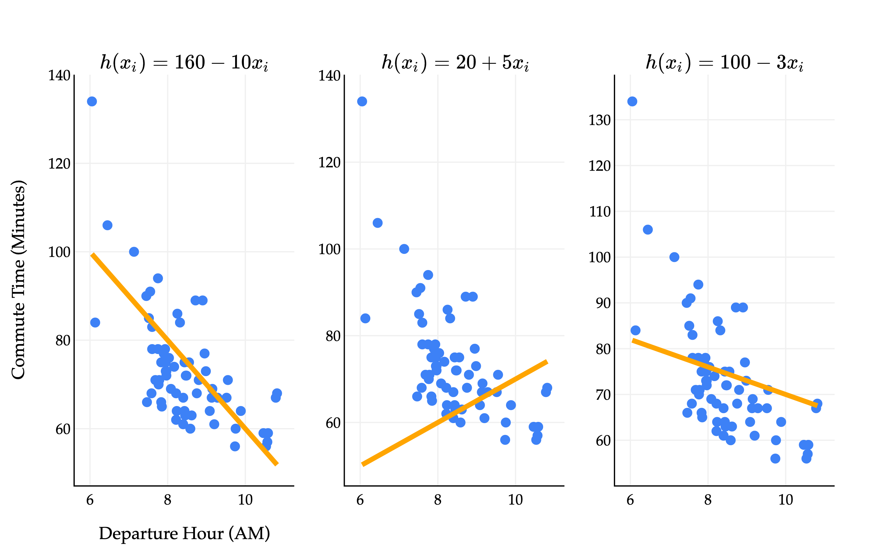
How do we find the optimal parameters, w0∗ and w1∗? Different values of w0 and w1 give us different lines, each of which fit the data with varying degrees of accuracy.
Consider a dataset with two points, (3,5) and (15,53). What are the optimal parameters, w0∗ and w1∗, for the line h(xi)=w0+w1xi that minimizes mean squared error for this dataset?
To make things precise, let’s turn to the three-step modeling recipe from Chapter 1.3.
1. Choose a model.
h(xi)=w0+w1xi
2. Choose a loss function.
We’ll stick with squared loss:
Lsq(yi,h(xi))=(yi−h(xi))2
3. Minimize average loss (also known as empirical risk) to find optimal parameters.
Average squared loss – also known as mean squared error – for any hypothesis function h, takes the form:
n1i=1∑n(yi−h(xi))2
For the simple linear regression model, this becomes:
Rsq(w0,w1)=n1i=1∑n(yi−(w0+w1xi))2
Now, we need to find the values of w0 and w1 that together minimize Rsq(w0,w1). But what does that even mean?
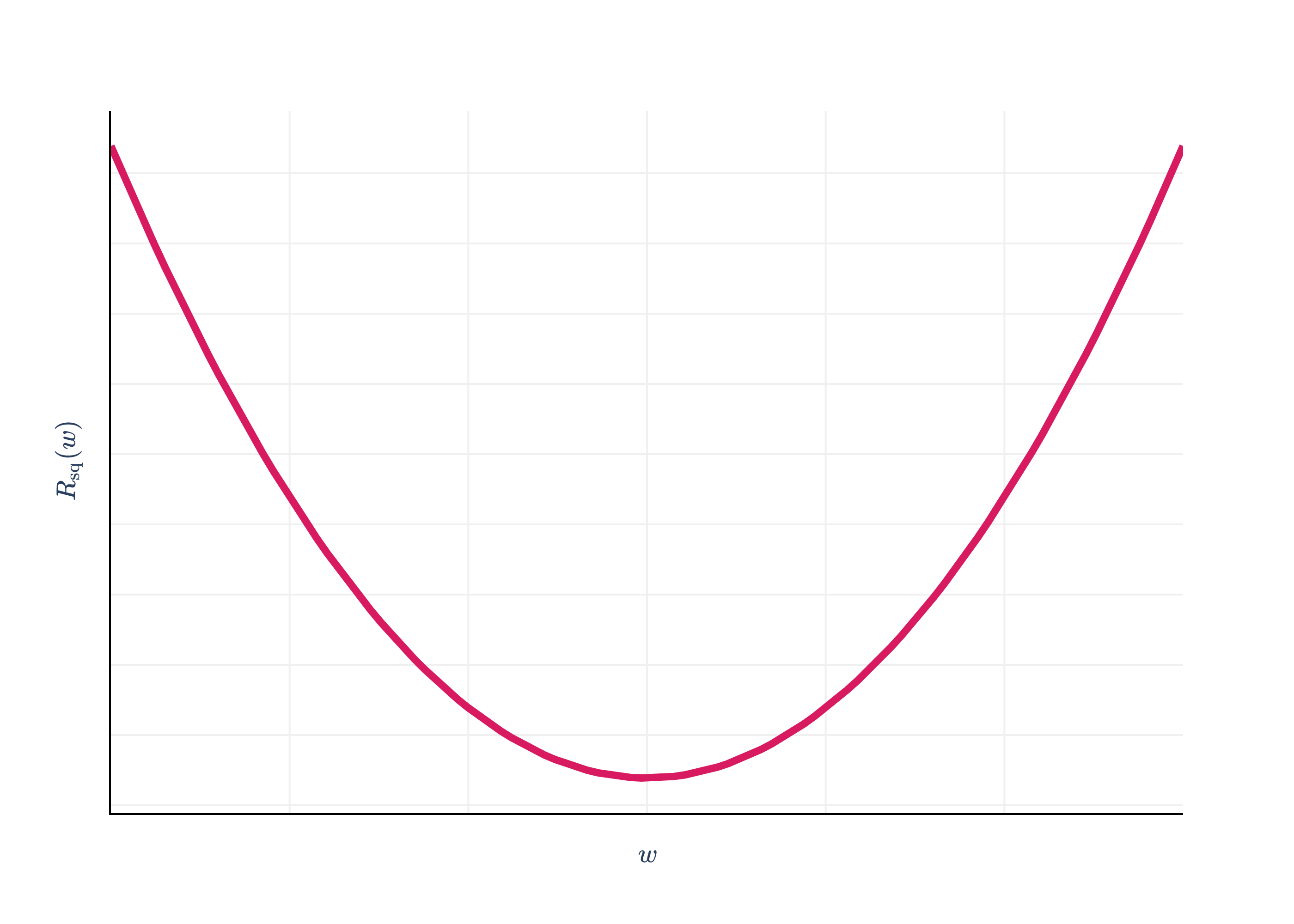
In the case of the context model and squared loss, where we had to minimize Rsq(w)=n1∑i=1n(yi−w)2, we did so by taking the derivative with respect to w and setting it to 0.
import pandas as pd
import numpy as np
import plotly.graph_objects as go
from plotly.subplots import make_subplots

df = pd.read_csv('data/commute-times.csv')

f = lambda h: ((72-h)**2 + (90-h)**2 + (61-h)**2 + (85-h)**2 + (92-h)**2) / 5

x = np.linspace(50, 110, 100)
y = np.array([f(h) for h in x])

# Calculate mean and variance
data = np.array([72, 90, 61, 85, 92])
mean = np.mean(data)
variance = np.mean((data - mean) ** 2)

fig = go.Figure()

fig.add_trace(
    go.Scatter(
        x=x,
        y=y,
        mode='lines',
        name='Data',
        line=dict(color='#D81B60', width=4)
    )
)

# Draw a point at the vertex (mean, variance)
# fig.add_trace(
#     go.Scatter(
#         x=[mean],
#         y=[variance],
#         mode='markers+text',
#         marker=dict(color='#D81B60', size=14, symbol='circle'),
#         text=[f"<span style='font-family:Palatino, Palatino Linotype, serif; color:#D81B60'>(mean, variance)</span>"],
#         textposition="top center",
#         showlegend=False
#     )
# )

fig.update_xaxes(
    showticklabels=False,
    showgrid=True,
    gridwidth=1,
    gridcolor='#f0f0f0',
    showline=True,
    linecolor="black",
    linewidth=1,
)

fig.update_yaxes(
    showgrid=True,
    gridwidth=1,
    gridcolor='#f0f0f0',
    showline=True,
    linecolor="black",
    linewidth=1,
    showticklabels=False
)

fig.update_layout(
    xaxis_title=r'$w$',
    yaxis_title=r'$R_\text{sq}(w)$',
    plot_bgcolor='white',
    paper_bgcolor='white',
    margin=dict(l=60, r=60, t=60, b=60),
    font=dict(
        family="Palatino Linotype, Palatino, serif",
        # color="black"
    ),
    showlegend=False
)

fig.show(renderer='png', scale=4)
Rsq(w) was a function with just a single input variable (w), so the problem of minimizing Rsq(w) was straightforward, and resembled problems we solved in Calculus 1.
The function Rsq(w0,w1) we’re minimizing now has two input variables, w0 and w1. In mathematics, sometimes we’ll write Rsq:R2→R to say that Rsq is a function that takes in two real numbers and returns a single real number.
Rsq(w0,w1)=n1i=1∑n(yi−(w0+w1xi))2
Remember, we should treat the xi’s and yi’s as constants, as these are known quantities once we’re given a dataset.
What does Rsq(w0,w1) even look like? We need three dimensions to visualize it – one axis for w0, one for w1, and one for the output, Rsq(w0,w1).
The graph above is called a loss surface, even though it’s a graph of empirical risk, i.e. average loss, not the loss for a single data point. The plot is interactive, so you should drag it around to get a sense of what it looks like. It looks like a parabola with added depth, similar to how cubes look like squares with added depth. Lighter regions above correspond to low mean squared error, and darker regions correspond to high mean squared error.
Think of the “floor” of the graph – in other words, the w0-w1 plane – as all the set of possible combinations of intercept and slope. The height of the surface at any point (w0,w1) is the mean squared error of the hypothesis h(xi)=w0+w1xi on the commute times dataset.
Our goal is to find the combination of w0 and w1 that get us to the bottom of the surface, marked by the gold point in the plot. Somehow, this will involve calculus and derivatives, but we’ll need to extend our single variable approach.
In the single-input case – i.e., for functions of the form f:R→R – the derivative dxdf(x) captured f(x)'s rate of change along the x-axis, which was the only axis of motion.
The function f(x,y) has two input variables, and so there are two directions along which we can move. As such, we need two “derivatives” to describe the rate of change of f(x,y) – one for the x-axis and one for the y-axis. Think of this as a science experiment, where we need control variables to isolate changes to a single variable. Our solution to this dilemma comes in the form of partial derivatives.
If f has n input variables, it has n partial derivatives, one for each axis. The function f(x,y)=9x2+y2 has two partial derivatives, ∂x∂f(x,y) and ∂y∂f(x,y). (The symbol you’re seeing, ∂, is the lowercase Greek letter delta, and is used specifically for partial derivatives.)
Let me show you how to compute partial derivatives before we visualize them. We’ll start with ∂x∂f(x,y).
The result, ∂x∂f(x,y)=92x, is a function of x and y. It tells us the rate of change of f(x,y) along the x axis, at any point (x,y). It just so happens that this function doesn’t involve y since we chose a relatively simple function f, but we’ll see more sophisticated examples soon.
Following similar steps, you’ll see that ∂y∂f(x,y)=92y. This gives us:
∂x∂f(x,y)=92x,∂y∂f(x,y)=92y
Let’s pick an arbitrary point and see what the partial derivatives tell us about it. Consider, say, (−3,0.5):
∂x∂f(−3,0.5)=92(−3)=−32, so if we holdyconstant, fdecreases asxincreases.
∂y∂f(−3,0.5)=92(0.5)=91, so if we holdxconstant, fincreases asyincreases.
Above, we’ve shown the tangent lines in both the x and y directions at the point (−3,0.5). After all, the derivative of a function at a point tells us the slope of the tangent line at that point; that interpretation remains true with partial derivatives.
To compute ∂x∂g(x,y), we treated y as a constant. Let me try and make more sense of this.
To help visualize, we’ve drawn the functiong(x,y), along with the planey=a. The slider lets you change the value of a being considered, i.e., it lets you change the constant value that we’re assigning to y.
The intersection of g(x,y) and y=a is marked as a gold curve and is a function of x alone.
Drag the slider to y=1.40, for example, and look at the gold curve that results. The expression below tells you the derivative of thatgold curve with respect to x.
∂x∂g(x,1.40)=3x2−3(1.40)2+2cos(x)cos(1.40)=derivative of gold curve w.r.t. x3x2−0.34cos(x)−5.88
Thinking in three dimensions can be difficult, so don’t fret if you’re confused as to what all of these symbols mean – this is all a bit confusing to me too. (Are professors allowed to say this?) Nonetheless, I hope these interactive visualizations are helping you make some sense of the formulas, and if there’s anything I can do to make them clearer, please do tell me!
Activity 2
Find all three partial derivatives of the function:
To minimia (or maximize) a function f:R→R, we solved for critical points, which were points where the (single variable) derivative was 0, and used the second derivative test to classify them as minima or maxima (or neither, like in the case of f(x)=x3 at x=0).
The analog in the R2→R case is solving for the points where both partial derivatives are 0, which corresponds to the points where the function is neither increasing nor decreasing along either axis.
In the case of our first example,
f(x,y)=9x2+y2
the partial derivatives were relatively simple,
∂x∂f=92x,∂y∂f=92y
and both are 0 when x=y=0. So, (0,0,f(0)) is a critical point, and we can see visually that it’s a global minimum.
(Notice that above I wrote ∂x∂f and ∂y∂f instead of ∂x∂f(x,y) and ∂y∂f(x,y) to save space, but don’t forget that both partial derivatives are functions of both x and y in general.)
import numpy as np
import plotly.graph_objects as go

# Grid for paraboloid
x = np.linspace(-5, 5, 50)
y = np.linspace(-5, 5, 50)
X, Y = np.meshgrid(x, y)
a = 3
Z = (X**2 + Y ** 2) / a**2

fig = go.Figure()

# Paraboloid only, with RdBu_r colorscale
fig.add_trace(go.Surface(
    z=Z, x=X, y=Y,
    colorscale="PuRd",
    opacity=1,
    name="Paraboloid",
    showscale=False
))

# Add gold point at (0, 0, 0) and label it "global minimum"
fig.add_trace(go.Scatter3d(
    x=[0],
    y=[0],
    z=[0],
    mode='markers+text',
    marker=dict(size=8, color='gold', symbol='circle'),
    # text=["global minimum"],
    textposition="top center",
    name="Global Minimum"
))

fig.update_layout(
    scene=dict(
        xaxis=dict(
            title=r"x",
            backgroundcolor="white",
            gridcolor="#f0f0f0",
            showbackground=True,
            showline=True,
            linecolor="black",
            linewidth=1,
        ),
        yaxis=dict(
            title=r"y",
            backgroundcolor="white",
            gridcolor="#f0f0f0",
            showbackground=True,
            showline=True,
            linecolor="black",
            linewidth=1,
        ),
        zaxis=dict(
            title=r"f(x,y)",
            backgroundcolor="white",
            gridcolor="#f0f0f0",
            showbackground=True,
            showline=True,
            linecolor="black",
            linewidth=1,
        ),
        bgcolor="white"
    ),
    paper_bgcolor='white',
    plot_bgcolor='white',
    margin=dict(l=30, r=30, t=30, b=30),
    autosize=True,
    width=600,
    height=400,
    font=dict(
        family="Palatino Linotype, Palatino, serif",
        color="black"
    ),
    scene_camera=dict(
        eye=dict(x=1, y=-1.5, z=1.2)
    )
)

fig.show()
Loading...
There is a second derivative test for functions of multiple variables, but it’s a bit more complicated than the single variable case, and to give you an honest explanation of it, I’ll need to introduce you to quite a bit of linear algebra first. So, we’ll table that thought for now.
The function g(x,y)=x3−3xy2+2sin(x)cos(y) has much more complicated partial derivatives, and so it’s difficult to solve for its critical points by hand. Fear not – in Chapter 4, when we discover the technique of gradient descent, we’ll learn how to minimize such functions just by using their partial derivatives, even when we can’t solve for where they’re 0.
Activity 3
Find the values of x1 and x2 that minimize the function:
g(x1,x2)=100(x2−x12)2+(1−x1)2
Here, we’ve used x1 and x2 to denote the two input variables, rather than x and y.
Let’s return to the simple linear regression problem. Recall, the function we’re trying to minimize is:
Rsq(w0,w1)=n1i=1∑n(yi−(w0+w1xi))2
Why? By minimizing Rsq(w0,w1), we’re finding the intercept (w0∗) and slope (w1∗) of the line that best fits the data. Don’t forget that this goal is the point of all of these mathematical ideas.
We’ve learned that to minimize Rsq(w0,w1), we’ll need to find both of its partial derivatives, and solve for the point (w0∗,w1∗,Rsq(w0∗,w1∗)) at which they’re both 0.
Let’s start with the partial derivative with respect to w0:
These look very similar – it’s just ∂w1∂Rsq has an added xi in the summation.
Remember, both partial derivatives are functions of two variables: w0 and w1. We’re treating the xi’s and yi’s as constants. If I already have a dataset, you can pick an intercept w0 and slope w1 and I can use these formulas to compute the partial derivatives of Rsq for that combination of intercept and slope.
In case it helps you put things in perspective, here’s how I might implement these formulas in code, assuming that x and y are arrays:
# Assume x and y are defined somewhere above this function.
def partial_R_w0(w0, w1):
    # Sub-optimal technique, since it uses a for-loop.
    total = 0
    for i in range(len(x)):
        total += (y[i] - (w0 + w1 * x[i]))
    return -2 * total / len(x)
    # Returns a single number!

def partial_R_w1(w0, w1):
    # Better technique, as it uses vectorized operations.
    return -2 * np.mean(x * (y - (w0 + w1 * x)))
    # Also returns a single number!
Before we solve for where both ∂w0∂Rsq and ∂w1∂Rsq are 0, let’s visualize them in the context of our loss surface.
Click “Slider for values of w0”. No matter where you drag that slider, the resulting gold curve is a function of w1 only. Every gold curve you see when dragging the w0 slider will have a minimum at some value of w1.
Then, click “Slider for values of w1”. No matter where you drag that slider, the resulting gold curve is a function of w0 only, and has some minimum value.
But there is only one combination of w0 and w1 where the gold curves have minimums at the exact same intersecting point. That is the combination of w0 and w1 that minimizes Rsq, and it’s who we’re searching for.
Now, it’s time to analytically (that is, on paper) find the values of w0∗ and w1∗ that minimize Rsq. We’ll do so by solving the following system of two equations and two unknowns:
In the first equation, try and isolate for w0; this value will be called w0∗.
Plug the expression for w0∗ into the second equation to solve for w1∗.
Let’s start with the first step.
−n2i=1∑n(yi−(w0+w1xi))=0
Multiplying both sides by −2n gives us:
i=1∑n(actualyi−predictedw0+w1xi)=0
Before I continue, I want to highlight that this itself is an importance balance condition, much like those we discussed in Chapter 1.3. It’s saying that the sum of the errors of the optimal line’s predictions – that is, the line with intercept w0∗ and slope w1∗ – is 0.
Let’s continue with the first step – I’ll try and keep the commentary to a minimum. It’s important to try and replicate these steps yourself, on paper.
Awesome! We’re halfway there. We have a formula for the optimal slope, w0∗, in terms of the optimal intercept, w1∗. Let’s use w0∗=yˉ−w1∗xˉ and see where it gets us in the second equation.
We’re done! We have formulas for the optimal slope and intercept. But, before we celebrate, I’m going to try and rewrite w1∗ in an equivalent, more symmetrical form that is easier to interpret.
Claim:
w1∗=formula we derived above∑i=1nxi(xi−xˉ)∑i=1nxi(yi−yˉ)=nicer looking formula∑i=1n(xi−xˉ)2∑i=1n(xi−xˉ)(yi−yˉ)
Proof of equivalent, nicer looking formula
To show that these two formulas are equal, I’ll start by recapping the fact that the sum of deviations from the mean is 0, in other words:
i=1∑n(xi−xˉ)=0
This has come up in homeworks and past sections of the notes, but for completeness, here’s the proof:
i=1∑nxi−xˉi=1∑nxi−i=1∑nxˉ=nxˉ−nxˉ=0
Equipped with this fact, I can show that the new, more symmetric version of the formula is equal to the original one I derived.
new formula for w1∗original formula for w1∗numerator of new formula: denominator of new formula: =∑i=1n(xi−xˉ)2∑i=1n(xi−xˉ)(yi−yˉ)=i=1∑nxi(xi−xˉ)i=1∑nxi(yi−yˉ)i=1∑n(xi−xˉ)(yi−yˉ)=i=1∑n(xi(yi−yˉ)−xˉ(yi−yˉ))=i=1∑nxi(yi−yˉ)−i=1∑nxˉ(yi−yˉ)=i=1∑nxi(yi−yˉ)−xˉ=0i=1∑n(yi−yˉ)=i=1∑nxi(yi−yˉ)=numerator of original formula!i=1∑n(xi−xˉ)2=i=1∑n(xi−xˉ)(xi−xˉ)=i=1∑nxi(xi−xˉ)−same logic as in the denominator casexˉi=1n∑(xi−xˉ)=i=1∑nxi(xi−xˉ)=denominator of original formula!
We skipped some steps in the denominator case, since many of them are the same as in the numerator case. Nevertheless, since we’ve shown that the numerators of both formulas are the same and the denominators of both formulas are the same, well, both formulas are the same!
This is not the only other equivalent formula for the slope; for instance, w1∗=∑i=1n(xi−xˉ)2∑i=1n(xi−xˉ)yi too, and you can verify this using the same logic as in the proof above.
To summarize, the parameters that minimize mean squared error for the simple linear regression model, h(xi)=w0+w1xi, are:
This is an important result, and you should remember it. There are a lot of symbols above, but just note that given a dataset (x1,y1),(x2,y2),…,(xn,yn), you could apply the formulas above by hand to find the optimal parameters yourself.
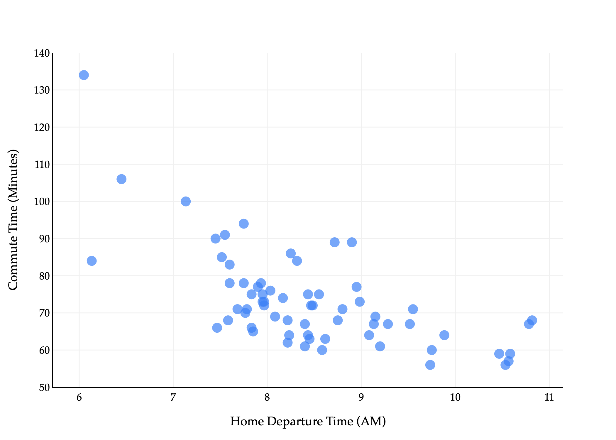
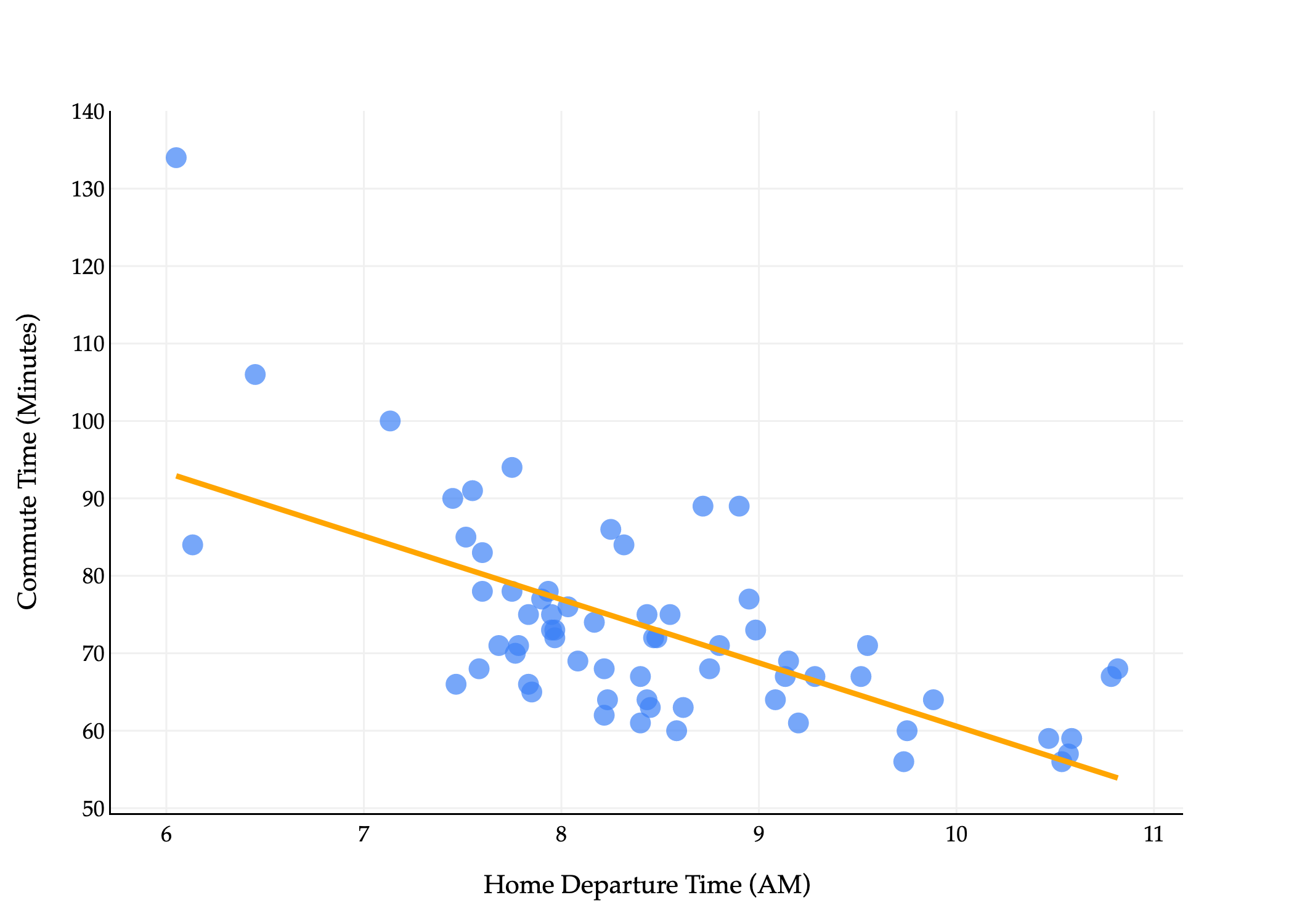
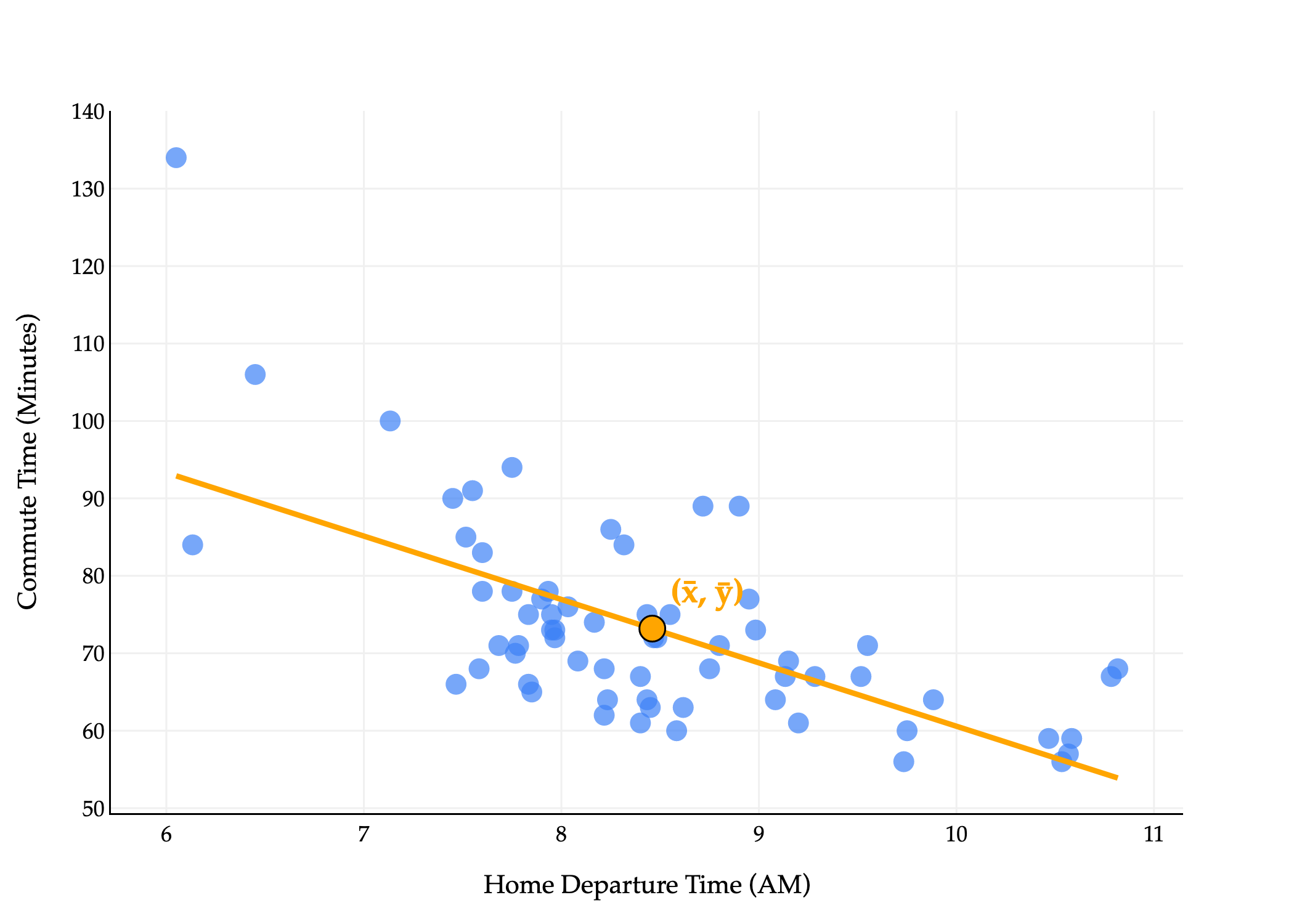
What does this line look like on the commute times data?
import pandas as pd
import numpy as np
import plotly.express as px
import plotly.graph_objects as go

df = pd.read_csv('data/commute-times.csv')

# Compute means
x = df['departure_hour'].values
y = df['minutes'].values
x_bar = np.mean(x)
y_bar = np.mean(y)

# Compute slope (w1) and intercept (w0) using the closed-form solution
w1 = np.sum((x - x_bar) * (y - y_bar)) / np.sum((x - x_bar) ** 2)
w0 = y_bar - w1 * x_bar

# Prepare regression line points
x_line = np.array([x.min(), x.max()])
y_line = w0 + w1 * x_line

# Create scatter plot
fig = px.scatter(
    df,
    x='departure_hour',
    y='minutes',
    size=np.ones(len(df)) * 50,
    size_max=8
)
fig.update_traces(marker_color="#3D81F6", marker_line_width=0)

# Add regression line in orange
fig.add_traces(go.Scatter(
    x=x_line,
    y=y_line,
    mode='lines',
    line=dict(color='orange', width=3),
    name='Regression Line'
))

fig.update_xaxes(
    title='Home Departure Time (AM)',
    gridcolor='#f0f0f0',
    showline=True,
    linecolor="black",
    linewidth=1,
)
fig.update_yaxes(
    title='Commute Time (Minutes)',
    gridcolor='#f0f0f0',
    showline=True,
    linecolor="black",
    linewidth=1,
)
fig.update_layout(
    plot_bgcolor='white',
    paper_bgcolor='white',
    margin=dict(l=60, r=60, t=60, b=60),
    width=700,
    font=dict(
        family="Palatino Linotype, Palatino, serif",
        color="black"
    ),
    showlegend=False
)
fig.show(renderer='png', scale=3)
The line above goes by many names:
The simple linear regression line that minimizes mean squared error.
The simple linear regression line (if said without context).
The regression line.
The least squares regression line (because it has the least mean squared error).
The line of best fit.
Whatever you’d like to call it, now that we’ve found our optimal parameters, we can use them to make predictions.
h(xi)=w0∗+w1∗xi
On the dataset of commute times:
# Assume x is an array with departure hours and y is an array with commute times.
w1_star = np.sum((x - np.mean(x)) * (y - np.mean(y))) / np.sum((x - np.mean(x)) ** 2)
w0_star = np.mean(y) - w1_star * np.mean(x)

w0_star, w1_star
(142.4482415877287, -8.186941724265552)
So, our specific fit, or trained hypothesis function is:
This trained hypothesis function is not saying that leaving later causes you to have shorter commutes. Rather, that’s just the best linear pattern it observed in the data for the purposes of minimizing mean squared error. In reality, there are other factors that affect commute times, and we haven’t performed a thorough-enough analysis to say anything about the causal relationship between departure time and commute time.
To predict how long it might take to get to school tomorrow, plug in the time you’d like to leave for departure houri and out will come your prediction. The slope, -8.19, is in units units of xunits of y=hourminutes, and is telling us that for every hour later you leave, your predicted commute time decreases by 8.19 minutes.
In Python, I can define a predict function as follows:
def predict(x_new):
    return w0_star + w1_star * x_new

# Predicted commute time if I leave at 8:30AM.
predict(8.5)
There’s an important property that the regression line satisfies: for any dataset, the line that minimizes mean squared error passes through the point (mean of x,mean of y).
import pandas as pd
import numpy as np
import plotly.express as px
import plotly.graph_objects as go

df = pd.read_csv('data/commute-times.csv')

# Compute means
x = df['departure_hour'].values
y = df['minutes'].values
x_bar = np.mean(x)
y_bar = np.mean(y)

# Compute slope (w1) and intercept (w0) using the closed-form solution
w1 = np.sum((x - x_bar) * (y - y_bar)) / np.sum((x - x_bar) ** 2)
w0 = y_bar - w1 * x_bar

# Prepare regression line points
x_line = np.array([x.min(), x.max()])
y_line = w0 + w1 * x_line

# Create scatter plot
fig = px.scatter(
    df,
    x='departure_hour',
    y='minutes',
    size=np.ones(len(df)) * 50,
    size_max=8
)
fig.update_traces(marker_color="#3D81F6", marker_line_width=0)

# Add regression line in orange
fig.add_traces(go.Scatter(
    x=x_line,
    y=y_line,
    mode='lines',
    line=dict(color='orange', width=3),
    name='Regression Line'
))

# Add gold point at (x_bar, y_bar) and label it
fig.add_trace(go.Scatter(
    x=[x_bar],
    y=[y_bar],
    mode='markers+text',
    marker=dict(color='orange', size=14, line=dict(width=1, color='black')),
    text=[r'<b>(x̄, ȳ)</b>'],
    textfont=dict(color='orange', size=18),
    textposition='top right',
    name='Mean Point',
    showlegend=False
))

fig.update_xaxes(
    title='Home Departure Time (AM)',
    gridcolor='#f0f0f0',
    showline=True,
    linecolor="black",
    linewidth=1,
)
fig.update_yaxes(
    title='Commute Time (Minutes)',
    gridcolor='#f0f0f0',
    showline=True,
    linecolor="black",
    linewidth=1,
)
fig.update_layout(
    plot_bgcolor='white',
    paper_bgcolor='white',
    margin=dict(l=60, r=60, t=60, b=60),
    width=700,
    font=dict(
        family="Palatino Linotype, Palatino, serif",
        color="black"
    ),
    showlegend=False
)
fig.show(renderer='png', scale=3)
predict(np.mean(x))
73.18461538461538
# Same!
np.mean(y)
73.18461538461538
Our commute times regression line passes through the point (xˉ,yˉ), even if that was not necessarily one of the original points in the dataset.
Intuitively, this says that for an average input, the line that minimizes mean squared error will always predict an average output.
Why is this fact true? See if you can reason about it yourself, then check the solution once you’ve attempted it.
Proof that the regression line passes through (xˉ,yˉ)
Our regression line is:
h(xi)=w0∗+w1∗xi
We know that the optimal intercept of the regression line is:
w0∗=yˉ−w1∗xˉ
Substituting this in yields:
h(xi)=w0∗yˉ−w1∗xˉ+w1∗xi
If we plug in xi=xˉ, we have:
h(xˉ)=yˉcancels out−w1∗xˉ+w1∗xˉ=yˉ
My interpretation of this is that the intercept is chosen to “vertically adjust” the line so that it passes through (xˉ,yˉ).
While the process of minimizing Rsq was much, much more complex than in the case of our single parameter model, the conceptual backing of the process was still this three-step recipe, and hopefully now you see its value.
Sometimes, we’re not necessarily interested in making predictions, but instead want to be descriptive about patterns that exist in data.
In a scatter plot of two variables, if there is any pattern, we say the variables are associated. If the pattern resembles a straight line, we say the variables are correlated, i.e. linearly associated. We can measure how much a scatter plot resembles a straight line using the correlation coefficient.
There are actually many different correlation coefficients; this is the most common one, and it’s sometimes called the Pearson’s correlation coefficient, after the British statistician Karl Pearson.
No matter the values of x1,x2,…xn and y1,y2,…yn, the value of r is bounded between -1 and 1. The closer ∣r∣ is to 1, the stronger the linear association. The sign of r tells us the direction of the trend – upwards (positive) or downwards (negative). r is a unitless quantity – it’s not measured in hours, or dollars, or minutes, or anything else that depends on the units of x and y.
import numpy as np
import plotly.graph_objs as go
from plotly.subplots import make_subplots

np.random.seed(42)

# 1. Roughly circular cloud, little to no correlation
theta = np.linspace(0, 2 * np.pi, 50)
r = 3 + np.random.normal(0, 0.5, size=theta.shape)
x1 = r * np.cos(theta) + np.random.normal(0, 0.3, size=theta.shape)
y1 = r * np.sin(theta) + np.random.normal(0, 0.3, size=theta.shape)
r1 = np.corrcoef(x1, y1)[0, 1]

# 2. Tight positive linear
x2 = np.linspace(0, 10, 50)
y2 = -1.2 * x2 + 2 + np.random.normal(0, 0.5, size=x2.shape)
r2 = np.corrcoef(x2, y2)[0, 1]

# 3. V shape (two strong linear trends)
x3_left = np.linspace(0, 5, 25)
y3_left = -1.2 * x3_left + 10 + np.random.normal(0, 0.3, size=x3_left.shape)
x3_right = np.linspace(5, 10, 25)
y3_right = 1.2 * x3_right - 2 + np.random.normal(0, 0.3, size=x3_right.shape)
x3 = np.concatenate([x3_left, x3_right])
y3 = np.concatenate([y3_left, y3_right])
r3 = np.corrcoef(x3, y3)[0, 1]

# 4. Much looser positive linear (increase noise)
x4 = np.linspace(0, 10, 50)
y4 = 1.2 * x4 + 2 + np.random.normal(0, 5.0, size=x4.shape)  # Increased noise from 2.0 to 5.0
r4 = np.corrcoef(x4, y4)[0, 1]

# Use LaTeX for subplot titles and make them much bigger
subplot_titles = [
    r"r = {:.3f}".format(r1),
    r"r = {:.3f}".format(r2),
    r"r = {:.3f}".format(r3),
    r"r = {:.3f}".format(r4)
]

fig = make_subplots(
    rows=2, cols=2,
    subplot_titles=subplot_titles,
    vertical_spacing=0.1
)

fig.add_trace(
    go.Scatter(x=x1, y=y1, mode='markers', marker=dict(color='#3d81f6', opacity=0.7), showlegend=False),
    row=1, col=1
)
fig.add_trace(
    go.Scatter(x=x2, y=y2, mode='markers', marker=dict(color='#3d81f6', opacity=0.7), showlegend=False),
    row=1, col=2
)
fig.add_trace(
    go.Scatter(x=x3_left, y=y3_left, mode='markers', marker=dict(color='#3d81f6', opacity=0.7), showlegend=False),
    row=2, col=1
)
fig.add_trace(
    go.Scatter(x=x3_right, y=y3_right, mode='markers', marker=dict(color='#3d81f6', opacity=0.7), showlegend=False),
    row=2, col=1
)
fig.add_trace(
    go.Scatter(x=x4, y=y4, mode='markers', marker=dict(color='#3d81f6', opacity=0.7), showlegend=False),
    row=2, col=2
)

for i in range(1, 3):
    for j in range(1, 3):
        fig.update_xaxes(
            title_text="x",
            row=i,
            col=j,
            gridcolor='#f0f0f0',
            showline=True,
            linecolor="black",
            linewidth=1,
        )
        fig.update_yaxes(
            title_text="y",
            row=i,
            col=j,
            gridcolor='#f0f0f0',
            showline=True,
            linecolor="black",
            linewidth=1,
        )

fig.update_layout(
    height=700,
    width=700,
    showlegend=False,
    plot_bgcolor='white',
    paper_bgcolor='white',
    margin=dict(l=60, r=60, t=60, b=60),
    font=dict(
        family="Palatino Linotype, Palatino, serif",
        color="black"
    ),
    # Make subplot titles much bigger and use LaTeX
    annotations=[
        dict(
            text=title,
            x=0.225 if idx == 0 else 0.775 if idx == 1 else 0.225 if idx == 2 else 0.775,
            y=0.98 if idx < 2 else 0.4,
            xref="paper",
            yref="paper",
            showarrow=False,
            font=dict(size=28, family="Palatino Linotype, Palatino, serif"),  # Increased from 28 to 36
            align="center"
        )
        for idx, title in enumerate(subplot_titles)
    ]
)
fig.show(renderer="png", scale=3)
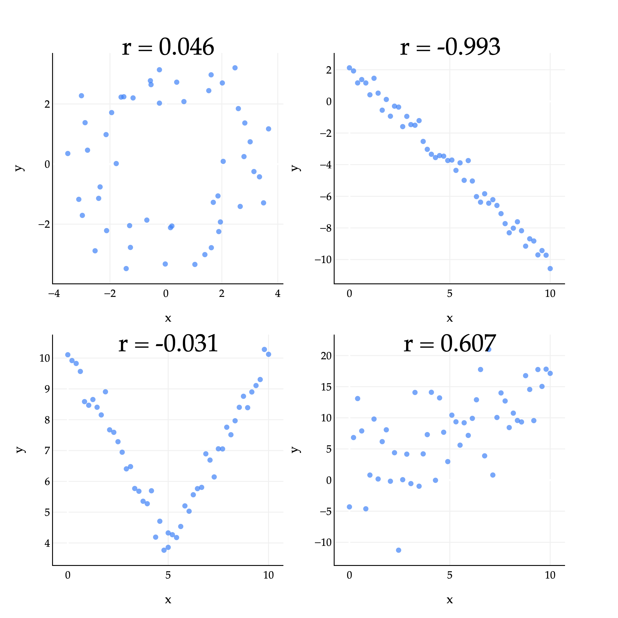
The plots above give us some examples of what the correlation coefficient can look like in practice.
Top left (r=0.046): There’s some loose circle-like pattern, but it mostly looks like a random cloud of points. ∣r∣ is close to 0, but just happens to be positive.
Top right (r=−0.993): The points are very tightly clustered around a line with a negative slope, so r is close to -1.
Bottom left (r=−0.031): While the points are certainly associated, they are not linearly associated, so the value of r is close to 0. (The shape looks more like a V or parabola than a straight line.)
Bottom right (r=0.607): The points are loosely clustered and follow a roughly linear pattern trending upwards. r is positive, but not particularly large.
The correlation coefficient has some useful properties to be aware of. For one, it’s symmetric: r(x,y)=r(y,x). If you swap the xi’s and yi’s in its formula, you’ll see the result is the same.
r=n1i=1∑n(σxxi−xˉ)(σyyi−yˉ)
One way to think of r is that it’s the mean of the product of x and y, once both variables have been standardized. To standardize a collection of numbers x1,x2,…xn, you first find the mean xˉ and standard deviation σx of the collection. Then, for each xi, you compute:
zi=σxxi−xˉ
This tells you how many standard deviations away from the mean each xi is. For example, if zi=−1.5, that means xi is 1.5 standard deviations below the mean of x. The value of xi once it’s standardized is sometimes called its z-score; you may have heard of z-scores in the context of curved exam scores.
With this in mind, I’ll again state that r is the mean of theproduct ofx and y, once both variables have been standardized:
This interpretation of r makes it a bit easier to see whyr measures the strength of linear association – because up until now, it must seem like a formula I pulled out of thin air.
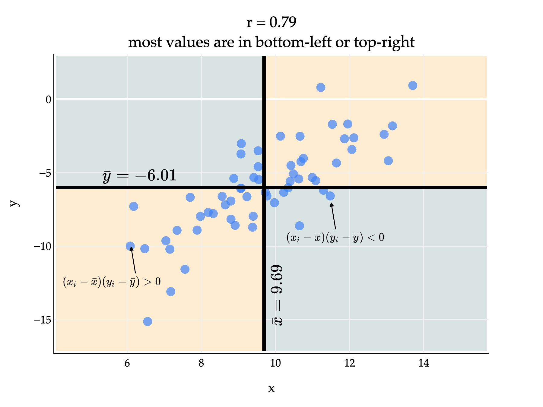
If there’s positive linear association, then xi and yi will usually either both be above their averages, or both be below their averages, meaning that xi−xˉ and yi−yˉ will usually have the same sign. If we multiply two numbers with the same sign – either both positive or both negative – then the product will be positive.
import numpy as np
import plotly.graph_objects as go
np.random.seed(42)
n = 60
x = np.random.normal(10, 2, n)
# Create y with r ≈ 0.75 to x, y mean ≈ -6
r = 0.75
y = r * (x - np.mean(x)) / np.std(x) * 3 + np.random.normal(0, np.sqrt(1 - r**2) * 3, n) - 6
x_mean = np.mean(x)
y_mean = np.mean(y)
corr = np.corrcoef(x, y)[0, 1]
x_min, x_max = min(x)-2, max(x)+2
y_min, y_max = min(y)-2, max(y)+2
# Compute (x - x̄), (y - ȳ), and their product for each point
x_centered = x - x_mean
y_centered = y - y_mean
product = x_centered * y_centered
# Prepare custom hover text
hover_text = [
f"x = {xi:.2f}<br>y = {yi:.2f}<br>x - ȳ = {xc:.2f}<br>y - ȳ = {yc:.2f}<br>product = {p:.2f}"
.replace("x - ȳ", "x - \\bar{{x}}").replace("y - ȳ", "y - \\bar{{y}}")
for xi, yi, xc, yc, p in zip(x, y, x_centered, y_centered, product)
]
fig = go.Figure()
# Shade quadrants: top right and bottom left green, others red
# Top right (x > x_mean, y > y_mean): light orange
fig.add_shape(
type="rect",
x0=x_mean, x1=x_max,
y0=y_mean, y1=y_max,
fillcolor="rgba(255, 183, 77, 0.25)", # light orange
line=dict(width=0),
layer="below"
)
# Bottom left (x < x_mean, y < y_mean): light orange
fig.add_shape(
type="rect",
x0=x_min, x1=x_mean,
y0=y_min, y1=y_mean,
fillcolor="rgba(255, 183, 77, 0.25)", # light orange
line=dict(width=0),
layer="below"
)
# Top left (x < x_mean, y > y_mean): light #004d40
fig.add_shape(
type="rect",
x0=x_min, x1=x_mean,
y0=y_mean, y1=y_max,
fillcolor="rgba(0, 77, 64, 0.15)", # light #004d40
line=dict(width=0),
layer="below"
)
# Bottom right (x > x_mean, y < y_mean): light #004d40
fig.add_shape(
type="rect",
x0=x_mean, x1=x_max,
y0=y_min, y1=y_mean,
fillcolor="rgba(0, 77, 64, 0.15)", # light #004d40
line=dict(width=0),
layer="below"
)
fig.add_trace(go.Scatter(
x=x, y=y,
mode='markers',
marker=dict(size=10, color="#3D81F6", line=dict(width=0), opacity=0.7),
showlegend=False,
hovertemplate=(
"x = %{x:.2f}<br>"
"y = %{y:.2f}<br>"
"x - ̄x = %{customdata[0]:.2f}<br>"
"y - ̄y = %{customdata[1]:.2f}<br>"
"product = %{customdata[2]:.2f}<extra></extra>"
),
customdata=np.stack([x_centered, y_centered, product], axis=-1)
))
# Add thick black vertical line at x = mean(x)
fig.add_shape(
type="line",
x0=x_mean, x1=x_mean,
y0=y_min, y1=y_max,
line=dict(color="black", width=4)
)
# Add thick black horizontal line at y = mean(y)
fig.add_shape(
type="line",
x0=x_min, x1=x_max,
y0=y_mean, y1=y_mean,
line=dict(color="black", width=4)
)
# Annotate mean of x along the y-axis, vertical and rotated, using \bar{x}
fig.add_annotation(
x=x_mean+0.1,
y=-14,
text=f"$\\bar{{x}} = {x_mean:.2f}$",
showarrow=False,
font=dict(size=20, color="black"),
textangle=-90,
xanchor="left",
yanchor="middle"
)
# Annotate mean of y along the x-axis, horizontal, using \bar{y}
fig.add_annotation(
x=6,
y=y_mean+0.5,
text=f"$\\bar{{y}} = {y_mean:.2f}$",
showarrow=False,
font=dict(size=20, color="black"),
xanchor="center",
yanchor="bottom"
)
fig.update_layout(
title={
'text': f"r = {corr:.2f}<br>most values are in bottom-left or top-right",
'x': 0.5,
'xanchor': 'center'
},
xaxis_title="x",
yaxis_title="y",
width=600,
height=450,
plot_bgcolor='white',
font=dict(
family="Palatino Linotype, Palatino, serif",
color="black"
),
margin=dict(l=60, r=60, t=60, b=60)
)
fig.update_xaxes(
gridcolor='#f0f0f0',
showline=True,
linecolor="black",
linewidth=1,
)
fig.update_yaxes(
gridcolor='#f0f0f0',
showline=True,
linecolor="black",
linewidth=1,
)
# Add annotation with arrow to (6, -10)
fig.add_annotation(
x=6.1,
y=-10,
text="$(x_i - \\bar{x})(y_i - \\bar{y}) > 0$",
showarrow=True,
arrowhead=2,
arrowsize=1,
arrowwidth=1,
arrowcolor="black",
ax=5, # horizontal offset in pixels
ay=30, # vertical offset in pixels
font=dict(size=12, color="black"),
xanchor="center",
yanchor="top"
)
# Add annotation with arrow to (6, -10)
fig.add_annotation(
x=11.5,
y=-7,
text="$(x_i - \\bar{x})(y_i - \\bar{y}) < 0$",
showarrow=True,
arrowhead=2,
arrowsize=1,
arrowwidth=1,
arrowcolor="black",
ax=5, # horizontal offset in pixels
ay=30, # vertical offset in pixels
font=dict(size=12, color="black"),
xanchor="center",
yanchor="top"
)
fig.show(renderer="png", scale=3)
Since most points are in the bottom-left and top-right quadrants, most of the products (xi−xˉ)(yi−yˉ) are positive. This means that r, which is the average of these products divided by the standard deviations of x and y, will be positive too. (We divide by the standard deviations to ensure that −1≤r≤1.)
Above, r is positive but not exactly 1, since there are several points in the bottom-right and top-left quadrants, who would have a negative product (xi−xˉ)(yi−yˉ) and bring down the average product.
If there’s negative linear association, then typically it’ll be the case that xi is above average while yi is below average, or vice versa. This means that xi−xˉ and yi−yˉ will usually have opposite signs, and when they have opposite signs, their product will be negative. If most points have a negative product, then r will be negative too.
Since r measures how closely points cluster around a line, it is invariant to units of measurement, or linear transformations of the variables independently.
import numpy as np
import plotly.graph_objects as go
from plotly.subplots import make_subplots

np.random.seed(42)
n = 60
x = np.random.normal(10, 2, n)
r = 0.75
y = r * (x - np.mean(x)) / np.std(x) * 3 + np.random.normal(0, np.sqrt(1 - r**2) * 3, n) - 6

# Compute axis limits from original data (to keep axes fixed)
x_min, x_max = min(x)-7, max(x)+7
y_min, y_max = min(y)-7, max(y)+7

# Prepare transformed datasets and their correlations
transforms = [
    (x, y,         r"x(x,y)",      np.corrcoef(x, y)[0, 1], "r(x,y)"),
    (x / 2, y,         r"x(x/2, y)",      np.corrcoef(x / 2, y)[0, 1], "r(x/2, y)"),
    (x + 3, 2 * y,       r"x(x+3, 2y)",      np.corrcoef(x + 3, 2 * y)[0, 1], "r(x+3, 2y)"),
    (x + 1, -y/2 - 10,    r"x(x+1, -y/2 - 10)",  np.corrcoef(x + 1, -y/2 - 10)[0, 1], "r(x+1, -y/2 - 1)"),
]

# For the last plot, show -r in the title (negate the correlation)
transforms[-1] = (transforms[-1][0], transforms[-1][1], transforms[-1][2], -np.corrcoef(x, y)[0, 1], "r(-0.5x, y+1)")

titles = [
    f"r(x, y) = {transforms[0][3]:.2f}",
    f"r(x/2, y) = {transforms[1][3]:.2f}",
    f"r(x+3, 2y) = {transforms[2][3]:.2f}",
    f"r(x+1, -y/2 -10) = {transforms[3][3]:.2f}",
]

fig = make_subplots(
    rows=2, cols=2,
    subplot_titles=titles,
    horizontal_spacing=0.12,
    vertical_spacing=0.12
)

for i, (x_t, y_t, _, _, _) in enumerate(transforms):
    row = i // 2 + 1
    col = i % 2 + 1
    fig.add_trace(
        go.Scatter(
            x=x_t, y=y_t,
            mode='markers',
            marker=dict(size=10, color="#3D81F6", line=dict(width=0), opacity=0.7),
            showlegend=False,
            hovertemplate="x = %{x:.2f}<br>y = %{y:.2f}<extra></extra>"
        ),
        row=row, col=col
    )
    fig.update_xaxes(range=[x_min, x_max], row=row, col=col)
    fig.update_yaxes(range=[y_min, y_max], row=row, col=col)

fig.update_layout(
    height=900,
    width=1100,
    plot_bgcolor='white',
    paper_bgcolor='white',
    margin=dict(l=60, r=60, t=60, b=60),
    font=dict(
        family="Palatino Linotype, Palatino, serif",
        color="black",
    ),
    xaxis_title="x",
    yaxis_title="y",
    annotations=[
        dict(font=dict(size=28, family="Palatino Linotype, Palatino, serif"))
    ]
)

fig.show(renderer="png", scale=3)
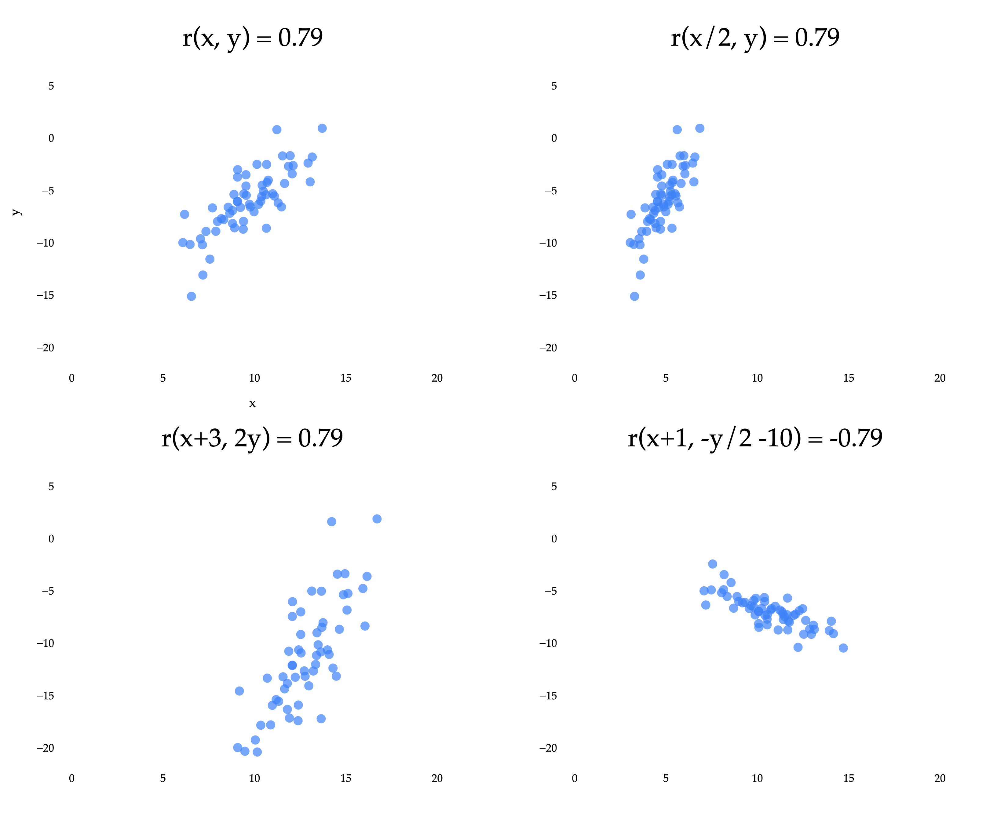
The top left scatter plot is the same as in the previous example, where we reasoned about why r is positive. The other three plots result from applying linear transformations to the x and/or y variables independently. A linear transformation of x is any function of the form ax+b, and a linear transformation of y is any function of the form cy+d. (This is an idea we’ll revisit more in Chapter 2.)
Notice that three of the four plots have the same r of approximately 0.79. The bottom right plot has an r of approximately -0.79, because the y coordinates were multiplied by a negative constant. What we’re seeing is that the correlation coefficient is invariant to linear transformations of the two variables independently.
Put in real-world terms: it doesn’t matter if you measure commute times in hours, minutes, or seconds, the correlation between departure time and commute time will be the same in all three cases.
Since r measures how closely points cluster around a line, it shouldn’t be all that surprising that r has something to do with w1∗, the slope of the regression line.
This is my preferred version of the formula for the optimal slope – it’s easy to use and interpret. I’ve hidden the proof behind a dropdown menu below, but you really should attempt it on your own (and then read it), since it helps build familiarity with how the various components of the formula for r and w1∗ are related.
Proof that w1∗=rσxσy
First, let’s show that we can express ∑i=1n(xi−xˉ)2 in terms of σx:
The simpler formula above implies that the sign of the slope is the same as the sign of r, which seems reasonable: if the direction of the linear association is negative, the best-fitting slope should be, too.
This new formula for the slope also gives us insight into how the spread of x (σx) and y (σy) affects the slope. If y is more spread out than x, the points on the scatter plot will be stretched out vertically, which will make the best-fitting slope steeper.
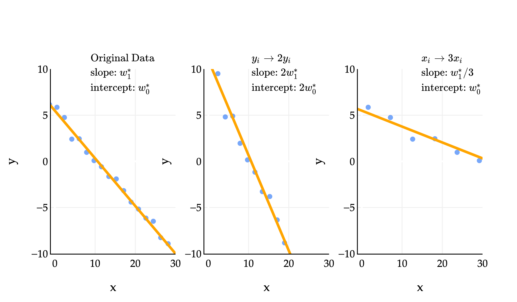
In the middle example above, yi→2yi means that we replaced each yi in the dataset with 2yi. In that example, the slope and intercept of the regression line both doubled. In the third example, where we replaced each xi with 3xi, the slope was divided by 3, while the intercept remained. One of the problems in Homework 2 has you prove these sorts of results, and you can do so by relying on the formula for w1∗ that involves r; note that all three datasets above have the same r.
Activity 4
This activity is an old exam question, taken from an exam that used to allow calculators.
First, suppose we minimize mean squared error to fit a simple linear regression line that uses the square footage of a house to predict its price. The resulting line has an intercept of w0∗ and a slope of w1∗. In other words:
predicted pricei=w0∗+w1∗square footagei
We’re now interested in minimizing mean squared error to find a simple linear regression line that uses price to predict square footage. Suppose this new regression line has an intercept of β0∗ and a slope of β1∗.
What is β1∗? Give your answer as an expression in terms of n, r, w0∗, and/or w1∗.
Given that:
n=100
r=0.6
w0∗=1000
w1∗=250|
The average square footage of houses in the dataset is 2000
What is β0∗? Your answer should be a constant with no variables. (Once you’re able to express β0∗ in terms of constants only, you can stop simplifying your answer.)
The correlation coefficient is just one number that describes the linear association between two variables; it doesn’t tell us everything.
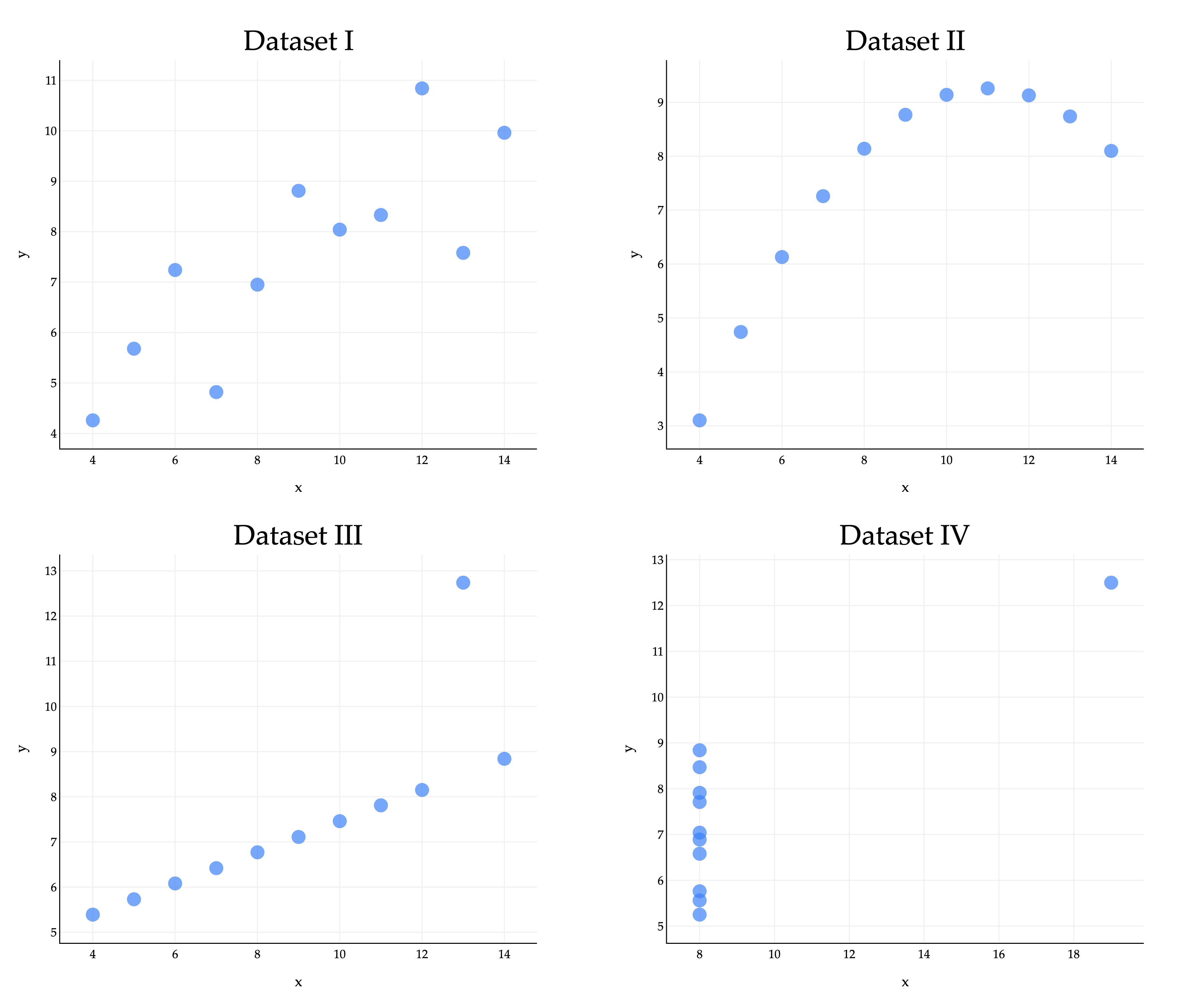
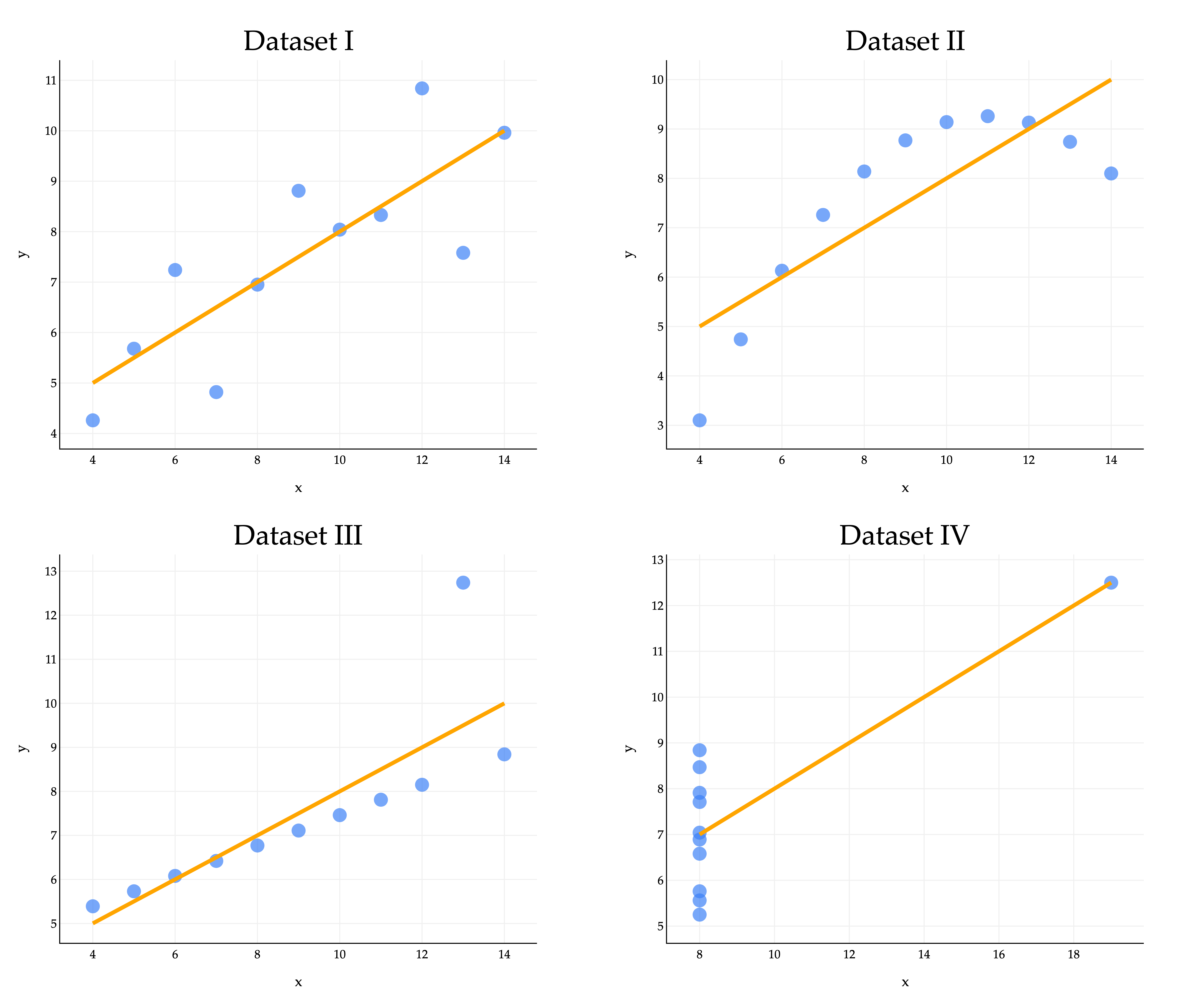
Consider the famous example of Anscombe’s quartet, which consists of four datasets that all have the same mean, standard deviation, and correlation coefficient, but look very different.
import pandas as pd
import plotly.graph_objects as go
from plotly.subplots import make_subplots

anscombe = pd.read_csv('data/anscombe.csv')

fig = make_subplots(
    rows=2, cols=2,
    subplot_titles=[f"Dataset {n}" for n in ['I', 'II', 'III', 'IV']],
    horizontal_spacing=0.12,
    vertical_spacing=0.12
)

for i, n in enumerate(['I', 'II', 'III', 'IV']):
    rows = anscombe[anscombe['dataset'] == n]
    x = rows['x']
    y = rows['y']
    row = i // 2 + 1
    col = i % 2 + 1
    fig.add_trace(
        go.Scatter(
            x=x, y=y,
            mode='markers',
            marker=dict(size=14, color='#3d81f6', opacity=0.7),
            showlegend=False
        ),
        row=row, col=col
    )

fig.update_layout(
    height=1000,
    width=1200,
    plot_bgcolor='white',
    paper_bgcolor='white',
    margin=dict(l=60, r=60, t=60, b=60),
    font=dict(
        family="Palatino Linotype, Palatino, serif",
        color="black"
    ),
    annotations=[
        dict(font=dict(size=28, family="Palatino Linotype, Palatino, serif"))
    ]
)

for i in range(1, 5):
    fig.update_xaxes(
        title_text="x",
        row=(i-1)//2+1,
        col=(i-1)%2+1,
        gridcolor='#f0f0f0',
        showline=True,
        linecolor="black",
        linewidth=1,
    )
    fig.update_yaxes(
        title_text="y",
        row=(i-1)//2+1,
        col=(i-1)%2+1,
        gridcolor='#f0f0f0',
        showline=True,
        linecolor="black",
        linewidth=1,
    )

fig.show(renderer="png", scale=3)
In all four datasets:
xˉ=9,yˉ=7.5,σx=3.16,σy=1.94,r=0.82
Because they all share the same five values of these key quantities, they also share the same regression lines, since the optimal slope and intercept are determined just using those five quantities.
import pandas as pd
import plotly.graph_objects as go
from plotly.subplots import make_subplots

anscombe = pd.read_csv('data/anscombe.csv')

fig = make_subplots(
    rows=2, cols=2,
    subplot_titles=[f"Dataset {n}" for n in ['I', 'II', 'III', 'IV']],
    horizontal_spacing=0.12,
    vertical_spacing=0.12
)

for i, n in enumerate(['I', 'II', 'III', 'IV']):
    rows = anscombe[anscombe['dataset'] == n]
    x = rows['x']
    y = rows['y']
    row = i // 2 + 1
    col = i % 2 + 1
    fig.add_trace(
        go.Scatter(
            x=x, y=y,
            mode='markers',
            marker=dict(size=14, color='#3d81f6', opacity=0.7),
            showlegend=False
        ),
        row=row, col=col
    )

fig.update_layout(
    height=1000,
    width=1200,
    plot_bgcolor='white',
    paper_bgcolor='white',
    margin=dict(l=60, r=60, t=60, b=60),
    font=dict(
        family="Palatino Linotype, Palatino, serif",
        color="black"
    ),
    annotations=[
        dict(font=dict(size=28, family="Palatino Linotype, Palatino, serif"))
    ]
)

for i in range(1, 5):
    fig.update_xaxes(
        title_text="x",
        row=(i-1)//2+1,
        col=(i-1)%2+1,
        gridcolor='#f0f0f0',
        showline=True,
        linecolor="black",
        linewidth=1,
    )
    fig.update_yaxes(
        title_text="y",
        row=(i-1)//2+1,
        col=(i-1)%2+1,
        gridcolor='#f0f0f0',
        showline=True,
        linecolor="black",
        linewidth=1,
    )
for i, n in enumerate(['I', 'II', 'III', 'IV']):
    rows = anscombe[anscombe['dataset'] == n]
    x = rows['x']
    y = rows['y']
    w1_ans = ((x - x.mean()) * (y - y.mean())).sum() / ((x - x.mean()) ** 2).sum()
    w0_ans = y.mean() - w1_ans * x.mean()
    # Sort x for a proper regression line
    x_sorted = np.sort(x)
    y_pred = w0_ans + w1_ans * x_sorted
    row = i // 2 + 1
    col = i % 2 + 1
    # Add regression line to the corresponding subplot
    fig.add_trace(
        go.Scatter(
            x=x_sorted,
            y=y_pred,
            mode='lines',
            line=dict(color='orange', width=4),
            showlegend=False
        ),
        row=row, col=col
    )


fig.show(renderer="png", scale=4)
The regression line clearly looks better for some datasets than others, with Dataset IV looking particularly off. A high ∣r∣ may be evidence of a strong linear association, but it cannot guarantee that a linear model is suitable for a dataset. Moral of the story - visualize your data before trying to fit a model! Don’t just trust the numbers.
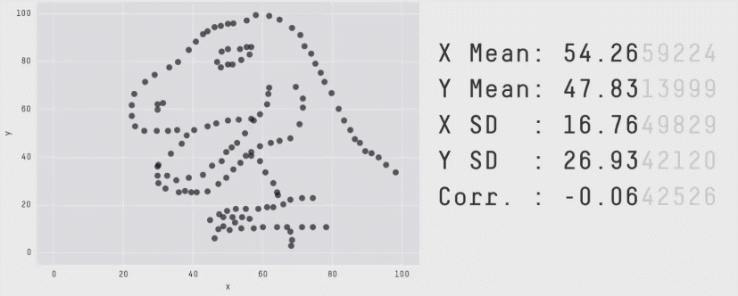
You might like the Datasaurus Dozen, another similar collection of 13 datasets that all have the same mean, standard deviation, and correlation coefficient, but look very different. (One looks like a dinosaur!)