Most modern supervised learning algorithms follow these same three steps, just with different models, loss functions, and techniques for optimization.
Another name given to this process is empirical risk minimization.
When using squared loss, all three of these mean the same thing:
Average squared loss.
Mean squared error.
Empirical risk.
Risk is an idea from theoretical statistics that we’ll visit in Chapter 6. It refers to the expected error of a model, when considering the probability distribution of the data. “Empirical” risk refers to risk calculated using an actual, concrete dataset, rather than a theoretical distribution. The reason we call the average loss R is precisely because it is empirical risk.
The first half of the course – and in some ways, the entire course – is focused on empirical risk minimization, and so we will make many passes through the three-step modeling recipe ourselves, with differing models and loss functions.
A common question you’ll see in labs, homeworks, and exams will involve finding the optimal model parameters for a given model and loss function – in particular, for a combination of model and loss function that you’ve never seen before. For practice with this sort of exercise, work through the following activity. If you feel stuck, try reading through the rest of this section for context, then come back.
Activity 1
Suppose we’d like to find the optimal parameter, w∗, for the constant model h(xi)=w. To do so, we use the following loss function:
L(yi,h(xi))=(4yi−3h(xi))2
What value of w minimizes average loss for this new loss function?
When we first introduced the idea of a loss function, we first started by computing the error, ei, of each prediction:
ei=yi−h(xi)
where yi is the actual value and h(xi) is the predicted value.
The issue was that some errors were positive and some were negative, and so it was hard to compare them directly. We wanted the value of the loss function to be large for bad predictions and small for good predictions.
To get around this, we squared the errors, which gave us squared loss:
Lsq(yi,h(xi))=(yi−h(xi))2
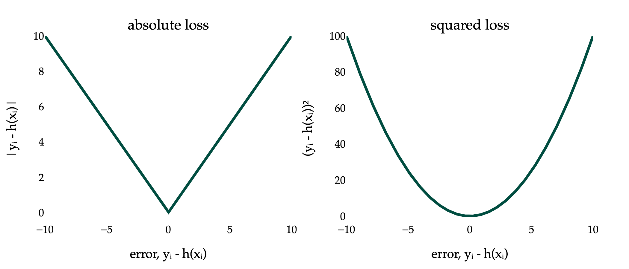
But, instead, we could have taken the absolute value of the errors. Doing so gives us absolute loss:
Labs(yi,h(xi))=∣yi−h(xi)∣
Below, I’ve visualized the absolute loss and squared loss for just a single data point.
You should notice two key differences between the two loss functions:
The absolute loss function is not differentiable when yi=h(xi). The absolute value function, f(x)=∣x∣, does not have a derivative at x=0, because its slope to the left of x=0 (-1) is different from its slope to the right of x=0 (1). For more on this idea, see Chapter 0.2.
The squared loss function grows much faster than the absolute loss function, as the prediction h(xi) gets further away from the actual value yi.
We know the optimal constant prediction, w∗, when using squared loss, is the mean. What is the optimal constant prediction when using absolute loss? The answer is not still the mean; rather, the answer reflects some of these differences between squared loss and absolute loss.
Let’s find that new optimal constant prediction, w∗, by revisiting the three-step modeling recipe.
Choose a model.
We’ll stick with the constant model, h(xi)=w.
Choose a loss function.
We’ll use absolute loss:
Labs(yi,h(xi))=∣yi−h(xi)∣
For the constant model, since h(xi)=w, we have:
Labs(yi,w)=∣yi−w∣
Minimize average loss to find optimal model parameters.
The average loss – also known as mean absolute error here – is:
Rabs(w)=n1i=1∑n∣yi−w∣
In Chapter 1.2, we minimized Rsq(w)=n1i=1∑n(yi−w)2 by taking the derivative of Rsq(w) with respect to w and setting it equal to 0. That will be more challenging in the case of Rabs(w), because the absolute value function is not differentiable when its input is 0, as we just discussed.
We need to minimize the mean absolute error, Rabs(w), for the constant model, h(xi)=w, but we have to address the fact that Rabs(w) is not differentiable across its entire domain.
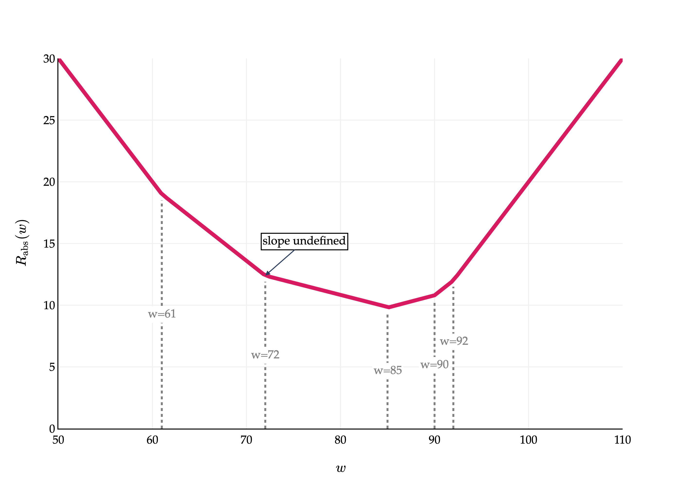
I think it’ll help to visualize what Rabs(w) looks like. To do so, let’s reintroduce the small dataset of 5 values we used in Chapter 1.2.
y1=72,y2=90,y3=61,y4=85,y5=92
Then, Rabs(w) is:
Rabs(w)=51(∣72−w∣+∣90−w∣+∣61−w∣+∣85−w∣+∣92−w∣)
import pandas as pd
import numpy as np
import plotly.graph_objects as go
from plotly.subplots import make_subplots

df = pd.read_csv('data/commute-times.csv')

f = lambda h: (abs(72-h) + abs(90-h) + abs(61-h) + abs(85-h) + abs(92-h)) / 5

x = np.linspace(50, 110, 100)
y = np.array([f(h) for h in x])

fig = go.Figure()

fig.add_trace(
    go.Scatter(
        x=x,
        y=y,
        mode='lines',
        name='Data',
        line=dict(color='#D81B60', width=4)
    )
)

# Add vertical dotted lines at the 5 data points
data_points = [72, 90, 61, 85, 92]
for pt in data_points:
    y_val = f(pt)
    fig.add_trace(
        go.Scatter(
            x=[pt, pt],
            y=[0, y_val-0.5],
            mode='lines',
            line=dict(color='gray', width=2, dash='dot'),
            showlegend=False
        )
    )
    # Add annotation halfway up the dotted line
    halfway_y = (y_val-0.5) / 2 if pt != max(data_points) else y_val-5
    fig.add_annotation(
        x=pt,
        y=halfway_y,
        text=f"w={pt}",
        showarrow=False,
        font=dict(
            family="Palatino Linotype, Palatino, serif",
            color="gray",
            size=12
        ),
        bgcolor="white",
        xanchor="center",
        yanchor="middle"
    )

# Annotate (72, f(72)) with an arrow and text
fig.add_annotation(
    x=72,
    y=f(72),
    text=r"slope undefined",
    showarrow=True,
    arrowhead=2,
    ax=40,
    ay=-35,
    font=dict(
        family="Palatino Linotype, Palatino, serif",
        color="black",
        size=12
    ),
    bgcolor="white",
    bordercolor="black"
)

fig.update_xaxes(
    showticklabels=True,
    showgrid=True,
    gridwidth=1,
    gridcolor='#f0f0f0',
    showline=True,
    linecolor="black",
    linewidth=1,
)

fig.update_yaxes(
    showgrid=True,
    gridwidth=1,
    gridcolor='#f0f0f0',
    showline=True,
    linecolor="black",
    linewidth=1,
    range=[0, 30]
)

fig.update_layout(
    xaxis_title=r'$w$',
    yaxis_title=r'$R_\text{abs}(w)$',
    plot_bgcolor='white',
    paper_bgcolor='white',
    margin=dict(l=60, r=60, t=60, b=60),
    font=dict(
        family="Palatino Linotype, Palatino, serif",
        color="black"
    ),
    showlegend=False
)

fig.show(renderer='png', scale=4)
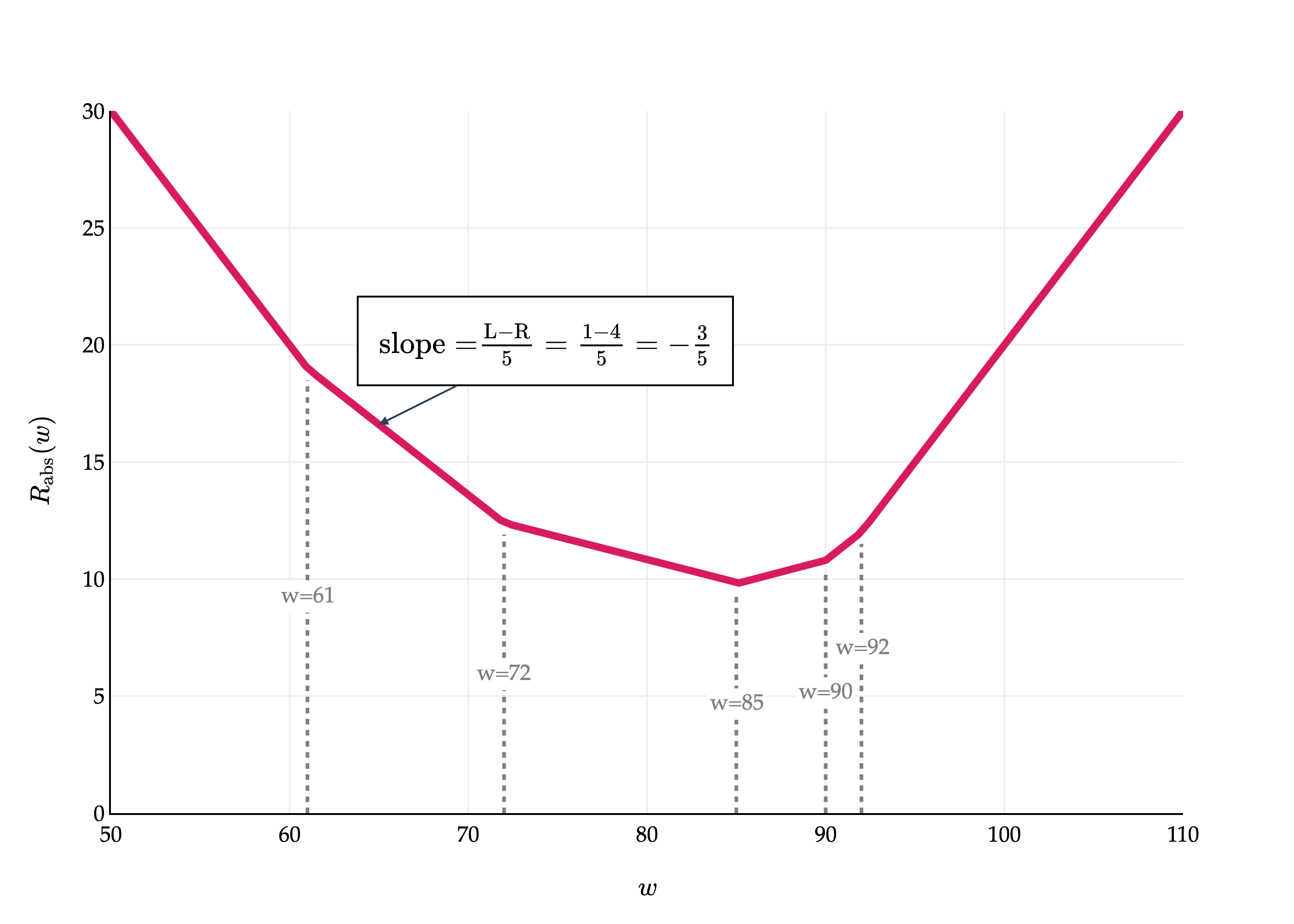
This is a piecewise linear function. Where are the “bends” in the graph? Precisely where the data points, y1,y2,…,y5, are! Its at exactly these points where Rabs(w) is not differentiable. At each of those points, the slope of the line segment approaching from the left is different from the slope of the line segment approaching from the right, and for a function to be differentiable at a point, the slope of the tangent line must be the same when approaching from the left and the right.
The graph of Rabs(w) above, while not differentiable at any of the data points, still shows us something about the optimal constant prediction. If there is a bend at each data point, and at each bend the slope increases – that is, becomes more positive – then the optimal constant prediction seems to be in the middle, when the slope goes from negative to positive. I’ll make this more precise in a moment.
For now, you might notice the value of w that minimizes the graph of Rabs(w) above is a familiar summary statistic, but not the mean. I won’t spell it out just yet, since I’d like for you to reason about it yourself.
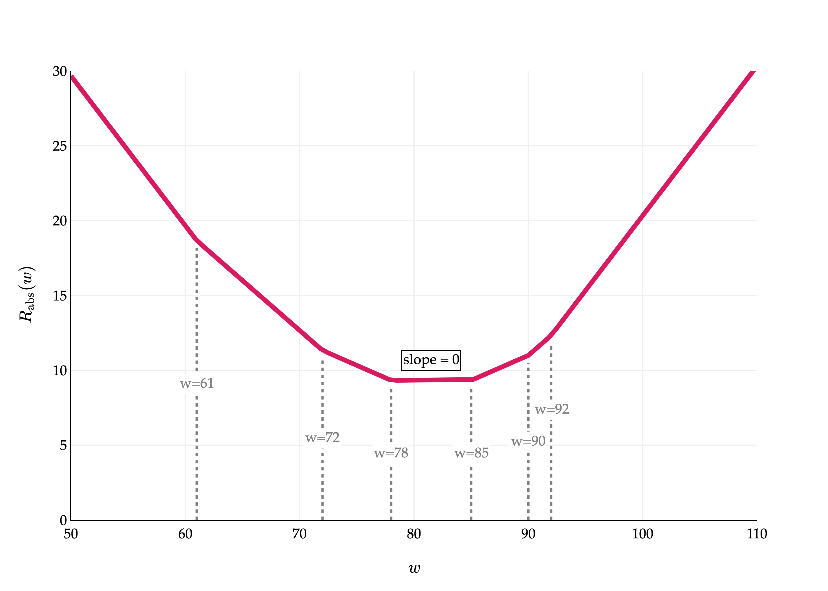
Let me show you one more graph of Rabs(w), but this time, in a case where there are an even number of data points. Suppose we have a sixth point, y6=78.
import pandas as pd
import numpy as np
import plotly.graph_objects as go
from plotly.subplots import make_subplots

df = pd.read_csv('data/commute-times.csv')

f = lambda h: (abs(72-h) + abs(90-h) + abs(61-h) + abs(85-h) + abs(92-h) + abs(78 - h)) / 6

x = np.linspace(50, 110, 100)
y = np.array([f(h) for h in x])

fig = go.Figure()

fig.add_trace(
    go.Scatter(
        x=x,
        y=y,
        mode='lines',
        name='Data',
        line=dict(color='#D81B60', width=4)
    )
)

data_points = [72, 90, 61, 85, 92, 78]
for pt in data_points:
    # Find the y value on the curve at this x (pt)
    y_val = f(pt)
    fig.add_trace(
        go.Scatter(
            x=[pt, pt],
            y=[0, y_val-0.5],
            mode='lines',
            line=dict(color='gray', width=2, dash='dot'),
            showlegend=False
        )
    )
    halfway_y = (y_val-0.5) / 2 if pt != max(data_points) else y_val-5
    fig.add_annotation(
        x=pt,
        y=halfway_y,
        text=f"w={pt}",
        showarrow=False,
        font=dict(
            family="Palatino Linotype, Palatino, serif",
            color="gray",
            size=12
        ),
        bgcolor="white",
        xanchor="center",
        yanchor="middle"
    )

# Annotate the flat region between the middle two points with a box that says slope = 0
sorted_points = sorted(data_points)
mid1, mid2 = sorted_points[2], sorted_points[3]
# Find the y value at the midpoint for annotation placement
mid_x = (mid1 + mid2) / 2
mid_y = f(mid_x)

# Add annotation box
fig.add_annotation(
    x=mid_x,
    y=mid_y+1.3,
    text="slope = 0",
    showarrow=False,
    font=dict(size=12, color="black"),
    bordercolor="black",
    bgcolor="white",
    borderwidth=1,
    # borderpad=4
)

fig.update_xaxes(
    showticklabels=True,
    showgrid=True,
    gridwidth=1,
    gridcolor='#f0f0f0',
    showline=True,
    linecolor="black",
    linewidth=1,
)

fig.update_yaxes(
    showgrid=True,
    gridwidth=1,
    gridcolor='#f0f0f0',
    showline=True,
    linecolor="black",
    linewidth=1,
    range=[0, 30]
)

fig.update_layout(
    xaxis_title=r'$w$',
    yaxis_title=r'$R_\text{abs}(w)$',
    plot_bgcolor='white',
    paper_bgcolor='white',
    margin=dict(l=60, r=60, t=60, b=60),
    font=dict(
        family="Palatino Linotype, Palatino, serif",
        color="black"
    ),
    showlegend=False
)

fig.show(renderer='png', scale=4)
This graph is broken into 7 segments, with 6 bends (one per data point). Between the 3rd and 4th bends – that is, the 3rd and 4th data points – the slope is 0, and all values in that interval minimize Rabs(w). So, it seems that the value of w∗ doesn’t have to be unique!
From the two graphs above, you may have a clear picture of what the optimal constant prediction, w∗, is. But, to avoid relying too heavily on visual intuition and just a single set of example data points, let’s try and minimize Rabs(w) mathematically, for an arbitrary set of data points.
To be clear, the goal is to minimize:
Rabs(w)=n1i=1∑n∣yi−w∣
To do so, we’ll take the derivative of Rabs(w) with respect to w and set it equal to 0.
dwdRabs(w)=dwd(n1i=1∑n∣yi−w∣)
Using the familiar facts that the derivative of a sum is the sum of the derivatives, and that constants can be pulled out of the derivative, we have:
dwdRabs(w)=n1i=1∑ndwd∣yi−w∣
Here’s where the challenge comes in. What is dwd∣yi−w∣?
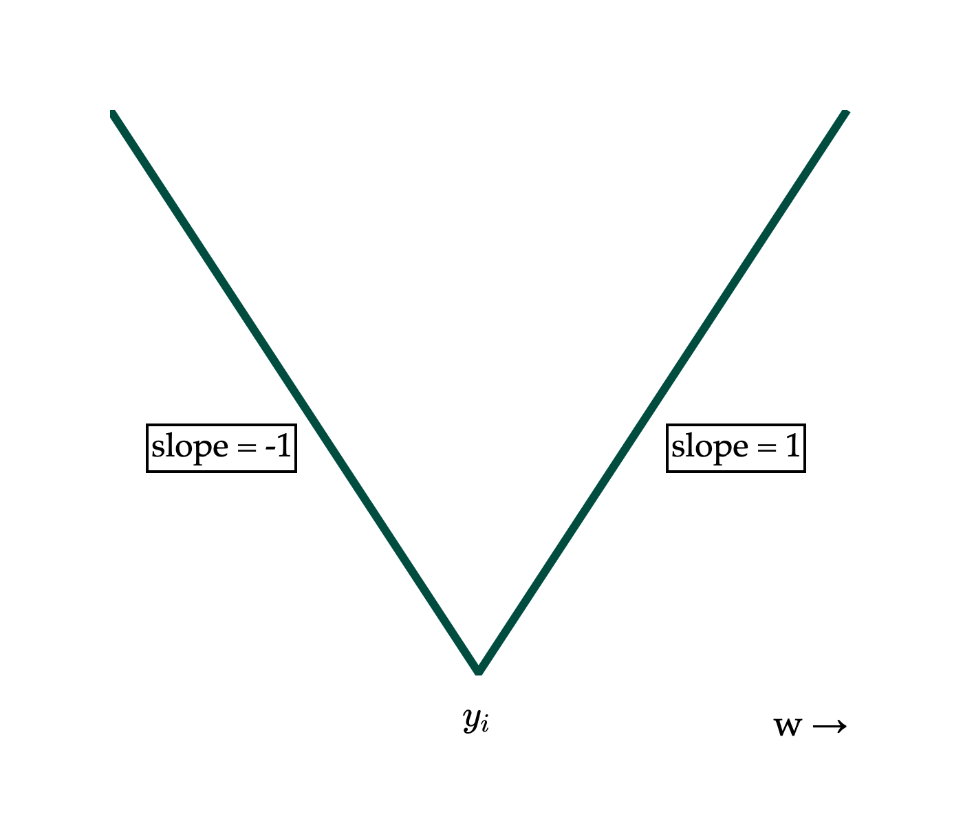
Let’s start by remembering the derivative of the absolute value function. The absolute value function itself can be thought of as a piecewise function:
∣x∣={x−xx≥0x<0
Note that the x=0 case can either lumped in either the x or −x case, since 0 and -0 are both 0.
Using this logic, I’ll write ∣yi−w∣ as a piecewise of w:
∣yi−w∣={yi−ww−yiw≤yiw>yi
I have written the two conditions with w on the left, since it’s easier to think in terms of w in my mind, but this means that the inequalities are flipped relative to how I presented them in the definition of ∣x∣. Remember, ∣yi−w∣ is a function of w; we’re treating yi as some constant. If it helps, replace every instance of yi with a concrete number, like 5, then reason through the resulting graph.
import numpy as np
import plotly.graph_objects as go

h = np.linspace(-10, 10, 400)
y_i = 0

abs_loss = np.abs(y_i - h)

fig = go.Figure(
    data=go.Scatter(
        x=h,
        y=abs_loss,
        mode='lines',
        line=dict(color='#004d40', width=3),
        showlegend=False
    )
)

# Annotate left side (slope = 1)
fig.add_annotation(
    x=-7,
    y=4,
    text="slope = -1",
    showarrow=False,
    font=dict(size=12, color="black"),
    align="center",
    bordercolor="black"
)

# Annotate right side (slope = -1)
fig.add_annotation(
    x=7,
    y=4,
    text="slope = 1",
    showarrow=False,
    font=dict(size=12, color="black"),
    align="center",
    bordercolor="black",
)

# Annotate y_i at x=0
fig.add_annotation(
    x=0,
    y=-0.5,
    text="$y_i$",
    showarrow=False,
    font=dict(size=13, color="black"),
    yanchor="top"
)

# Annotate "w ->" towards the right of the x-axis
fig.add_annotation(
    x=9,
    y=-0.5,
    text="w →",
    showarrow=False,
    font=dict(size=13, color="black"),
    yanchor="top"
)

fig.update_xaxes(showticklabels=False, title_text=None)
fig.update_yaxes(showticklabels=False, title_text=None, range=[-0.75, 10])

fig.update_layout(
    width=350,
    height=300,
    plot_bgcolor='white',
    paper_bgcolor='white',
    margin=dict(l=40, r=40, t=40, b=40),
    font=dict(
        family="Palatino Linotype, Palatino, serif",
        color="black"
    ),
)

fig.show(renderer='png', scale=4)
Now we can take the derivative of each piece:
∣yi−w∣=⎩⎨⎧−1undefined1w<yiw=yiw>yi
Great. Remember, this is the derivative of the absolute loss for a single data point. But our main objective is to find the derivative of the average absolute loss, Rabs(w). Using this piecewise definition of dwd∣yi−w∣, we have:
At any point where w=yi, for any value of i, dwdRabs(w) is undefined. (This makes any point where w=yi a critical point.) Let’s exclude those values of w from our consideration. In all other cases, the sum in the expression above involves only two possible values: -1 and 1.
The sum adds -1 for all data points greater than w, i.e. where w<yi.
The sum adds 1 for all data points less than w, i.e. where w>yi.
Using some creative notation, I’ll re-write dwdRabs(w) as:
dwdRabs(w)=n1(w<yi∑−1+w>yi∑1)
The sum w<yi∑−1 is the sum of -1 for all data points greater than w, so perhaps a more intuitive way to write it is:
w<yi∑−1=add once per data point to the right of w(−1)+(−1)+…+(−1)=−(# right of w)
Equivalently, w>yi∑1=(# left of w), meaning that:
dwdRabs(w)=n1(−(# right of w)+(# left of w))=n# left of w−# right of w
By “left of w”, I mean less than w.
This boxed form gives us the slope of Rabs(w), for any point w that is not an original data point. To put it in perspective, let’s revisit the first graph we saw in this section, where we plotted Rabs(w) for the dataset:
y1=72,y2=90,y3=61,y4=85,y5=92
Rabs(w)=51(∣72−w∣+∣90−w∣+∣61−w∣+∣85−w∣+∣92−w∣)
import pandas as pd
import numpy as np
import plotly.graph_objects as go
from plotly.subplots import make_subplots

df = pd.read_csv('data/commute-times.csv')

f = lambda h: (abs(72-h) + abs(90-h) + abs(61-h) + abs(85-h) + abs(92-h)) / 5

x = np.linspace(50, 110, 100)
y = np.array([f(h) for h in x])

fig = go.Figure()

fig.add_trace(
    go.Scatter(
        x=x,
        y=y,
        mode='lines',
        name='Data',
        line=dict(color='#D81B60', width=4)
    )
)

# Add vertical dotted lines at the 5 data points
data_points = [72, 90, 61, 85, 92]
for pt in data_points:
    y_val = f(pt)
    fig.add_trace(
        go.Scatter(
            x=[pt, pt],
            y=[0, y_val-0.5],
            mode='lines',
            line=dict(color='gray', width=2, dash='dot'),
            showlegend=False
        )
    )
    # Add annotation halfway up the dotted line
    halfway_y = (y_val-0.5) / 2 if pt != max(data_points) else y_val-5
    fig.add_annotation(
        x=pt,
        y=halfway_y,
        text=f"w={pt}",
        showarrow=False,
        font=dict(
            family="Palatino Linotype, Palatino, serif",
            color="gray",
            size=12
        ),
        bgcolor="white",
        xanchor="center",
        yanchor="middle"
    )

# Annotate (65, f(65)) with an arrow and the specified text
fig.add_annotation(
    x=65,
    y=f(65),
    text=r"$\text{slope} = \frac{\text{L} - \text{R}}{5} = \frac{1-4}{5} = -\frac{3}{5}$",
    showarrow=True,
    arrowhead=2,
    ax=90,  # Move the annotation box further to the right
    ay=-45,
    font=dict(
        family="Palatino Linotype, Palatino, serif",
        color="black",
        size=16
    ),
    bgcolor="white",
    bordercolor="black",
    borderwidth=1,
    borderpad=12  # Keep the box tall
)

fig.update_xaxes(
    showticklabels=True,
    showgrid=True,
    gridwidth=1,
    gridcolor='#f0f0f0',
    showline=True,
    linecolor="black",
    linewidth=1,
)

fig.update_yaxes(
    showgrid=True,
    gridwidth=1,
    gridcolor='#f0f0f0',
    showline=True,
    linecolor="black",
    linewidth=1,
    range=[0, 30]
)

fig.update_layout(
    xaxis_title=r'$w$',
    yaxis_title=r'$R_\text{abs}(w)$',
    plot_bgcolor='white',
    paper_bgcolor='white',
    margin=dict(l=60, r=60, t=60, b=60),
    font=dict(
        family="Palatino Linotype, Palatino, serif",
        color="black"
    ),
    showlegend=False
)

fig.show(renderer='png', scale=4)
Now that we have a formula for dwdRabs(w), the easy thing to claim is that we could set it to 0 and solve for w. Doing so would give us:
n# left of w−# right of w=0
Which yields the condition:
# left of w=# right of w
The optimal value of w is the one that satisfies this condition, and that’s precisely the median of the data, as you may have noticed earlier.
This logic isn’t fully rigorous, however, because the formula for dwdRabs(w) is only valid for w’s that aren’t original data points, and if we have an odd number of data points, the median is indeed one of the original data points. In the graph above, there is never a point where the slope is 0.
To fully justify why the median minimizes mean absolute error even when there are an odd number of data points, I’ll say that:
If w is just to the left of the median, there are more points to the right of w than to the left of w, so (# left of w)<(# right of w) and n(# left of w)−(# right of w) is negative.
If w is just to the right of the median, there are more points to the left of w than to the right of w, so (# left of w)>(# right of w) and n(# left of w)−(# right of w) is positive.
So even though the slope is undefined at the median, we know it is a point at which the sign of the derivative switches from negative to positive, and as we discussed in Chapter 0.2, this sign change implies at least a local minimum.
To summarize:
If n is odd, the median minimizes mean absolute error.
If n is even, any value between the middle two values (when sorted) minimizes mean absolute error. (It’s common to call the mean of the middle two values the median.)
We’ve just made a second pass through the three-step modeling recipe:
Choose a model.
h(xi)=w
Choose a loss function.
Rabs(w)=n1∑i=1n∣yi−w∣
Minimize average loss to find optimal model parameters.
Depending on your criteria for what makes a good or bad prediction (i.e., the loss function you choose), optimal model parameters may change.
Activity 2
Suppose we have a dataset of n=13 numbers, such that:
0<y1≤y2≤…≤y13
Given that y8−y7>1 and y9−y8>1, how does the value of Rabs(y8−1) compare to the value of Rabs(y8+1)? Can you determine which is bigger, and by how much?
Let’s compare the behavior of the mean and median, and reason about how their differences in behavior are related to the differences in the loss functions used to derive them.
Let’s consider our example dataset of 5 commute times, with a mean of 85 and median of 80:
6172859092
Suppose 200 is added to the largest commute time:
61728590292
The median is still 85, but the mean is now 80+5200=120. This example illustrates the fact that the mean is sensitive to outliers, while the median is robust to outliers.
But why? I like to think of the mean and median as different “balance points” of a dataset, each satisfying a different “balance condition”.
Summary Statistic
Minimizes
Balance Condition (comes from setting dwdR(w)=0)
Median
Rabs(w)=n1i=1∑n∣yi−w∣
# left of w=# right of w
Mean
Rsq(w)=n1i=1∑n(yi−w)2
i=1∑n(yi−w)=0
In both cases, the “balance condition” comes from setting the derivative of empirical risk, dwdR(w), to 0. The logic for the median and mean absolute error is more fresh from this section, so let’s think in terms of the mean and mean squared error, from Chapter 1.2. There, we found that:
dwdRsq(w)=−n2i=1∑n(yi−w)
Setting this to 0 gave us the balance equation above.
i=1∑n(yi−w∗)=0
In English, this is saying that the sum of deviations from each data point to the mean is 0. (“Deviation” just means "difference from the mean.) Or, in other words, the positive differences and negative differences cancel each other out at the mean, and the mean is the unique point where this happens.
Let me illustrate using our familiar small example dataset.
Note that the negative deviations and positive deviations both total 27 in magnitude.
While the mean balances the positive and negative deviations, the median balances the number of points on either side, without regard to how far the values are from the median.
Here’s another perspective: the squared loss more heavily penalizes outliers, and so the resulting predictions “cater to” or are “pulled” towards these outliers.
import plotly.graph_objects as go
import numpy as np
from plotly.subplots import make_subplots

# Data points
commute_times = [1, 2, 3, 14]
mean_val = np.mean(commute_times)   # 5.0
median_val = np.median(commute_times)  # 2.5

# Function to create arc coordinates
def create_arc(x1, x2, height=0.8, num_points=50):
    """Create arc coordinates between two x points"""
    t = np.linspace(0, np.pi, num_points)
    x_center = (x1 + x2) / 2
    x_radius = abs(x2 - x1) / 2

    x_arc = x_center + x_radius * np.cos(t)
    y_arc = height * np.sin(t)

    return x_arc, y_arc

# --- Top image: Outlier illustration (with arc annotations) ---
h_ref = 4

# Prepare traces for top plot
top_traces = []
# Reference line at h=4
top_traces.append(go.Scatter(
    x=[h_ref, h_ref],
    y=[-1.5, 1.5],
    mode='lines',
    line=dict(color="orange", width=3, dash='dash'),
    opacity=0.5,
    showlegend=False
))
# Data points
top_traces.append(go.Scatter(
    x=commute_times,
    y=[0] * 4,
    mode='markers+text',
    marker=dict(size=28, color="#1976d2"),
    text=[r"$1$", r"$2$", r"$3$", r"$14$"],
    textposition="middle center",
    textfont=dict(family="Palatino Linotype, Palatino, serif", color="white", size=20),
    showlegend=False
))

# Add orange dotted arcs for top plot, and annotate at midpoint above each arc
arc_pairs_top = [(4, 3), (4, 2), (4, 1), (4, 14)]
arc_labels_top = [r"$\boxed{\mathbf{1}}$", r"$2^2 = \boxed{\mathbf{4}}$", r"$3^2 = \boxed{\mathbf{9}}$", r"$10^2 = \boxed{\mathbf{100}}$"]

# For scaling arc height: set min and max heights
min_height_top = 0.5
max_height_top = 1.3
arc_distances_top = [abs(x1 - x2) for x1, x2 in arc_pairs_top]
min_dist_top = min(arc_distances_top)
max_dist_top = max(arc_distances_top)

def scale_height(dist, min_dist, max_dist, min_height, max_height):
    if max_dist == min_dist:
        return min_height
    return min_height + (dist - min_dist) / (max_dist - min_dist) * (max_height - min_height)

for (x1, x2), dist, label in zip(arc_pairs_top, arc_distances_top, arc_labels_top):
    height = scale_height(dist, min_dist_top, max_dist_top, min_height_top, max_height_top)
    x_arc, y_arc = create_arc(x1, x2, height=height)
    top_traces.append(go.Scatter(
        x=x_arc,
        y=y_arc if x2 != 2 else -y_arc,
        mode='lines',
        line=dict(color="orange", width=2, dash='dot'),
        showlegend=False
    ))
    # Annotate at midpoint (t=pi/2)
    x_center = (x1 + x2) / 2
    y_center = {3: height * 0.3, 2: -height * 1.6, 1: height * 1.1, 14: height * 0.75}[x2]
    top_traces.append(go.Scatter(
        x=[x_center],
        y=[y_center],
        mode='text',
        text=[label],
        textposition="top center",
        textfont=dict(family="Palatino Linotype, Palatino, serif", color="orange", size=10),
        showlegend=False
    ))

# Annotate MSE in the open space between 4 and 14 for the top plot
top_traces.append(go.Scatter(
    x=[9.5],
    y=[-0.5],
    mode='text',
    text=[r"$\text{MSE} = \frac{1 + 4 + 9 + 100}{4} = 28.5$"],
    textposition="top center",
    textfont=dict(family="Palatino Linotype, Palatino, serif", color="black", size=14),
    showlegend=False
))

# --- Bottom image: Median vs mean ---
# Prepare traces for bottom plot
bottom_traces = []
# Data points
bottom_traces.append(go.Scatter(
    x=commute_times,
    y=[0]*len(commute_times),
    mode='markers+text',
    marker=dict(size=28, color="#1976d2"),
    text=[r"$1$", r"$2$", r"$3$", r"$14$"],
    textposition="middle center",
    textfont=dict(family="Palatino Linotype, Palatino, serif", color="white", size=20),
    showlegend=False
))

# Mean line
bottom_traces.append(go.Scatter(
    x=[mean_val, mean_val],
    y=[-2, 2],
    mode='lines',
    line=dict(color="orange", width=3, dash='dash'),
    showlegend=False
))

# Add orange dotted arcs for bottom plot, starting at 5 instead of 4, and annotate at midpoint
arc_pairs_bottom = [(5, 3), (5, 2), (5, 1), (5, 14)]
arc_labels_bottom = [r"$\boxed{\mathbf{4}}$", r"$\boxed{\mathbf{9}}$", r"$\boxed{\mathbf{16}}$", r"$\boxed{\mathbf{81}}$"]

min_height_bottom = 0.3
max_height_bottom = 1.0
arc_distances_bottom = [abs(x1 - x2) for x1, x2 in arc_pairs_bottom]
min_dist_bottom = min(arc_distances_bottom)
max_dist_bottom = max(arc_distances_bottom)

for (x1, x2), dist, label in zip(arc_pairs_bottom, arc_distances_bottom, arc_labels_bottom):
    height = scale_height(dist, min_dist_bottom, max_dist_bottom, min_height_bottom, max_height_bottom)
    x_arc, y_arc = create_arc(x1, x2, height=height)  # Height now scales with distance
    bottom_traces.append(go.Scatter(
        x=x_arc,
        y=y_arc if x2 != 2 else -y_arc,
        mode='lines',
        line=dict(color="orange", width=2, dash='dot'),
        showlegend=False
    ))
    # Annotate at midpoint (t=pi/2)
    x_center = (x1 + x2) / 2
    y_center = {3: height * 0.1, 2: -height * 1.7, 1: height * 1.2, 14: height * 0.7}[x2]
    bottom_traces.append(go.Scatter(
        x=[x_center],
        y=[y_center],
        mode='text',
        text=[label],
        textposition="top center",
        textfont=dict(family="Palatino Linotype, Palatino, serif", color="orange", size=12),
        showlegend=False
    ))

# Annotate MSE in the open space between 4 and 14 for the bottom plot
bottom_traces.append(go.Scatter(
    x=[9.5],
    y=[-0.5],
    mode='text',
    text=[r"$\text{MSE} = \frac{4 + 9 + 16 + 81}{4} = 27.5$"],
    textposition="top center",
    textfont=dict(family="Palatino Linotype, Palatino, serif", color="black", size=14),
    showlegend=False
))

# --- Combine both images vertically ---
fig_combined = make_subplots(rows=2, cols=1, shared_xaxes=True, vertical_spacing=0.18)

for trace in top_traces:
    fig_combined.add_trace(trace, row=1, col=1)
for trace in bottom_traces:
    fig_combined.add_trace(trace, row=2, col=1)

# Axes and layout
for i in [1, 2]:
    fig_combined.update_xaxes(
        row=i, col=1,
        zeroline=False,
        showticklabels=True,
        tickfont=dict(family="Palatino Linotype, Palatino, serif", color="black"),
        linecolor='black',
        linewidth=2,
        mirror=True,
        ticks='outside',
        tickcolor='black',
        ticklen=8,
        tickmode='array',
        tickvals=list(range(1, 15)),
        ticktext=[str(j) for j in range(1, 15)],
    )
    fig_combined.update_yaxes(
        row=i, col=1,
        zeroline=False,
        showticklabels=False,
        linecolor='black',
        linewidth=2,
        mirror=True,
        range=[-1.5, 1.5] if i == 1 else [-1, 1.2],
    )

fig_combined.update_layout(
    height=400, width=700,
    margin=dict(l=60, r=60, t=60, b=60),
    plot_bgcolor='white',
    paper_bgcolor='white',
    font=dict(family="Palatino Linotype, Palatino, serif", color="black"),
    showlegend=False
)

fig_combined.show(renderer='png', scale=3)
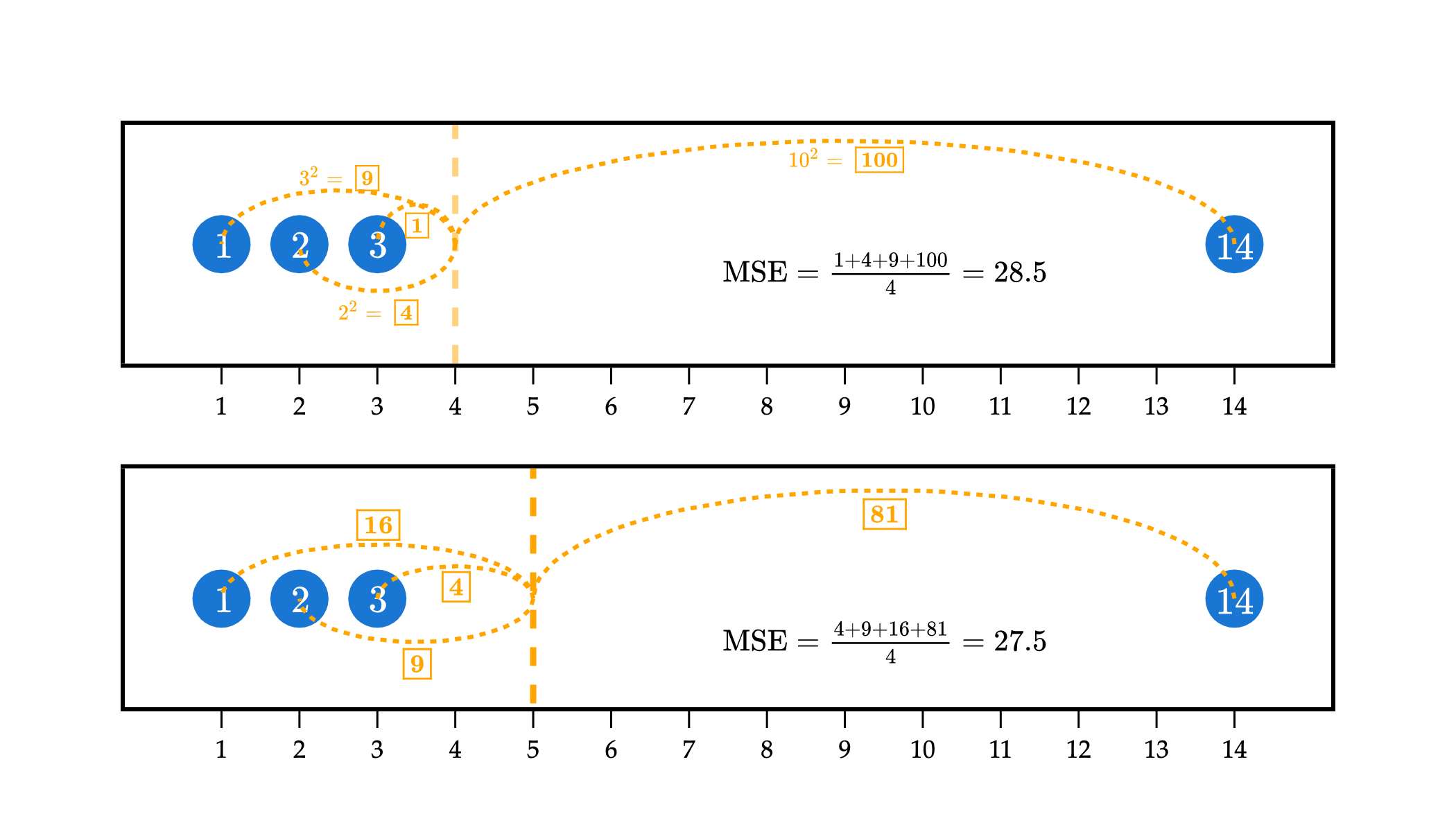
In the example above, the top plot visualizes the squared loss for the constant prediction of w=4 against the dataset 1, 2, 3, and 14. While it has relatively small squared losses to the three points on the left, it has a very large squared loss to the point at 14, of (14−4)2=100, which causes the mean squared error to be large.
In efforts to reduce the overall mean squared error, the optimal w∗ is pulled towards 14. w∗=5 has larger squared losses to the points at 1, 2, and 3 than w=4 did, but a much smaller squared loss to the point at 14, of (14−5)2=81. The “savings” from going from a squared loss of 102=100 to 92=81 more than makes up for the additional squared losses to the points at 1, 2, and 3.
In short: models that are fit using squared loss are strongly pulled towards outliers, in an effort to keep mean squared error low. Models fit using absolute loss don’t have this tendency.
To conclude, let me visualize the behavior of the mean and median with a larger dataset – the full dataset of commute times we first saw at the start of Chapter 1.2.
import pandas as pd
import numpy as np
import plotly.express as px
import plotly.graph_objects as go

df = pd.read_csv('data/commute-times.csv')

mean_val = df['minutes'].mean()
median_val = df['minutes'].median()

fig = px.histogram(
    df,
    x='minutes',
    nbins=20,
    opacity=0.3
)
fig.update_xaxes(
    title='Commute Time (Minutes)',
    gridcolor='#f0f0f0',
    showline=True,
    linecolor="black",
    linewidth=1,
)
fig.update_yaxes(
    title='Frequency',
    gridcolor='#f0f0f0',
    showline=True,
    linecolor="black",
    linewidth=1,
)

fig.update_traces(marker_line_color='white', marker_line_width=1, marker_color="#3D81F6")
fig.update_layout(
    plot_bgcolor='white',
    paper_bgcolor='white',
    margin=dict(l=60, r=60, t=60, b=60),
    width=700,
    font=dict(
        family="Palatino Linotype, Palatino, serif",
        color="black"
    )
)

# Add subtle green highlight between 100 and 130 across the entire plane
fig.add_vrect(
    x0=100, x1=135,
    fillcolor="rgba(0,200,0,0.08)",
    layer="below",
    line_width=0,
)

# Add dashed vertical lines for mean (orange) and median (purple)
fig.add_vline(
    x=mean_val,
    line_dash="dash",
    line_color="orange",
    line_width=3,
    annotation_text="Mean",
    annotation_position="right",
    annotation=dict(
        textangle=-90,
        xanchor="left",
        yanchor="middle",
        font=dict(
            color="orange",
            family="Palatino Linotype, Palatino, serif",
            size=16
        )
    )
)

fig.add_vline(
    x=median_val,
    line_dash="dash",
    line_color="purple",
    line_width=3,
    annotation_text="Median",
    annotation_position="left",
    annotation=dict(
        textangle=-90,
        xanchor="right",
        yanchor="middle",
        font=dict(
            color="purple",
            family="Palatino Linotype, Palatino, serif",
            size=16
        )
    )
)

fig.add_annotation(
    x=120,
    y=2,
    text="tail of distribution",
    showarrow=False,
    font=dict(
        color="black",
        family="Palatino Linotype, Palatino, serif",
        size=14
    ),
    xanchor="center"
)

fig.show(renderer='png', scale=3)
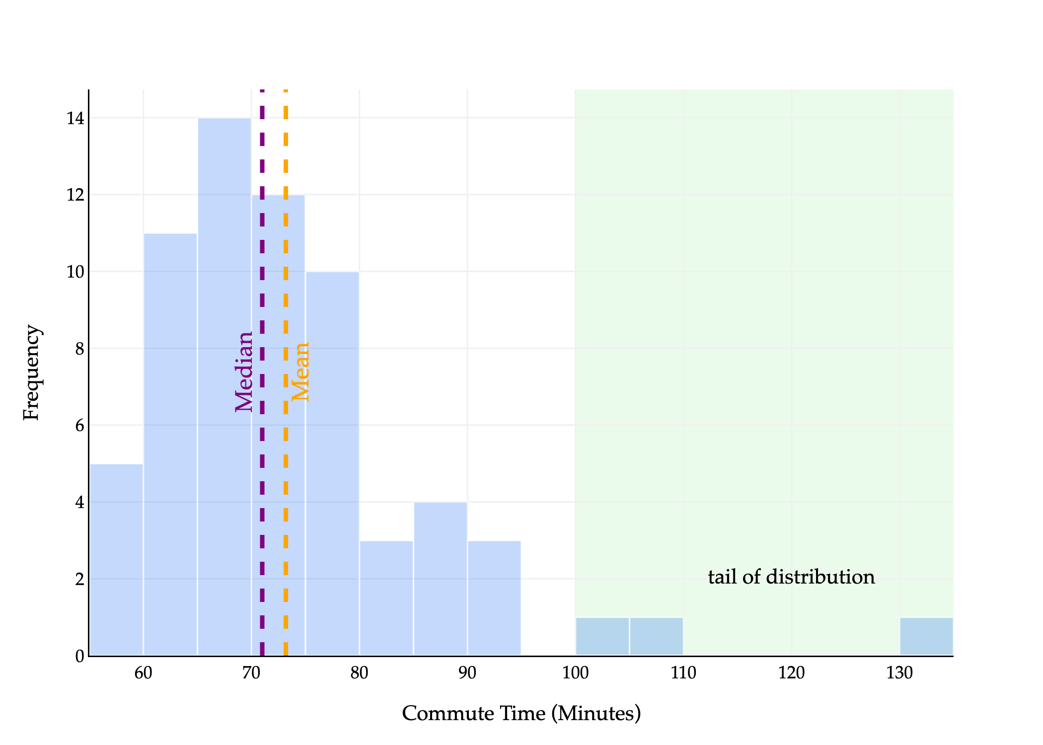
The median is the point at which half the values are below it and half are above it. In the histogram above, half of the area is to the left of the median and half is to the right.
The mean is the point at which the sum of deviations from each value to the mean is 0. Another interpretation: if you placed this histogram on a playground see-saw, the mean would be the point at which the see-saw is balanced. Wikipedia has a good illustration of this general idea.
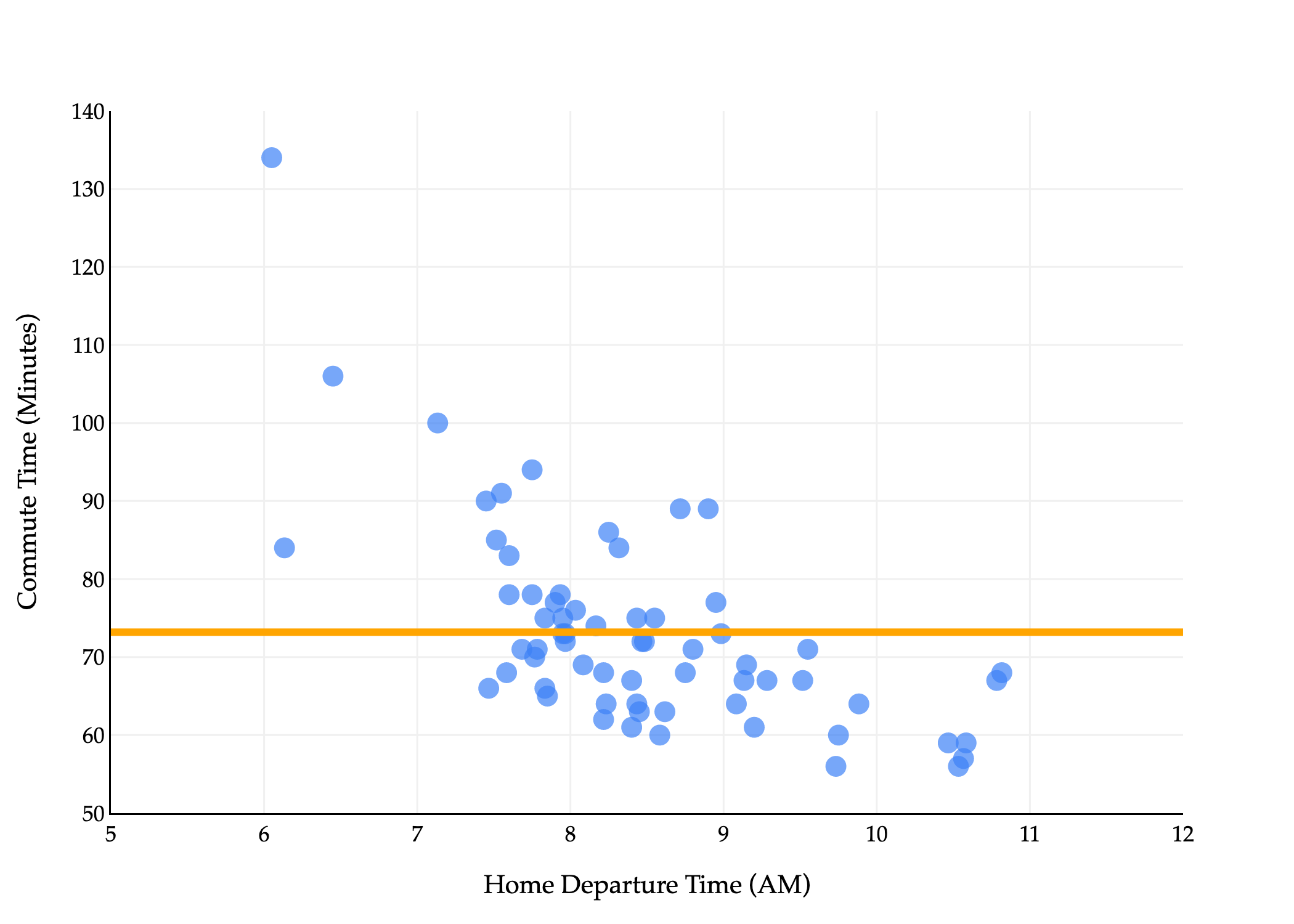
We say the distribution above is right-skewed or right-tailed because the tail is on the right side of the distribution. (This is counterintuitive to me, because most of the data is on the left of the distribution.)
In general, the mean is pulled in the direction of the tail of a distribution:
If a distribution is symmetric, i.e. has roughly the same-shaped tail on the left and right, the mean and median are similar.
If a distribution is right-skewed, the mean is pulled to the right of the median, i.e. Mean>Median.
If a distribution is left-skewed, the mean is pulled to the left of the median, i.e. Mean<Median.
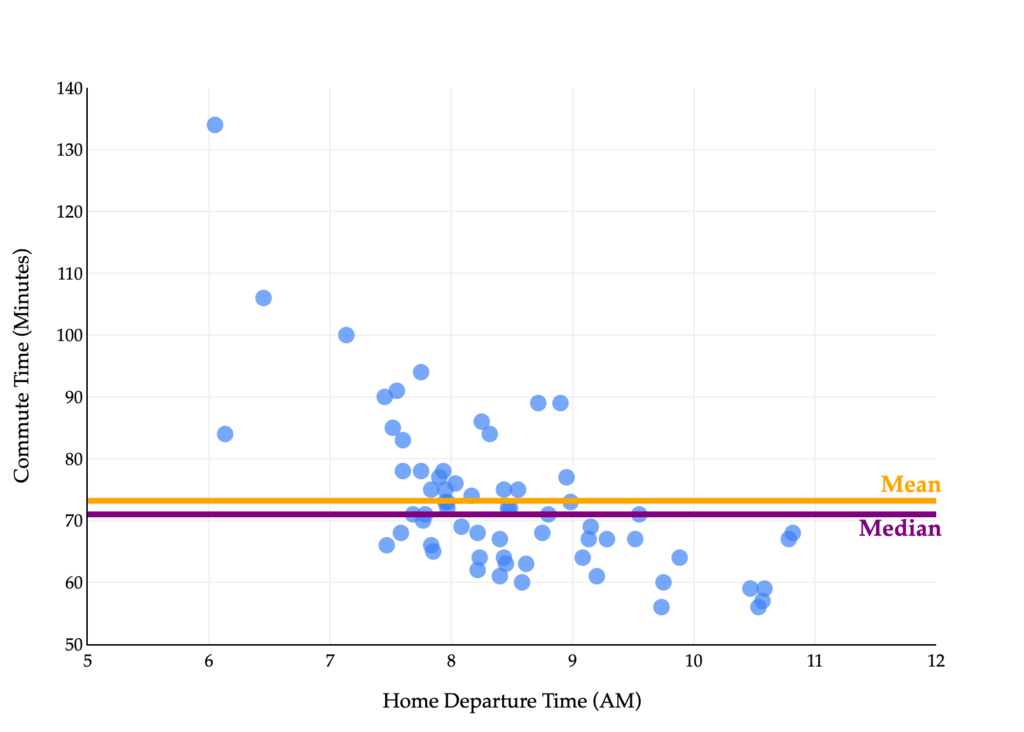
This explains why Mean>Median in the histogram above, and equivalently, in the scatter plot below.
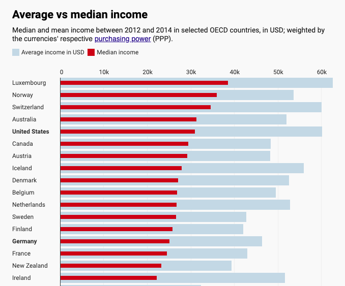
Many common distributions in the real world are right-skewed, including incomes and net worths, and in such cases, the mean doesn’t tell the full story.
Mean (average) and median incomes for several countries (source).
When we move to more sophisticated models with (many) more parameters, the optimal parameter values won’t be as easily interpretable as the mean and median of our data, but the effects of our choice of loss function will still be felt in the predictions we make.
You may have noticed that the absolute loss and squared loss functions both look relatively similar:
Labs(yi,h(xi))=∣yi−h(xi)∣
Lsq(yi,h(xi))=(yi−h(xi))2
Both of these loss functions are special cases of a more general class of loss functions, known as Lp loss functions. For any p≥1, define the Lp loss as follows:
Lp(yi,h(xi))=∣yi−h(xi)∣p
Suppose we continue to use the constant model, h(xi)=w. Then, the corresponding empirical risk for Lp loss is:
Rp(w)=n1i=1∑n∣yi−w∣p
We’ve studied, in depth, the minimizers of Rp(w) for p=1 (the median) and p=2 (the mean). What about when p=3, or p=4, or p=100? What happens as p→∞?
Let me be a bit less abstract. Suppose we have p=6. Then, we’re looking for the constant prediction w that minimizes the following:
R6(w)=n1i=1∑n∣yi−w∣6=n1i=1∑n(yi−w)6
Note that I dropped the absolute value, because (yi−w)6 is always non-negative, since 6 is an even number.
To find w∗ here, we need to take the derivative of R6(w) with respect to w and set it equal to 0.
dwdR6(w)=−n6i=1∑n(yi−w)5
Setting the above to 0 gives us a new balance condition: i=1∑n(yi−w)5=0. The minimizer of R2(w) was the point at which the balance condition i=1∑n(yi−w)=0 was satisfied; equivalently, the minimizer of R6(w) is the point at which the balance condition i=1∑n(yi−w)5=0 is satisfied. You’ll notice that the degree of the differences in the balance condition is one lower than the degree of the differences in the loss function --- this comes from the power rule of differentiation.
At what point w∗ does i=1∑n(yi−w∗)5=0? It’s challenging to determine the value by hand, but the computer can approximate solutions for us, as you’ll see in Lab 2.
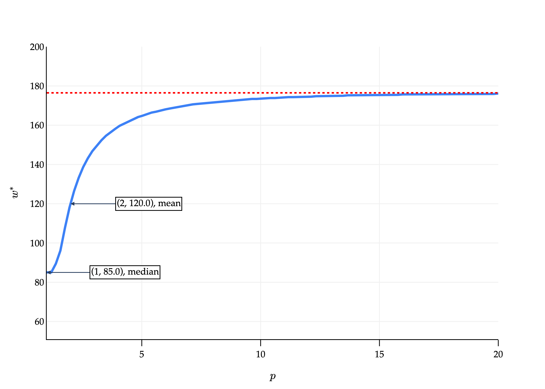
Below, you’ll find a computer-generated graph where:
The x-axis is p.
The y-axis represents the value of w∗ that minimizes Rp(w), for the dataset
61728590292
that we saw earlier. Note the maximum value in our dataset is 292.
import numpy as np
import plotly.graph_objects as go

# Corrected dataset
y = np.array([61, 72, 85, 90, 292])

# Range of p values
p_values = np.linspace(1, 20, 100)
w_stars = []

# For each p, numerically find the minimizer of average L_p loss
for p in p_values:
    ws = np.linspace(np.min(y), np.max(y), 1000)
    risks = np.array([np.mean(np.abs(y - w)**p) for w in ws])
    min_idx = np.argmin(risks)
    w_stars.append(ws[min_idx])

# For p = infinity, the minimizer is the midpoint of min and max
w_star_inf = (np.min(y) + np.max(y)) / 2

# Calculate median and mean for labels
median_val = np.median(y)
mean_val = np.mean(y)

# Plot
fig = go.Figure()

fig.add_trace(go.Scatter(
    x=p_values,
    y=w_stars,
    mode='lines',
    line=dict(color='#3D81F6', width=3),
    name='Minimizer $w^*$',
    showlegend=False
))

# Add horizontal line for p = infinity minimizer
fig.add_trace(go.Scatter(
    x=[p_values[0], p_values[-1]],
    y=[w_star_inf, w_star_inf],
    mode='lines',
    line=dict(color='red', width=2, dash='dot'),
    name='$w^*$ as $p \\to \\infty$',
    showlegend=False
))

# Add labels at p=1 (median) and p=2 (mean)
fig.add_annotation(
    x=1,
    y=median_val,
    text=f"(1, {median_val}), median",
    showarrow=True,
    arrowhead=2,
    ax=100,
    ay=0,
    font=dict(
        family="Palatino Linotype, Palatino, serif",
        color="black",
        size=12
    ),
    bgcolor="white",
    bordercolor="black",
    borderwidth=1
)

fig.add_annotation(
    x=2,
    y=mean_val,
    text=f"(2, {mean_val}), mean",
    showarrow=True,
    arrowhead=2,
    ax=100,
    ay=0,
    font=dict(
        family="Palatino Linotype, Palatino, serif",
        color="black",
        size=12
    ),
    bgcolor="white",
    bordercolor="black",
    borderwidth=1
)

fig.update_layout(
    xaxis=dict(
        title='$p$',
        showticklabels=True,
        visible=True,
        ticks='outside',
        tickcolor='black',
        ticklen=8,
        gridcolor='#f0f0f0',
        linecolor="black",
        linewidth=1,
        range=[1, 20],  # <-- Set x-axis to start from 1
    ),
    yaxis=dict(
        title='$w^*$',
        showticklabels=True,
        visible=True,
        range=[np.min(y)-10, 200],
        gridcolor='#f0f0f0',
        linecolor="black",
        linewidth=1,
    ),
    plot_bgcolor='white',
    paper_bgcolor='white',
    margin=dict(l=60, r=60, t=60, b=60),
    width=700,
    font=dict(
        family="Palatino Linotype, Palatino, serif",
        color="black"
    ),
)

fig.show(renderer='png', scale=3)
As p→∞, w∗ approaches some value.
On the other extreme end, let me introduce yet another loss function, 0-1 loss:
L0,1(yi,h(xi))={01yi=h(xi)yi=h(xi)
The corresponding empirical risk, for the constant model h(xi)=w, is:
R0,1(w)=n1i=1∑nL0,1(yi,w)
This is the sum of 0s and 1s, divided by n. A 1 is added to the sum each time yi=w. So, in other words, R0,1(w) is:
R0,1(w)=nnumber of points not equal to w
To minimize empirical risk, we want the number of points not equal to w to be as small as possible. So, w∗ is the mode (i.e. most frequent value) of the dataset. If all values in the dataset are unique, they all minimize average 0-1 loss. This is not a useful loss function for regression, since our predictions are drawn from the continuous set of real numbers, but is useful for classification.
Prior to taking EECS 245, you knew about the mean, median, and mode of a dataset. What you now know is that each one of these summary statistics comes from minimizing empirical risk (i.e. average loss) for a different loss function. All three measure the center of the dataset in some way.
Loss
Minimizer of Empirical Risk
Always Unique?
Robust to Outliers?
Empirical Risk Differentiable?
Lsq
mean
yes ✅
no ❌
yes ✅
Labs
median
no ❌
yes ✅
no ❌
L∞
midrange
yes ✅
no ❌
no ❌
L0,1
mode
no ❌
no ❌
no ❌
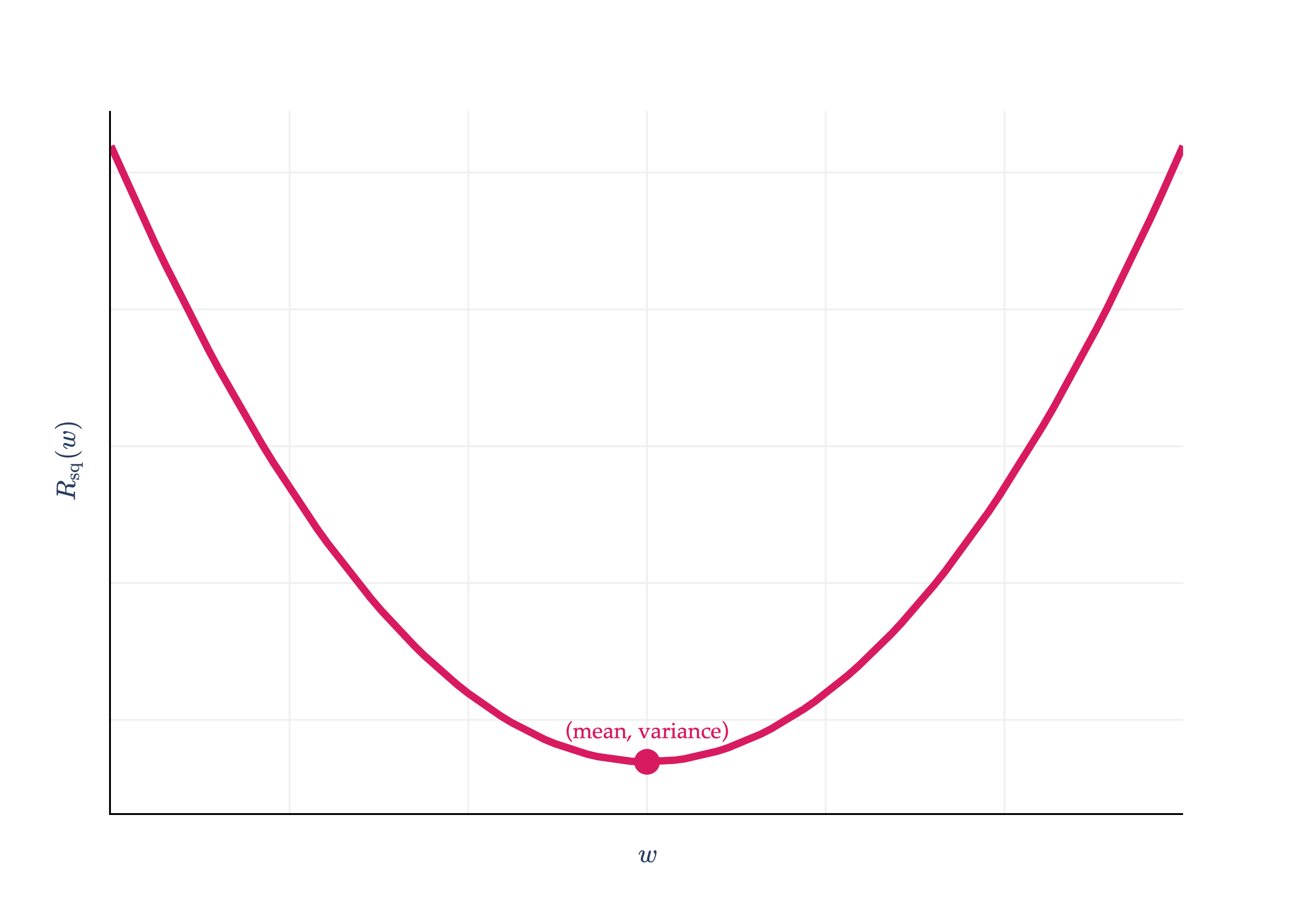
So far, we’ve focused on finding model parameters that minimize empirical risk. But, we never stopped to think about what the minimum empirical risk itself is! Consider the empirical risk for squared loss and the constant model:
Rsq(w)=n1i=1∑n(yi−w)2
Rsq(w) is minimized when w∗ is the mean, which I’ll denote with yˉ. What happens if I plug w∗=yˉ back into Rsq?
Rsq(w∗)=Rsq(yˉ)=n1i=1∑n(yi−yˉ)2
This is the variance of the dataset y1,y2,...,yn! The variance is nothing but the averagesquareddeviation of each value from the mean of the dataset.
This gives context to the y-axis value of the vertex of the parabola we saw in Chapter 1.2.
Rsq(w)=n1i=1∑n(yi−w)2
import pandas as pd
import numpy as np
import plotly.graph_objects as go
from plotly.subplots import make_subplots

df = pd.read_csv('data/commute-times.csv')

f = lambda h: ((72-h)**2 + (90-h)**2 + (61-h)**2 + (85-h)**2 + (92-h)**2) / 5

x = np.linspace(50, 110, 100)
y = np.array([f(h) for h in x])

# Calculate mean and variance
data = np.array([72, 90, 61, 85, 92])
mean = np.mean(data)
variance = np.mean((data - mean) ** 2)

fig = go.Figure()

fig.add_trace(
    go.Scatter(
        x=x,
        y=y,
        mode='lines',
        name='Data',
        line=dict(color='#D81B60', width=4)
    )
)

# Draw a point at the vertex (mean, variance)
fig.add_trace(
    go.Scatter(
        x=[mean],
        y=[variance],
        mode='markers+text',
        marker=dict(color='#D81B60', size=14, symbol='circle'),
        text=[f"<span style='font-family:Palatino, Palatino Linotype, serif; color:#D81B60'>(mean, variance)</span>"],
        textposition="top center",
        showlegend=False
    )
)

fig.update_xaxes(
    showticklabels=False,
    showgrid=True,
    gridwidth=1,
    gridcolor='#f0f0f0',
    showline=True,
    linecolor="black",
    linewidth=1,
)

fig.update_yaxes(
    showgrid=True,
    gridwidth=1,
    gridcolor='#f0f0f0',
    showline=True,
    linecolor="black",
    linewidth=1,
    showticklabels=False
)

fig.update_layout(
    xaxis_title=r'$w$',
    yaxis_title=r'$R_\text{sq}(w)$',
    plot_bgcolor='white',
    paper_bgcolor='white',
    margin=dict(l=60, r=60, t=60, b=60),
    font=dict(
        family="Palatino Linotype, Palatino, serif",
        # color="black"
    ),
    showlegend=False
)

fig.show(renderer='png', scale=4)
Practically speaking, this gives us a nice “worst-case” mean squared error of any regression model on a dataset. If we learn how to build a sophisticated regression model, and its mean squared error is somehow greater than the variance of the dataset, we know that we’re doing something wrong, since we could do better just by predicting the mean!
The units of the variance are the square of the units of the y-values. So, if the yi’s represent commute times in minutes, the variance is in minutes2. This makes it a bit difficult to interpret. So, we typically take the square root of the variance, which gives us the standard deviation, σ:
σ=variance=n1i=1∑n(yi−yˉ)2
The standard deviation has the same units as the y-values themselves, so it’s a more interpretable measure of spread.
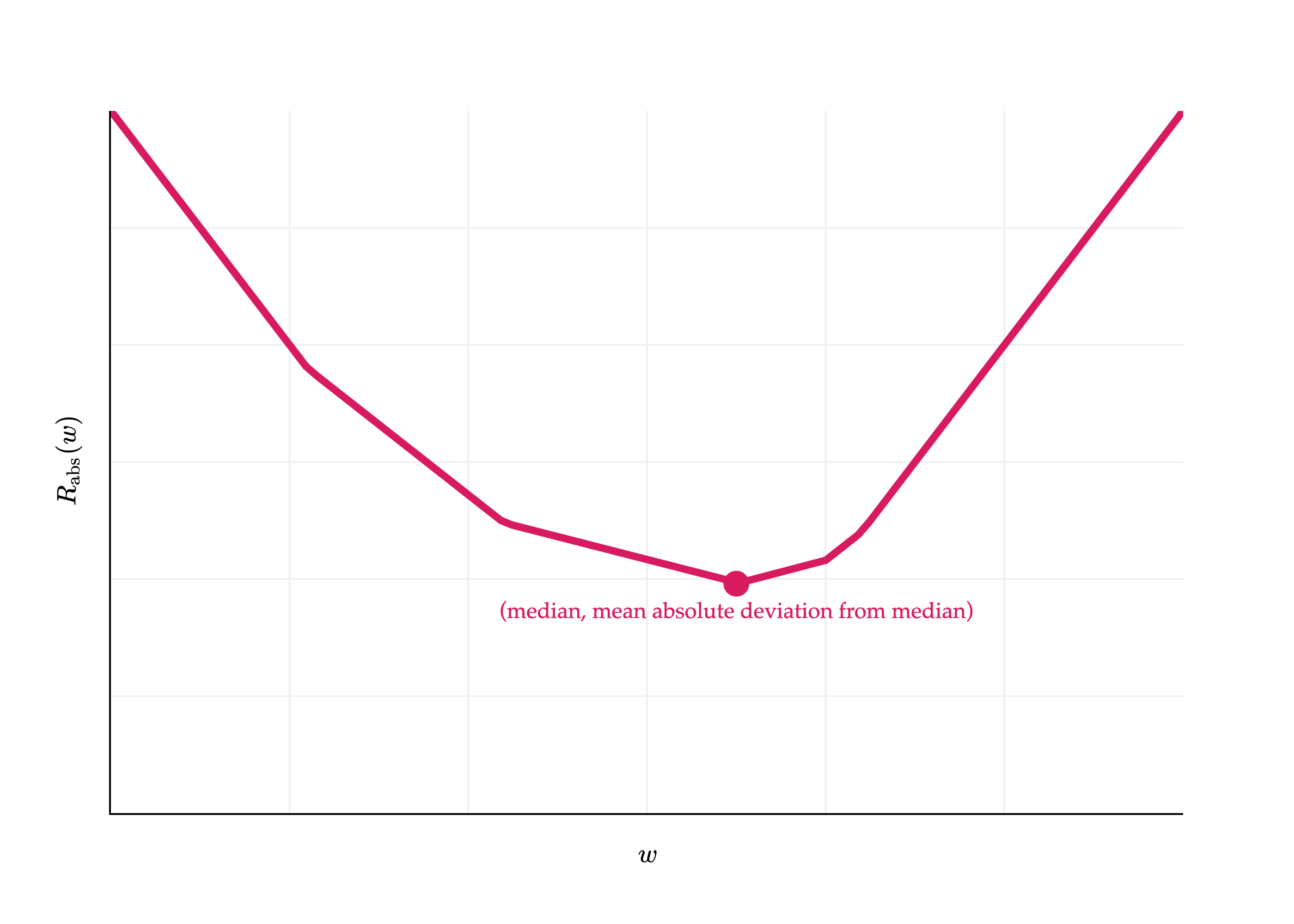
How does this work in the context of absolute loss?
Rabs(w)=n1i=1∑n∣yi−w∣
Plugging in w∗=Median(y1,y2,...,yn) into Rabs(w) gives us:
I’ll admit, this result doesn’t have a special name. It is the mean absolute deviation from the median. And, like the variance and standard deviation, it measures roughly how far spread out the data is from its center. Its units are the same as the y-values themselves (since there’s no squaring involved).
Rabs(w)=n1i=1∑n∣yi−w∣
import pandas as pd
import numpy as np
import plotly.graph_objects as go
from plotly.subplots import make_subplots

df = pd.read_csv('data/commute-times.csv')

f = lambda h: (abs(72-h) + abs(90-h) + abs(61-h) + abs(85-h) + abs(92-h)) / 5

x = np.linspace(50, 110, 100)
y = np.array([f(h) for h in x])

fig = go.Figure()

fig.add_trace(
    go.Scatter(
        x=x,
        y=y,
        mode='lines',
        name='Data',
        line=dict(color='#D81B60', width=4)
    )
)

fig.update_xaxes(
    showticklabels=False,
    showgrid=True,
    gridwidth=1,
    gridcolor='#f0f0f0',
    showline=True,
    linecolor="black",
    linewidth=1,
)

fig.update_yaxes(
    showgrid=True,
    showticklabels=False,
    gridwidth=1,
    gridcolor='#f0f0f0',
    showline=True,
    linecolor="black",
    linewidth=1,
    range=[0, 30]
)

median = np.median(data)
mean_abs_deviation = np.mean(np.abs(data - median))

fig.add_trace(
    go.Scatter(
        x=[median],
        y=[mean_abs_deviation],
        mode='markers+text',
        marker=dict(color='#D81B60', size=14, symbol='circle'),
        text=[f"<span style='font-family:Palatino, Palatino Linotype, serif; color:#D81B60'>(median, mean absolute deviation from median)</span>"],
        textposition="bottom center",
        showlegend=False
    )
)

fig.update_layout(
    xaxis_title=r'$w$',
    yaxis_title=r'$R_\text{abs}(w)$',
    plot_bgcolor='white',
    paper_bgcolor='white',
    margin=dict(l=60, r=60, t=60, b=60),
    font=dict(
        family="Palatino Linotype, Palatino, serif",
        color="black"
    ),
    showlegend=False
)

fig.show(renderer='png', scale=4)
Activity 4
Consider the dataset:
135764
Compute the following:
The variance.
The mean squared error of the median.
The mean absolute deviation from the median.
The mean absolute deviation from the mean.
What do you notice about the results to (1) and (2)? What about the results to (3) and (4)?
In the real-world, be careful when you hear the term “mean absolute deviation”, as sometimes it’s used to refer to the median absolute deviation from the mean, not the median as above.
Activity 5
What is the value of R0,1(w∗) for the constant model h(xi)=w and 0-1 loss? How does it measure the spread of the data?
To reiterate, in practice, our models will have many, many more parameters than just one, as is the case for the constant model. But, by deeply studying the effects of choosing squared loss vs. absolute loss vs. other loss functions in the context of the constant model, we can develop a better intuition for how to choose loss functions in more complex situations.