Sometimes, we’re not necessarily interested in making predictions, but instead want to be descriptive about patterns that exist in data.
In a scatter plot of two variables, if there is any pattern, we say the variables are associated. If the pattern resembles a straight line, we say the variables are correlated, i.e. linearly associated. We can measure how much a scatter plot resembles a straight line using the correlation coefficient. We’ll shortly see how the correlation coefficient relates to the slope of the regression line we found in Chapter 2.3.
Definition
There are actually many different correlation coefficients; this is the most common one, and it’s sometimes called the Pearson’s correlation coefficient, after the British statistician Karl Pearson.
No matter the values of and , the value of is bounded between -1 and 1. The closer is to 1, the stronger the linear association. The sign of tells us the direction of the trend – upwards (positive) or downwards (negative). is a unitless quantity – it’s not measured in hours, or dollars, or minutes, or anything else that depends on the units of and .
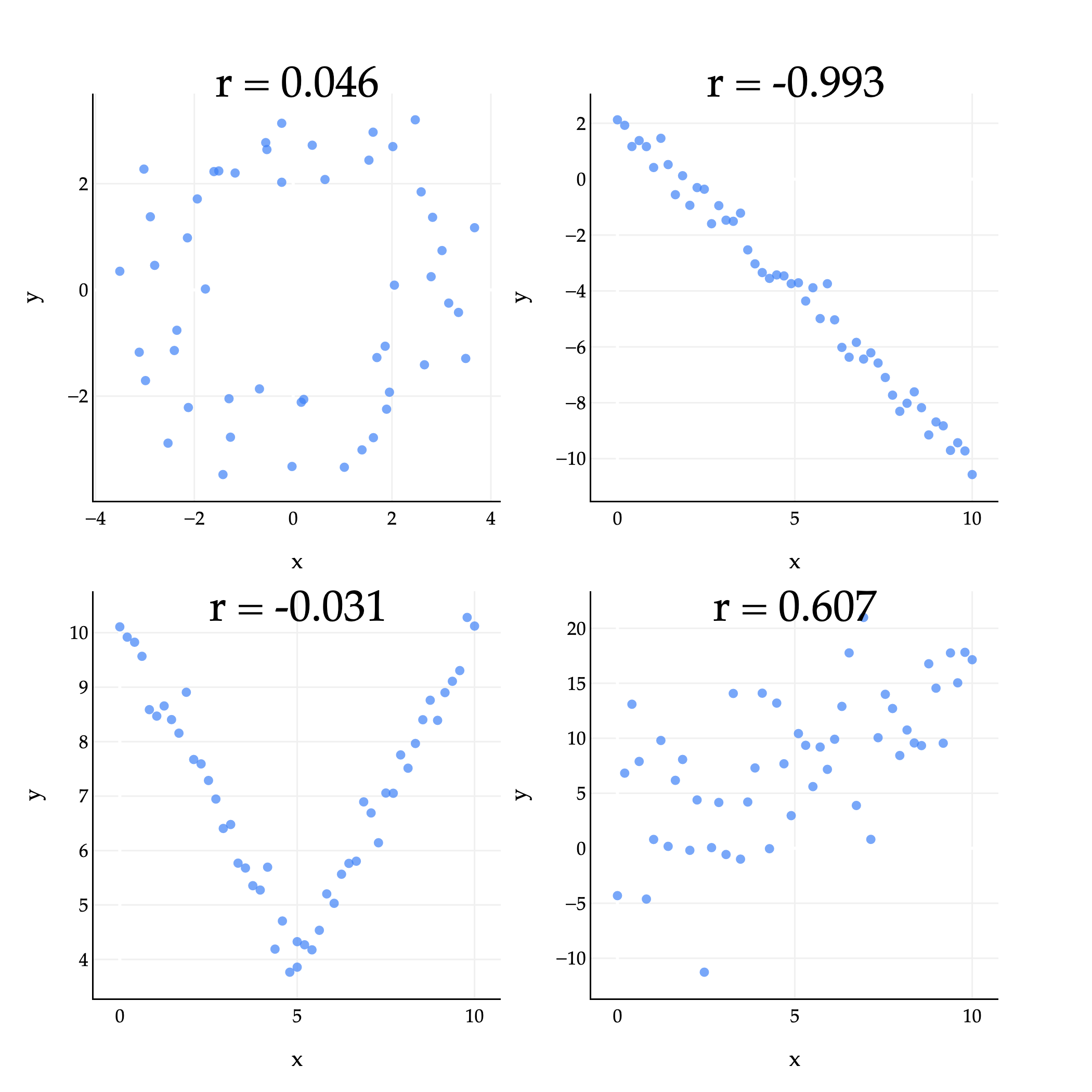
The plots above give us some examples of what the correlation coefficient can look like in practice.
Top left (): There’s some loose circle-like pattern, but it mostly looks like a random cloud of points. is close to 0, but just happens to be positive.
Top right (): The points are very tightly clustered around a line with a negative slope, so is close to -1.
Bottom left (): While the points are certainly associated, they are not linearly associated, so the value of is close to 0. (The shape looks more like a V or parabola than a straight line.)
Bottom right (): The points are loosely clustered and follow a roughly linear pattern trending upwards. is positive, but not particularly large.
The correlation coefficient has some useful properties to be aware of. For one, it’s symmetric: . If you swap the ’s and ’s in its formula, you’ll see the result is the same.
One way to think of is that it’s the mean of the product of and , once both variables have been standardized. To standardize a collection of numbers , you first find the mean and standard deviation of the collection. Then, for each , you compute:
This tells you how many standard deviations away from the mean each is. For example, if , that means is 1.5 standard deviations below the mean of . The value of once it’s standardized is sometimes called its z-score; you may have heard of -scores in the context of curved exam scores.
Intuition
With this in mind, I’ll again state that is the mean of the product of and , once both variables have been standardized:
This interpretation of makes it a bit easier to see why measures the strength of linear association – because up until now, it must seem like a formula I pulled out of thin air.
If there’s positive linear association, then and will usually either both be above their averages, or both be below their averages, meaning that and will usually have the same sign. If we multiply two numbers with the same sign – either both positive or both negative – then the product will be positive.
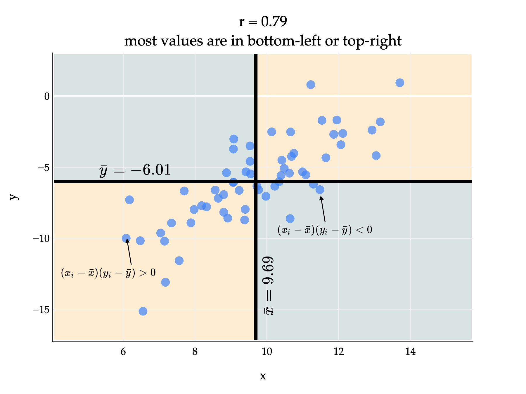
Since most points are in the bottom-left and top-right quadrants, most of the products are positive. This means that , which is the average of these products divided by the standard deviations of and , will be positive too. (We divide by the standard deviations to ensure that .)
Above, is positive but not exactly 1, since there are several points in the bottom-right and top-left quadrants, who would have a negative product and bring down the average product.
If there’s negative linear association, then typically it’ll be the case that is above average while is below average, or vice versa. This means that and will usually have opposite signs, and when they have opposite signs, their product will be negative. If most points have a negative product, then will be negative too.
Another Example
Let me show you another example that gets at the heart of how the correlation formula is defined. Consider the following two datasets.
Dataset A:
Dataset B:
Both datasets use the same and values, but the pairings are different, and so their scatter plots look quite different.
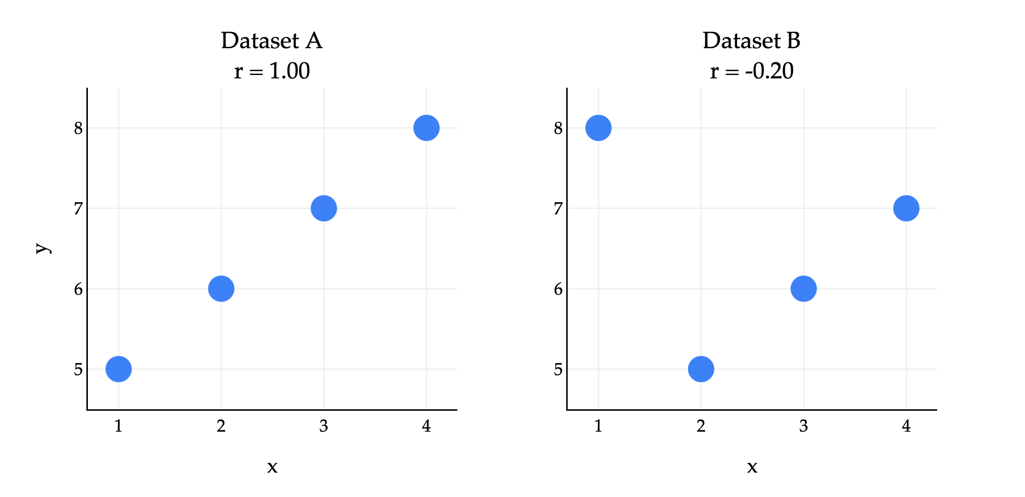
In both datasets, , , , and are the same. But, their correlation coefficients are quite different, because the pairings between ’s and ’s are different.
Preserving Correlation
Since measures how closely points cluster around a line, it is invariant to units of measurement. Whether you use feet or meters to measure distance, or dollars or yen to measure price, the correlation between two variables will be the same.
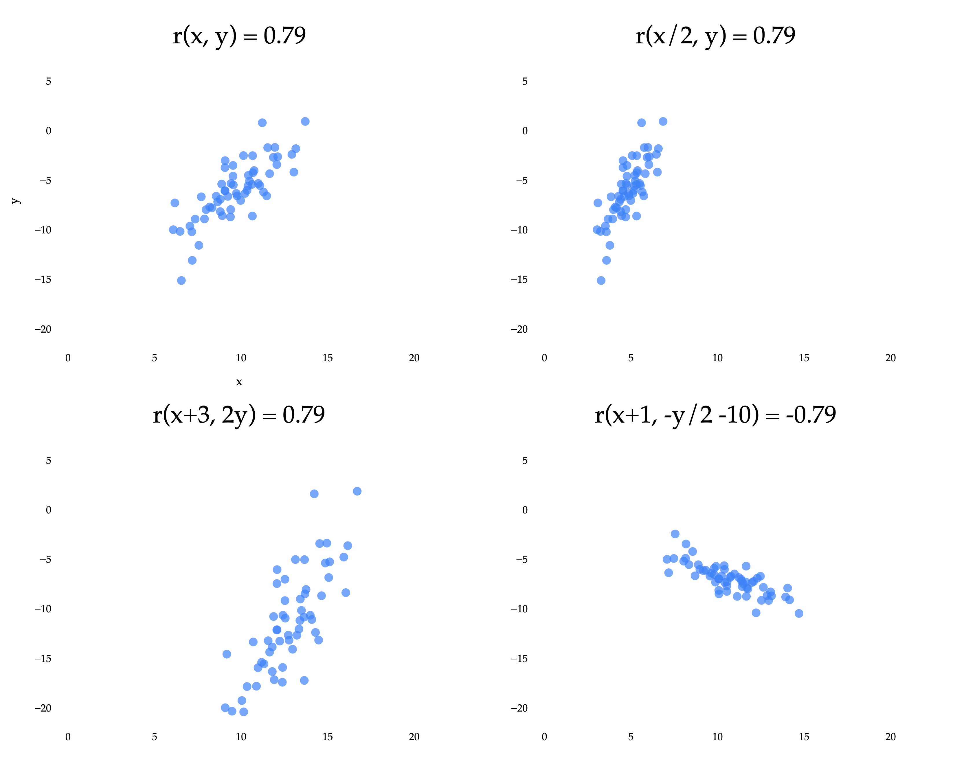
The top left scatter plot is the same as in the previous example, where we reasoned about why is positive. The other three plots result from applying linear transformations to the and/or variables independently. A linear transformation of is any function of the form , and a linear transformation of is any function of the form . (This is an idea we’ll revisit more in Chapter 6.1.)
Notice that three of the four plots have the same of approximately 0.79. The bottom right plot has an of approximately -0.79, because the coordinates were multiplied by a negative constant. What we’re seeing is that the correlation coefficient is invariant to linear transformations of the two variables independently.
Put in real-world terms: it doesn’t matter if you measure commute times in hours, minutes, or seconds, the correlation between departure time and commute time will be the same in all three cases.
Correlation and the Regression Line
Since measures how closely points cluster around a line, it shouldn’t be all that surprising that has something to do with , the slope of the regression line.
It turns out that:
This is my preferred version of the formula for the optimal slope – it’s easy to use and interpret. I’ve hidden the proof behind a dropdown menu below, but you really should attempt it on your own (and then read it), since it helps build familiarity with how the various components of the formula for and are related.
Proof that
First, let’s show that we can express in terms of :
Now, let’s prove that :
The simpler formula above implies that the sign of the slope is the same as the sign of , which seems reasonable: if the direction of the linear association is negative, the best-fitting slope should be, too.
So, all in one place:
This new formula for the slope also gives us insight into how the spread of () and () affects the slope. If is more spread out than , the points on the scatter plot will be stretched out vertically, which will make the best-fitting slope steeper.
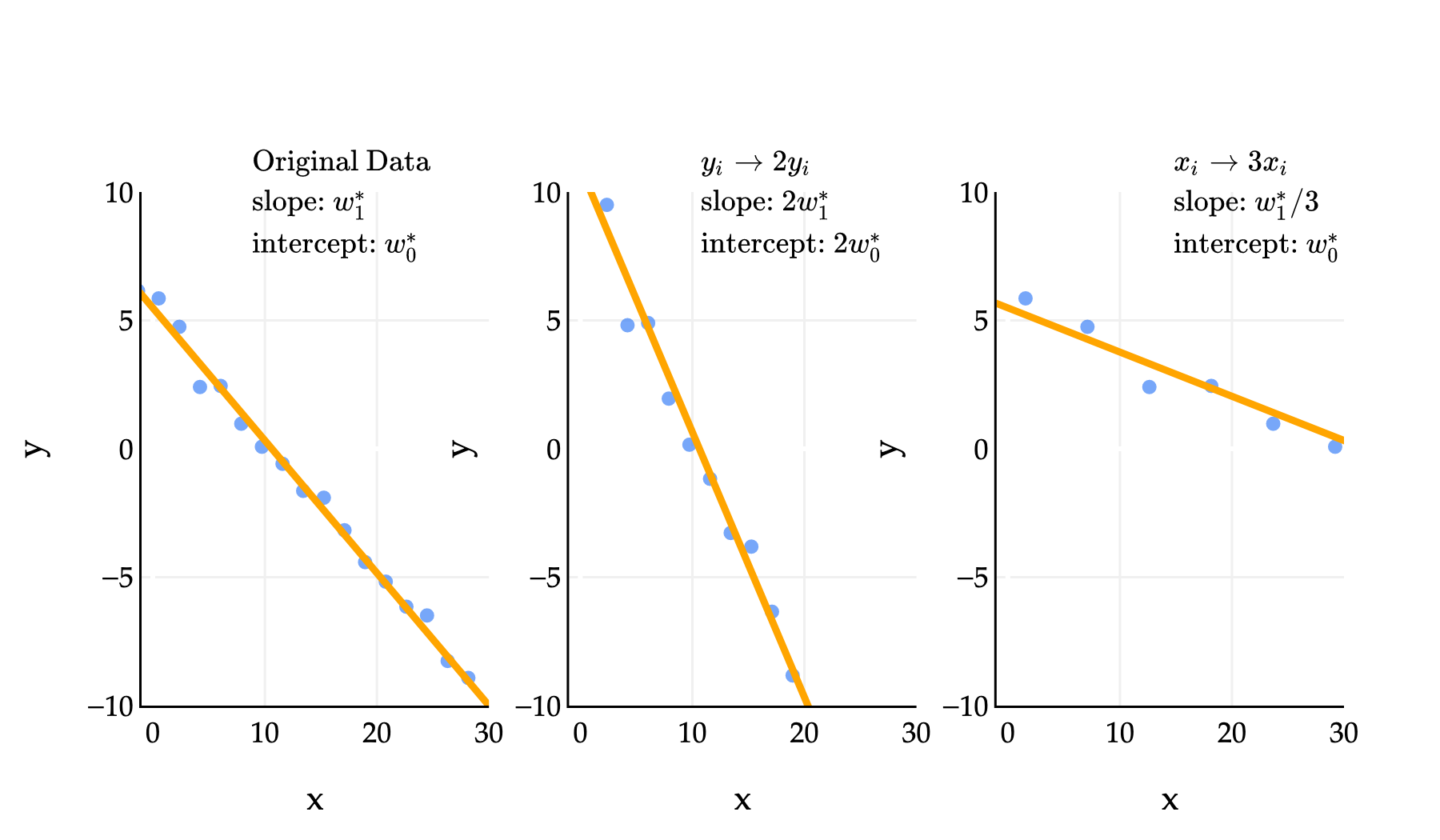
In the middle example above, means that we replaced each in the dataset with . In that example, the slope and intercept of the regression line both doubled. In the third example, where we replaced each with , the slope was divided by 3, while the intercept remained. One of the problems in Homework 2 has you prove these sorts of results, and you can do so by relying on the formula for that involves ; note that all three datasets above have the same .
Activity 1
Activity 1
This activity is an old exam question, taken from an exam that used to allow calculators. Part of it also appears in Lab 3.
First, suppose we minimize mean squared error to fit a simple linear regression line that uses the square footage of a house to predict its price. The resulting line has an intercept of and a slope of . In other words:
We’re now interested in minimizing mean squared error to find a simple linear regression line that uses price to predict square footage. Suppose this new regression line has an intercept of and a slope of .
What is ? Give your answer as an expression in terms of , , , and/or .
Given that:
|
The average square footage of houses in the dataset is 2000
What is ? Your answer should be a constant with no variables. (Once you’re able to express in terms of constants only, you can stop simplifying your answer.)
Example: Anscombe’s Quartet
The correlation coefficient is just one number that describes the linear association between two variables; it doesn’t tell us everything.
Consider the famous example of Anscombe’s quartet, which consists of four datasets that all have the same mean, standard deviation, and correlation coefficient, but look very different.
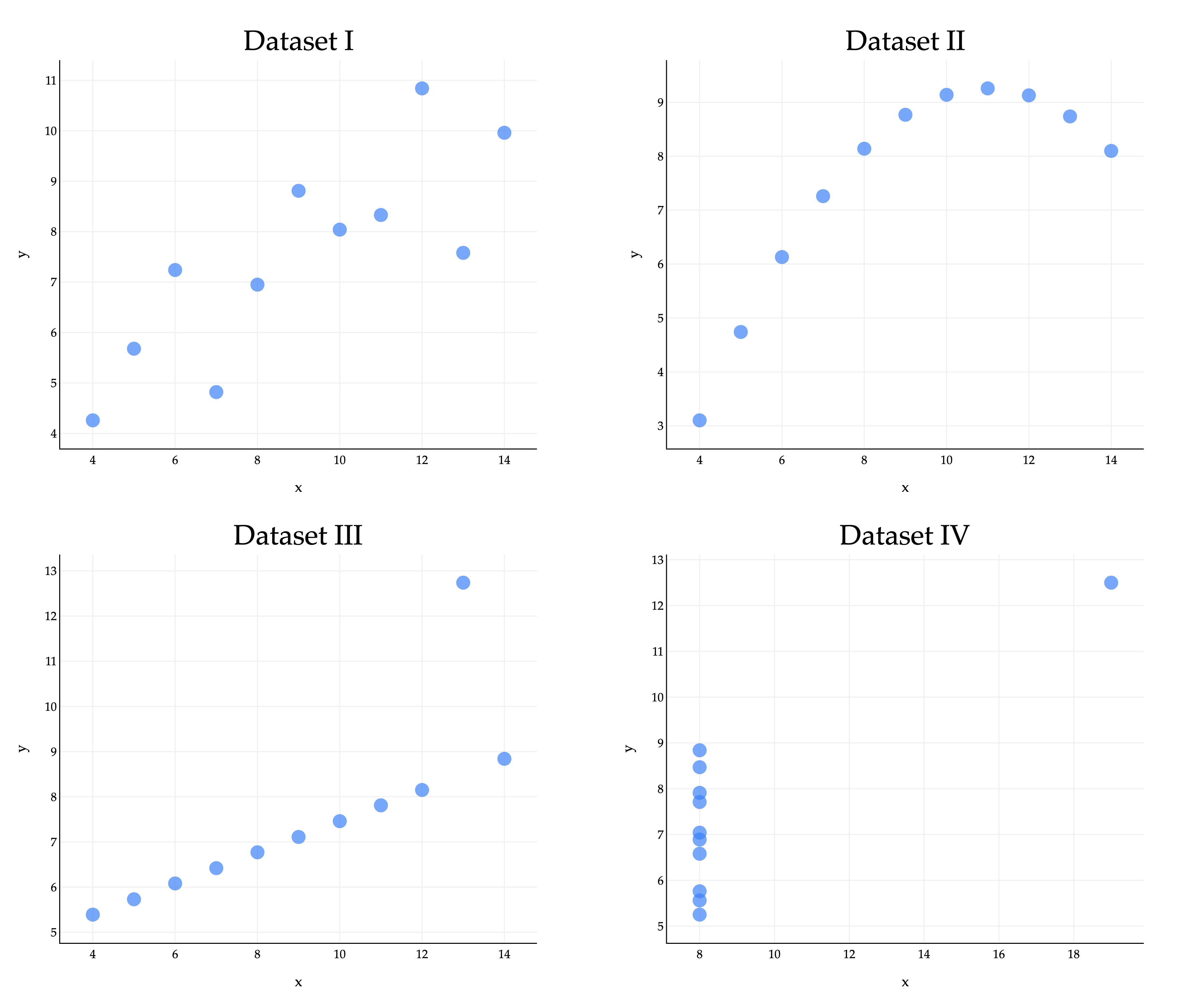
In all four datasets:
Because they all share the same five values of these key quantities, they also share the same regression lines, since the optimal slope and intercept are determined just using those five quantities.
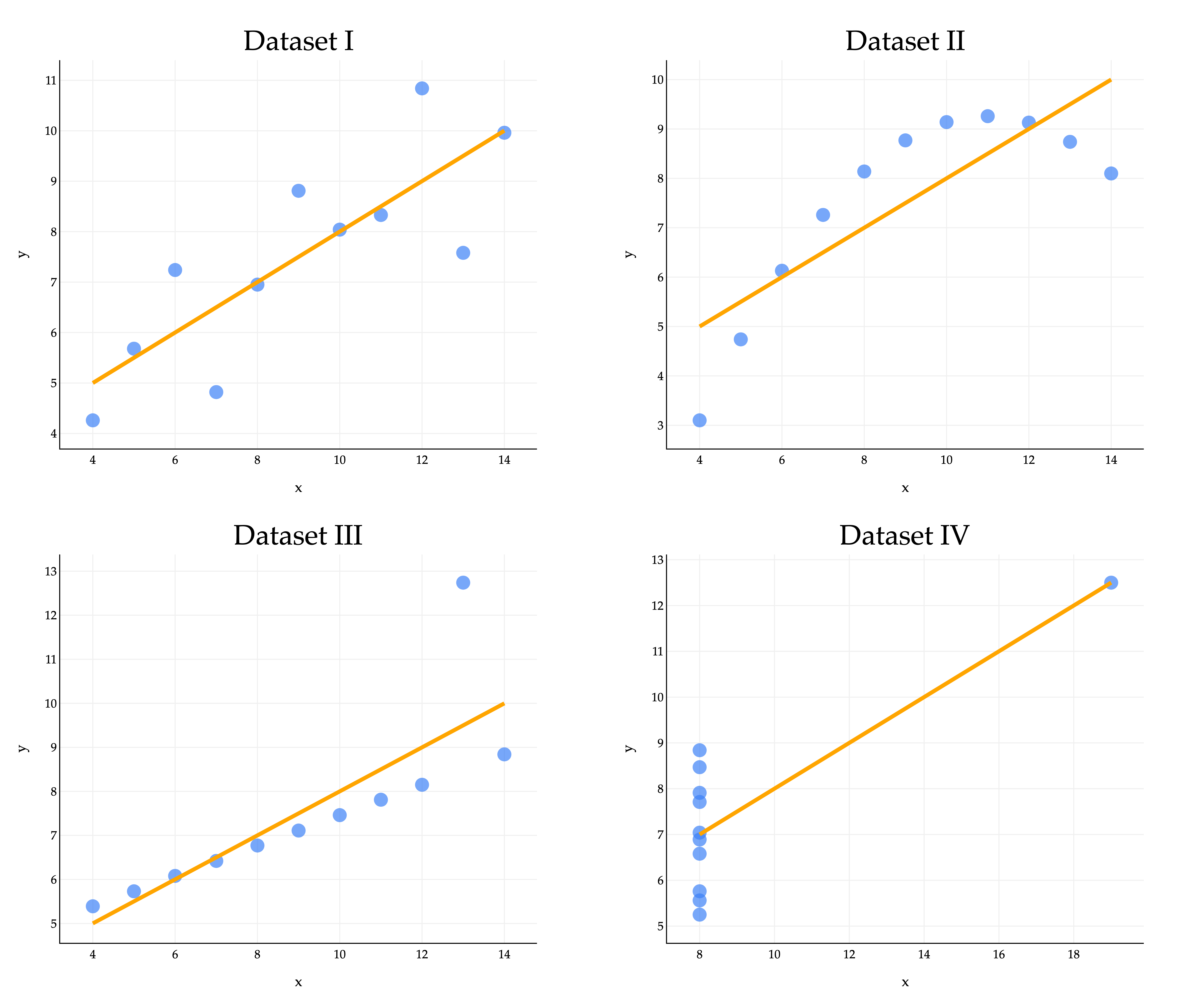
The regression line clearly looks better for some datasets than others, with Dataset IV looking particularly off. A high may be evidence of a strong linear association, but it cannot guarantee that a linear model is suitable for a dataset. Moral of the story - visualize your data before trying to fit a model! Don’t just trust the numbers.
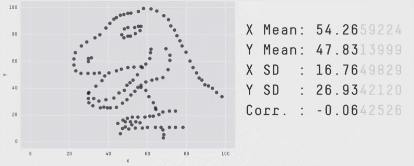
You might like the Datasaurus Dozen, another similar collection of 13 datasets that all have the same mean, standard deviation, and correlation coefficient, but look very different. (One looks like a dinosaur!)