In Chapter 10.4, I introduced principal components analysis (PCA), which is the process of creating new features (called principal components) that are linear combinations of the original features that
capture as much of the variation in the data as possible, and
are uncorrelated with each other.
The main use case of PCA so far has been for dimensionality reduction – taking a high-dimensional dataset and representing each point as a vector in a lower-dimensional space. The main example in Chapter 10.4 was the penguin dataset, where each penguin was originally described by four features (bill length, bill depth, flipper length, and body mass), but PCA allowed us to describe each penguin using just two features.
Handwritten Digits
At the very start of the course, in Chapter 1.1, I introduced you to the MNIST dataset (MNIST stands for Modified National Institute of Standards and Technology). To wrap up the course, I’d like to revisit this dataset.
The dataset contains 70,000 labeled grayscale images of handwritten digits, each of which is 28 pixels by 28 pixels. The dataset exists to train machine learning models to recognize handwritten digits. This is a classification task, rather than a regression task, which we spent the majority of the course studying.
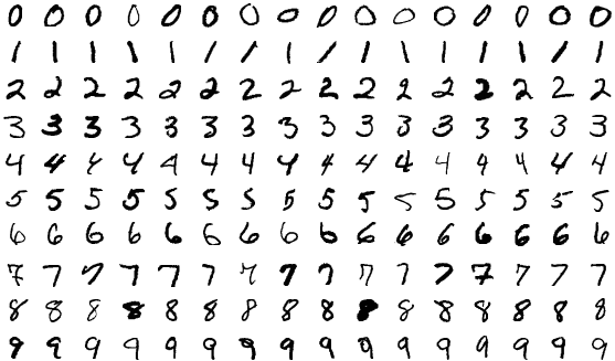
A few of the images in the MNIST dataset.
Each image is a grid of pixels, and each of these pixels is an integer between 0 and 255, representing the pixel’s intensity. In the example below, hover over any pixel to see its intensity value.
Each image can be stored as a vector in , since . A table containing all images, then, has 70,000 rows (one per image) and 784 columns (one per pixel).
Each row above corresponds to one flattened digit. While we can visualize individual images in the dataset one at a time, we can’t visualize the entire dataset at once, since it’s made up of vectors in . That’s where PCA comes in!
PCA Returns
By creating principal components, we can represent each image using only 2 or 3 features, rather than 784.
Below, I’ve reduced the dimensionality of the 784-feature dataset to just 2 features. Rather than using np.linalg.svd as in Chapter 10.4, I’ve
used sklearn’s PCA implementation, just to show you how it works.
pca_2 = PCA(n_components=2)
mnist_pca = pca_2.fit_transform(X)
What fraction of the variance in the full 784-dimensional data is captured by the first two principal components? It looks like about 17%, which is less than the ~99% we saw for the first two principal components in the penguin dataset. We’re seeing a much lower proportion of variance explained here likely because it’s hard to distinguish between images with just two numbers per image.
# The proportion of variance explained by each principal component.
pca_2.explained_variance_ratio_
array([0.09746116, 0.07155445])# The total variance explained by the first two principal components.
pca_2.explained_variance_ratio_.sum()0.16901560509373448In the scatter plot below, each point corresponds to an image. Its position is determined by its values in the first two principal components. Note that we’ve only included a small sample of the full 70,000 image dataset as to avoid crowding the plot (and slowing down your browser).
The values of principal component 1 and 2 not pixel intensities, as they don’t range between 0 and 255. Instead, they are linear combinations of the original pixel intensities.
By construction, PCA did not use the labels when determining the placement of each image. All it knew about each image were the 784 pixel values. Still, the images are roughly clustered by their true digits, meaning that handwritten 0s tend to be placed near handwritten 0s, handwritten 1s near handwritten 1s, and so on.
Notice that even with just two features, the digits are roughly clustered by their true digit label. The 1’s are clustered together in the top left, the 0’s are clustered together in the right center, and so on. But, there’s a fair amount of overlap.
Let’s go one step further: in the graph below (which only uses a random sample of 200 points for speed), hovering over a point reveals the full original 28 x 28 image itself.
Zoom in on the graph, and look at any two points that are close to each other but have different labels. You’ll run into cases like a 9 that looks like a 1, or 5 that looks like a 3. Again, with just these two features for each image, we retain a lot of information about the original image, which is remarkable!
Feature Maps
How are these principal components computed? As we saw in Chapter 10.4,
where is the centered data matrix, and is the th eigenvector of . In other words, is the th column of in , the SVD of .
Here, contains 784 values, one for each pixel in the original image. Here’s an idea: why don’t we visualize as a image? Such a graph is called a feature map, as it shows how the original 784 features are combined to create each principal component.
Now, let’s look at the scatter plot of the first two principal components again, with the digits colored by their true digit label. Notice that the 0’s are in the far right while the 1’s are in the far left. How does the above heat map explain this?
PCA Regression
Here’s the last big idea: what if we use these new features as inputs to a model? We absolutely can. But what kind of predictive task is this: regression or classification? Classification, of course, because the goal is to predict which digit appears in the image.
A standard choice is logistic regression. Despite the name, logistic regression is a linear classification technique that builds on linear regression. Instead of predicting a numerical response directly, it predicts class probabilities and then turns those probabilities into decisions.
For handwritten digits, sklearn uses a multinomial version of logistic regression that predicts a probability for each digit 0 through 9. We won’t focus on the math, the loss function, or the optimization details here; those are beyond our scope. The point is just that PCA can create new features, and a classifier can use those new features as inputs.
pipe.fit(X_train, y_train)
two_pc_accuracy = pipe.score(X_test, y_test)
two_pc_accuracy0.4465Even with just two principal components, the classifier reaches about 44.6% accuracy on the test set. That is far from perfect, but it is still much better than random guessing among 10 classes, which would only be correct about 10% of the time.
While the full MNIST dataset was too high-dimensional to visualize directly, it can be compressed into principal components, which can be visualized and then fed into a classifier. What a beautiful way to wrap up the course!