As we saw in Chapter 10.2, the singular value decomposition of a matrix X into X=UΣVT can be used to find the best low-rank approximation of X, which has applications in image compression, for example. But, hiding in the singular value decomposition is another, more data-driven application: dimensionality reduction.
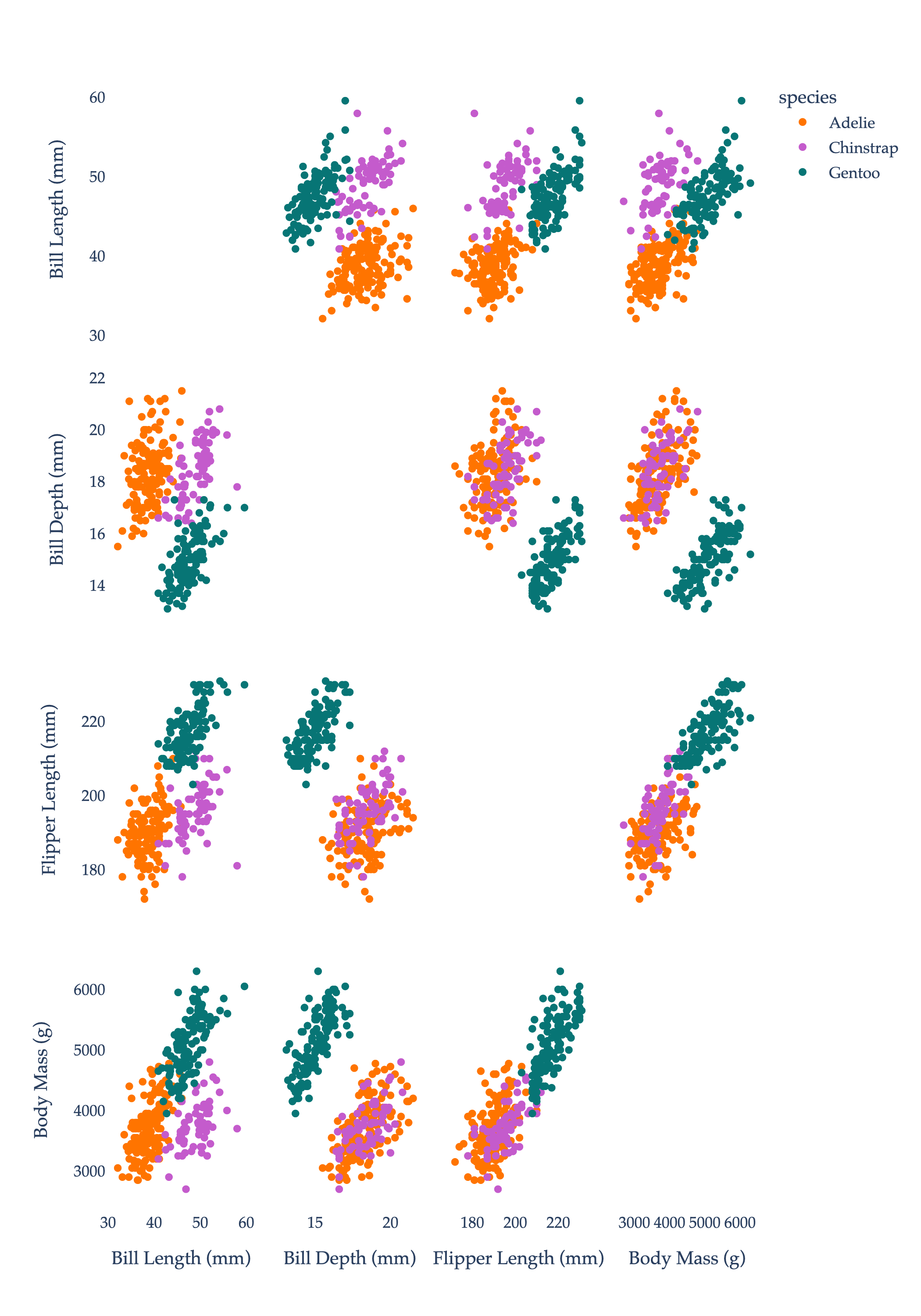
Consider, for example, the dataset below. Each row corresponds to a penguin.
import seaborn as sns
penguins = sns.load_dataset('penguins').dropna()
penguins
Loading...
Each penguin has three categorical features - species, island, and sex - and four numerical features - bill_length_mm, bill_depth_mm, flipper_length_mm, and body_mass_g. If we restrict our attention to these numerical features, we have a 333×4 matrix, which we can think of as 333 points in R4. We, of course, can’t visualize in R4. One solution is to draw scatter plots of all pairs of numerical features. Points are colored by species.
import plotly.express as px

numeric_features = ['bill_length_mm', 'bill_depth_mm', 'flipper_length_mm', 'body_mass_g']

# Custom color mapping for species
species_color_map = {
    'Adelie': '#ff7400',
    'Chinstrap': '#c45bcc',
    'Gentoo': '#077575'
}

fig = px.scatter_matrix(
    penguins,
    dimensions=numeric_features,
    color='species',
    labels={
        'bill_length_mm': 'Bill Length (mm)',
        'bill_depth_mm': 'Bill Depth (mm)',
        'flipper_length_mm': 'Flipper Length (mm)',
        'body_mass_g': 'Body Mass (g)'
    },
    color_discrete_map=species_color_map,
)

fig.update_traces(diagonal_visible=False)
fig.update_layout(
    height=1000,
    font_family="Palatino",
    paper_bgcolor="white",
    plot_bgcolor="white",
)

# Set axis background and major/minor gridline colors, and font for axes
# fig.update_xaxes(showgrid=True, gridwidth=1, gridcolor="#f0f0f0", zeroline=False, showline=True, linecolor="#ccc", ticks="outside", tickfont_family="Palatino")
# fig.update_yaxes(showgrid=True, gridwidth=1, gridcolor="#f0f0f0", zeroline=False, showline=True, linecolor="#ccc", ticks="outside", tickfont_family="Palatino")

fig.show(renderer='png', scale=3)
While we have four features (or “independent” variables) for each penguin, it seems that some of the features are strongly correlated, in the sense that the correlation coefficient
r=n1i=1∑n(σxxi−xˉ)(σyyi−yˉ)
between them is close to ±1. (To be clear, the coloring of the points is by species, which does not impact the correlations between features.)
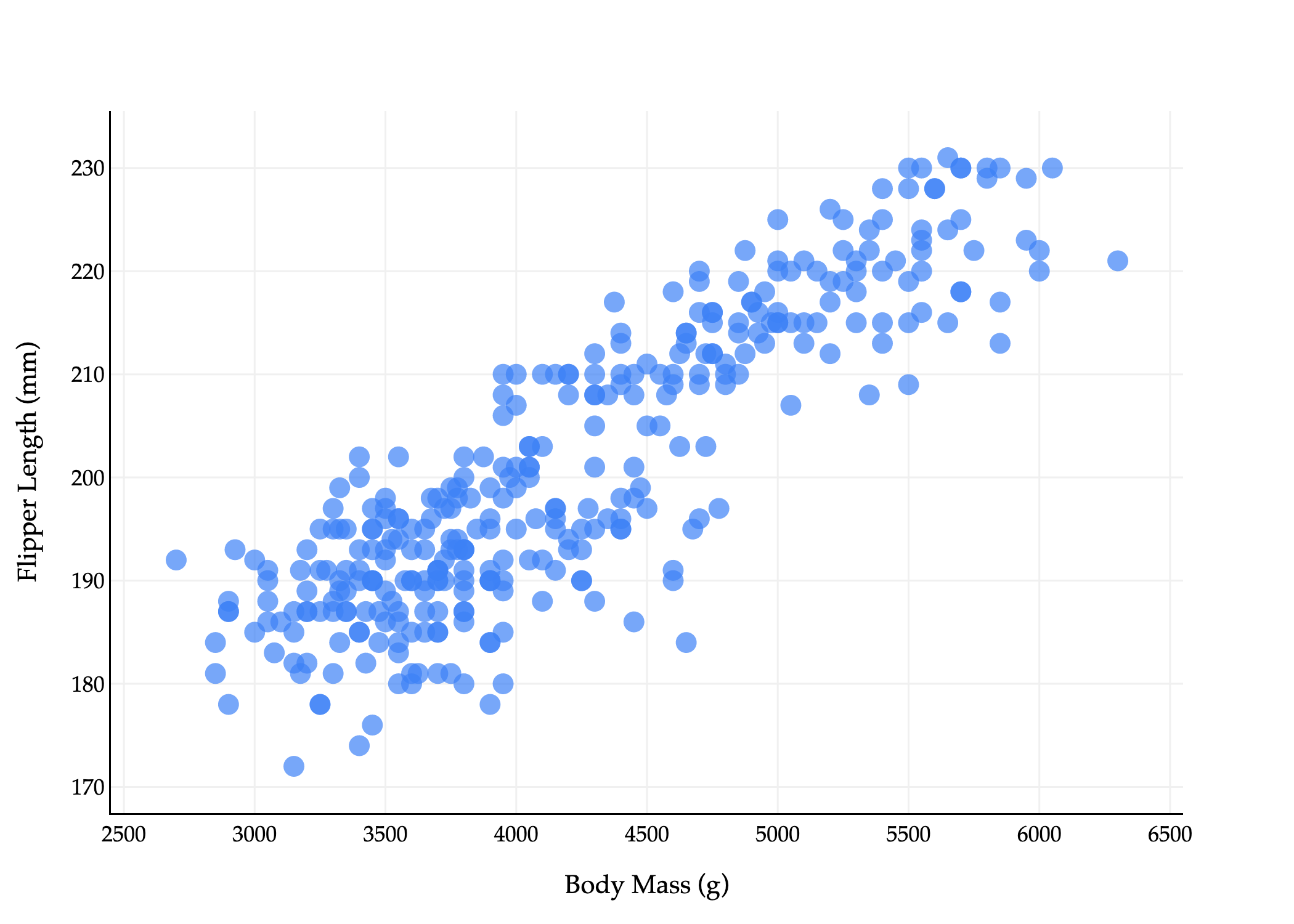
For instance, the correlation between flipper_length_mm and body_mass_g is about 0.87, which suggests that penguins with longer flippers tend to be heavier. Not only are correlated features redundant, but they can cause interpretability issues - that is, multicollinearity - when using them in a linear regression model, since the resulting optimal parameters w∗ will no longer be interpretable. (Remember, in h(xi)=w⋅Aug(xi), w∗ contains the optimal coefficients for each feature, which measure rates of change when the other features are held constant. But if two features are correlated, one can’t be held constant without also changing the other.)
Here’s the key idea: instead of having to work with d=4 features, perhaps we can instead construct some number k<d of new features that:
capture the “most important” information in the dataset,
while being uncorrelated (i.e. linearly independent) from one another.
I’m not suggesting that we just select some of the original features and drop the others; rather, I’m proposing that we find 1 or 2 new features that are linear combinations of the original features. If everything works out correctly, we may be able to reduce the number of features we need to deal with, without losing too much information, and without the interpretability issues that come with multicollinearity.
To illustrate what I mean by constructing a new feature, let’s suppose we’re starting with a 2-dimensional dataset, which we’d like to reduce to 1 dimension. Consider the scatter plot below of flipper_length_mm vs. body_mass_g (with colors removed).
Above, each penguin is represented by two numbers, which we can think of as a vector
xi=[body massiflipper lengthi]
The fact that each point is a vector is not immediately intuitive given the plot above: I want you to imagine drawing arrows from the origin to each point.
Now, suppose these vectors xi are in the rows of a matrix X, i.e.
Our goal is to construct a single new feature, called a principal component, by taking a linear combination of both existing features. Principal component analysis, or PCA, is the process of finding the best principal components (new features) for a dataset.
new featurei=a⋅body massi+b⋅flipper lengthi
This is equivalent to approximating this 2-dimensional dataset with a single line. (The equation above is a re-arranged version of y=mx+b, where x is body massi and y is flipper lengthi.)
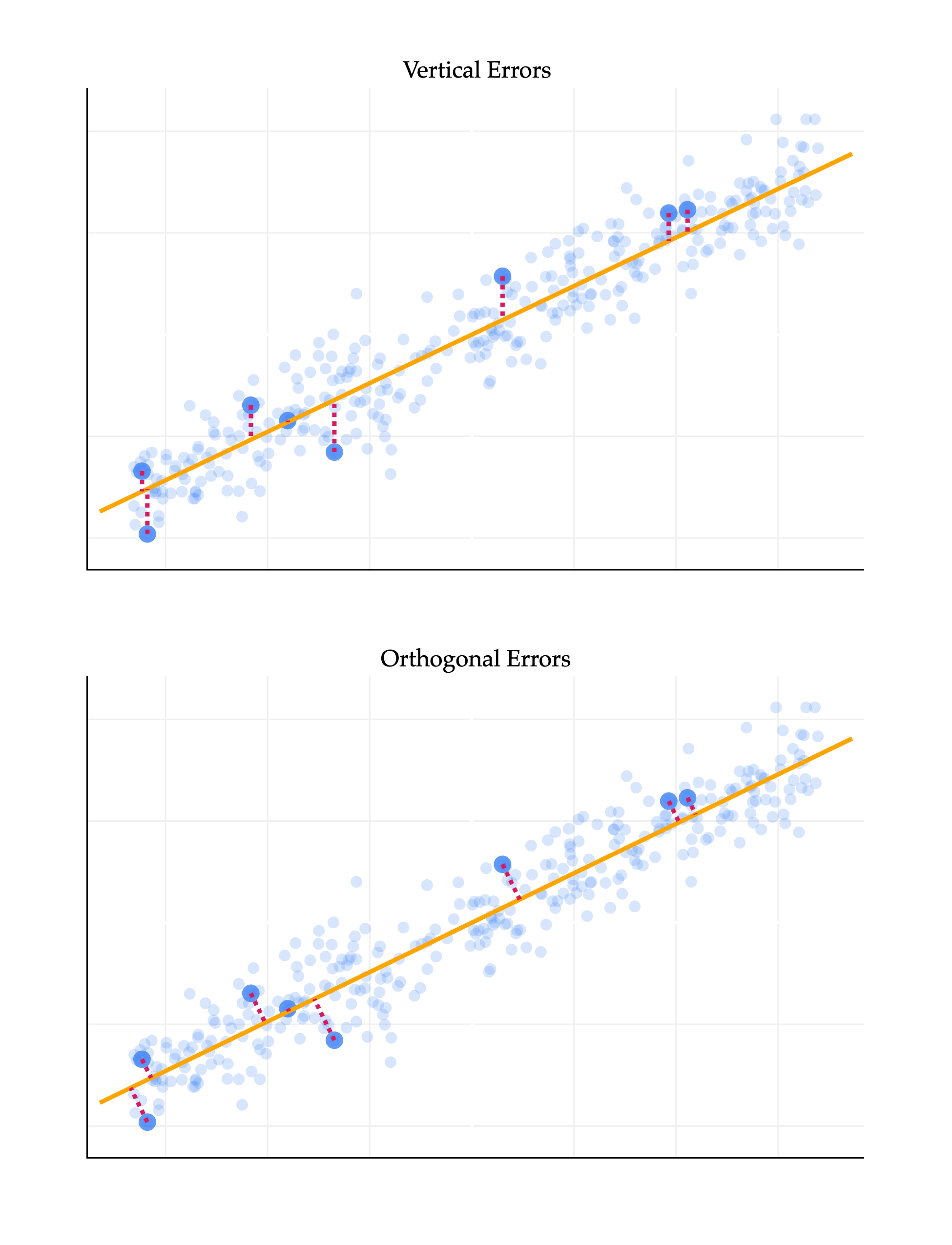
What is the best linear combination of the features, or equivalently, what is the best line to approximate this 2-dimensional dataset? To make this idea precise, we need to define what we mean by “best”. It may be tempting to think that we should find the best-fitting line that predicts flipper_length_mm from body_mass_g, but that’s not quite what we want, since this is not a prediction problem: it’s a representation problem. Regression lines in the way we’ve seen them before are fit by minimizing mean squared vertical error, yi−h(xi), but don’t at all capture horizontal errors, i.e. errors in the body_mass_g direction here.
So instead, we’d like to find the line such that, for our n vectors (points) x1,…,xn, the mean squared distance to the closest vector (point) on the line is minimized. Crucially, this distance is calculated by computing the norm of the difference between the two vectors. If pi is the closest vector (point) on the line to xi, then we’d like to minimize
n1i=1∑n∥xi−pi∥2
But, as we saw in Chapter 3.4, the vector (point) on a line that is closest to another vector (point) xi is the orthogonal projection of xi onto that line. The resulting error vectors are orthogonal to the line we’re projecting on. As such, I’ll say that we’re looking for the line that minimizes the mean squared orthogonal projection error.
import plotly.graph_objects as go
from plotly.subplots import make_subplots
import numpy as np
import pandas as pd
from sklearn.linear_model import LinearRegression
from sklearn.decomposition import PCA

# --- DATA GENERATION (Synthetic Data) ---
# Using synthetic data as the external 'penguins' dataset was inaccessible.
np.random.seed(42)
num_points = 340
body_mass_g = np.random.uniform(2700, 6300, num_points)
m_true = 0.015
c_true = 120
noise = np.random.normal(0, 5, num_points)
flipper_length_mm = m_true * body_mass_g + c_true + noise

df = pd.DataFrame({
    'body_mass_g': body_mass_g,
    'flipper_length_mm': flipper_length_mm
})

# --- STANDARDIZATION ---
# Standardize both columns to mean=0, std=1
for col in ['body_mass_g', 'flipper_length_mm']:
    mean = df[col].mean()
    std = df[col].std()
    df[col + '_std'] = (2 if col == 'body_mass_g' else 1) * (df[col] - mean) / std

data_2d = df[['body_mass_g_std', 'flipper_length_mm_std']].values

# --- MODEL FITTING on standardized data ---
# Linear Regression (still fit flipper_length_mm_std ~ body_mass_g_std)
lin_reg = LinearRegression()
lin_reg.fit(df[['body_mass_g_std']], df['flipper_length_mm_std'])
m_lr = lin_reg.coef_[0]
c_lr = lin_reg.intercept_

# PCA
pca = PCA(n_components=1)
pca.fit(data_2d)
v1 = pca.components_[0]
mean_data = pca.mean_

# --- SELECTION & RANGE ---
random_indices = np.random.choice(df.index, size=8, replace=False)
random_points = df.iloc[random_indices]

x_min, x_max = df['body_mass_g_std'].min(), df['body_mass_g_std'].max()
x_padding = (x_max - x_min) * 0.05
x_range = np.array([x_min - x_padding, x_max + x_padding])

# --- CALCULATIONS: LINEAR REGRESSION (Top Plot) ---
y_lr_line = m_lr * x_range + c_lr
lr_errors = []
for i in random_indices:
    x_i, y_i = df.loc[i, 'body_mass_g_std'], df.loc[i, 'flipper_length_mm_std']
    y_hat = m_lr * x_i + c_lr
    # Vertical error segment: (x_i, y_i) to (x_i, y_hat)
    lr_errors.append(go.Scatter(
        x=[x_i, x_i, None],
        y=[y_i, y_hat, None],
        mode='lines',
        line=dict(color='#d81a60', width=3, dash='dot'),
        showlegend=False,
        hoverinfo='none'
    ))

# --- CALCULATIONS: PCA (Bottom Plot) ---
# Parametric line points
t_min = (x_range.min() - mean_data[0]) / v1[0]
t_max = (x_range.max() - mean_data[0]) / v1[0]
x_pca_line = np.array([mean_data[0] + t_min * v1[0], mean_data[0] + t_max * v1[0]])
y_pca_line = np.array([mean_data[1] + t_min * v1[1], mean_data[1] + t_max * v1[1]])

pca_errors = []
for idx in random_indices:
    p_i = data_2d[idx]
    projection_scalar = np.dot(p_i - mean_data, v1)
    p_tilde = mean_data + projection_scalar * v1
    # Orthogonal error segment: (p_i) to (p_tilde)
    pca_errors.append(go.Scatter(
        x=[p_i[0], p_tilde[0], None],
        y=[p_i[1], p_tilde[1], None],
        mode='lines',
        line=dict(color='#d81a60', width=3, dash='dot'),
        showlegend=False,
        hoverinfo='none'
    ))

# --- CREATE SUBPLOTS ---
fig = make_subplots(
    rows=2,
    cols=1,
    shared_xaxes=False,
    vertical_spacing=0.1,
    subplot_titles=("Vertical Errors", "Orthogonal Errors")
)

## TOP PLOT (ROW 1): LINEAR REGRESSION
# 1. Full Scatter (Low Opacity)
fig.add_trace(go.Scatter(
    x=df['body_mass_g_std'], y=df['flipper_length_mm_std'], mode='markers',
    marker=dict(color="#3D81F6", size=8, opacity=0.2, line_width=0),
    name='All Points (LR)', showlegend=False
), row=1, col=1)

# 2. Selected Scatter (High Opacity)
fig.add_trace(go.Scatter(
    x=random_points['body_mass_g_std'], y=random_points['flipper_length_mm_std'], mode='markers',
    marker=dict(color="#3D81F6", size=12, opacity=0.8, line_width=0),
    name='Selected Points', legendgroup='selected', showlegend=True
), row=1, col=1)

# 3. Line of Best Fit
fig.add_trace(go.Scatter(
    x=x_range, y=y_lr_line, mode='lines',
    line=dict(color='orange', width=3),
    name='Line of Best Fit', legendgroup='lines', showlegend=True
), row=1, col=1)

# 4. Vertical Errors (Placeholder for Legend)
fig.add_trace(go.Scatter(
    x=[None], y=[None], mode='lines',
    line=dict(color='#d81a60', width=1.5, dash='dot'),
    name='Errors', legendgroup='errors', showlegend=True
), row=1, col=1)
for error_trace in lr_errors:
    fig.add_trace(error_trace, row=1, col=1)


## BOTTOM PLOT (ROW 2): PCA
# 1. Full Scatter (Low Opacity)
fig.add_trace(go.Scatter(
    x=df['body_mass_g_std'], y=df['flipper_length_mm_std'], mode='markers',
    marker=dict(color="#3D81F6", size=8, opacity=0.2, line_width=0),
    name='All Points (PCA)', showlegend=False
), row=2, col=1)

# 2. Selected Scatter (High Opacity)
fig.add_trace(go.Scatter(
    x=random_points['body_mass_g_std'], y=random_points['flipper_length_mm_std'], mode='markers',
    marker=dict(color="#3D81F6", size=12, opacity=0.8, line_width=0),
    name='Selected Points', legendgroup='selected', showlegend=False
), row=2, col=1)

# 3. First Principal Component Line
fig.add_trace(go.Scatter(
    x=x_pca_line, y=y_pca_line, mode='lines',
    line=dict(color='orange', width=3),
    name='First Principal Component', legendgroup='lines', showlegend=True
), row=2, col=1)

# 4. Orthogonal Errors
for error_trace in pca_errors:
    fig.add_trace(error_trace, row=2, col=1)

# --- APPLY STYLING: Equal aspect ratio for both axes in row 2 ---
common_axis_style = dict(
    title='Flipper Length (standardized)',
    gridcolor='#f0f0f0', showline=True, linecolor="black", linewidth=1,
)
fig.update_yaxes(common_axis_style, row=1, col=1)
fig.update_yaxes(common_axis_style, row=2, col=1)

fig.update_xaxes(
    title='Body Mass (standardized)', gridcolor='#f0f0f0', showline=True, linecolor="black", linewidth=1,
    row=2, col=1
)
fig.update_xaxes(
    gridcolor='#f0f0f0', showline=True, linecolor="black", linewidth=1, row=1, col=1
) # No x-axis title on top plot

# Set aspectmode='equal' for bottom plot only
fig.update_yaxes(
    scaleanchor = "x", scaleratio = 1,
    row=1, col=2,
    title=''
)
fig.update_xaxes(
    constrain='domain',
    row=2, col=1,
)

fig.update_xaxes(
    title='',
    showticklabels=False
)

fig.update_yaxes(
    title='',
    showticklabels=False
)

fig.update_layout(
    plot_bgcolor='white', paper_bgcolor='white',
    margin=dict(l=60, r=60, t=60, b=60),
    width=650, height=850,
    font=dict(family="Palatino Linotype, Palatino, serif", color="black"),
    showlegend=False
)

fig.show(renderer='png', scale=3)
The difference between the two lines above is key. The top line reflects the supervised nature of linear regression, where the goal is to make accurate predictions. The bottom line reflects the fact that we’re looking for a new representation of the data that captures the most important information. These, in general, are not the same line, since they’re chosen to minimize different objective functions.
Recall from Chapter 1 that unsupervised learning is the process of finding structure in unlabeled data, without any specific target variable. This is precisely the problem we’re trying to solve here. To further distinguish our current task from the problem of finding regression lines, I’ll now refer to finding the line with minimal orthogonal projection error as finding the best direction.
The first section above told us that our goal is to find the best direction, which is the direction that minimizes the mean squared orthogonal error of projections onto it. How do we find this direction?
Fortunately, we spent all of Chapter 3.4 and Chapter 6.3 discussing orthogonal projections. But there, we discussed how to project one vector onto the span of one or more other given vectors (e.g. projecting the observation vector y onto the span of the columns of a design matrix X). That’s not quite we’re doing here, because here, we don’t know which vector we’re projecting onto: we’re trying to find the best vector to project our n=333 other vectors onto!
Suppose that in general, X is an n×d matrix, whose rows xi are data points in Rd. (In our current example, d=2, but everything we’re studying applies in higher dimensions.) Then,
The orthogonal projection of xi onto v is
pi=v⋅vxi⋅vv
To keep the algebra slightly simpler, if we assume that v is a unit vector (meaning ∥v∥=v⋅v=1), then the orthogonal projection of xi onto v is
pi=(xi⋅v)v
This is a reasonable choice to make, since unit vectors are typically used to describe directions.
If v∈Rd, then span({v}) is a line through the origin in Rd.
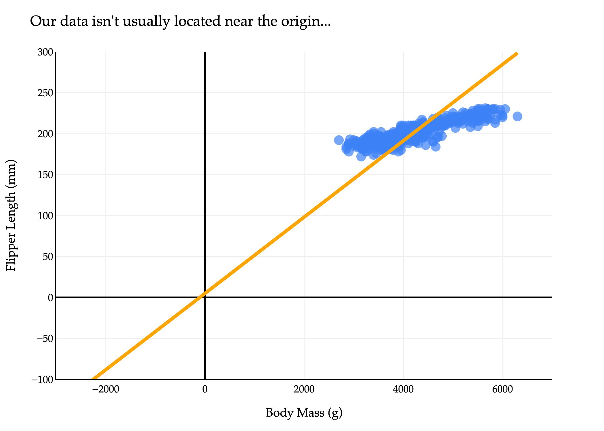
The issue is that our dataset - and most datasets in general, by default - aren’t centered at the origin, but the projections pi=(xi⋅v)v all lie on the line through the origin spanned by v. So, trying to approximate our dataset using a line through the origin is not a good idea.
import plotly.express as px
import numpy as np

# Scatter plot as before
fig = px.scatter(
    penguins,
    x='body_mass_g',
    y='flipper_length_mm',
    size=np.ones(len(penguins)) * 50,
    size_max=8,
    labels={
        "flipper_length_mm": "Flipper Length (mm)",
        "body_mass_g": "Body Mass (g)"
    }
)
fig.update_xaxes(
    title='Body Mass (g)',
    gridcolor='#f0f0f0',
    showline=True,
    linecolor="black",
    linewidth=1,
    zeroline=True,              # Add the zeroline (x=0)
    zerolinewidth=2,
    zerolinecolor="#000"
)
fig.update_yaxes(
    title='Flipper Length (mm)',
    gridcolor='#f0f0f0',
    showline=True,
    linecolor="black",
    linewidth=1,
    zeroline=True,              # Add the zeroline (y=0)
    zerolinewidth=2,
    zerolinecolor="#000"
)
fig.update_traces(marker_color="#3D81F6", marker_line_width=0)
fig.update_layout(
    plot_bgcolor='white',
    paper_bgcolor='white',
    margin=dict(l=60, r=60, t=60, b=60),
    width=700,
    font=dict(
        family="Palatino Linotype, Palatino, serif",
        color="black"
    )
)

# --- Why doesn't the orange line pass through the origin? ---
# We are calculating the principal component direction using the uncentered data.
# That is, we use the original values of body_mass_g and flipper_length_mm,
# not values shifted so that their mean is zero.
# The line we draw to indicate the main data direction is then *anchored at the mean* of the data,
# not at the origin (0, 0).
#
# In PCA, the principal component direction is meant to describe the direction *from the center of the data*,
# not necessarily from the origin—unless the data itself has the origin as its center.

# Compute mean and principal direction from UNcentered data
X_no_center = penguins[['body_mass_g', 'flipper_length_mm']].dropna().values
mean_point = np.mean(X_no_center, axis=0)

# SVD gives principal directions, but if we don't center, the "line through the origin"
# describes how the data is spread around its mean, not around (0,0).
U, S, Vt = np.linalg.svd(X_no_center, full_matrices=False)
direction = Vt[0]
direction = direction / np.linalg.norm(direction)

# Find t values so that the orange line spans the plot regardless of origin
bm_min, bm_max = penguins['body_mass_g'].min(), penguins['body_mass_g'].max()
t0 = (-3000 - mean_point[0]) / direction[0]
t1 = (bm_max - mean_point[0]) / direction[0]
line_bm = mean_point[0] + np.array([t0, t1]) * direction[0]
line_fl = mean_point[1] + np.array([t0, t1]) * direction[1]

fig.add_traces([
    {
        "type": "scatter",
        "mode": "lines",
        "x": line_bm,
        "y": line_fl,
        "line": dict(color="orange", width=4),
        "name": "Principal Direction (uncentered)"
    }
])

fig.update_layout(
    xaxis_range=[-3000, 7000],
    yaxis_range=[-100, 300],
    showlegend=False,
    title="Our data isn't usually located near the origin..."
)
fig.show(renderer='png', scale=3)

# Explanation:
# The orange line follows the principal direction of the data, but is anchored on the mean value of
# (body_mass_g, flipper_length_mm). Since the mean is NOT the origin (0,0), the line will not
# pass through the origin. This illustrates why, when analyzing data directions, we almost always
# first center the data (subtract the mean), so the principal direction can be represented as a
# line through the origin in the transformed coordinates.
import plotly.express as px
import numpy as np
# Center the data
X = penguins[['body_mass_g', 'flipper_length_mm']].dropna().values
X_mean = np.mean(X, axis=0)
X_centered = X - X_mean
# Scatter plot of centered data
fig = px.scatter(
x=X_centered[:, 0], # body_mass_g (centered)
y=X_centered[:, 1], # flipper_length_mm (centered)
size=np.ones(len(X_centered)) * 50,
size_max=8,
labels={
"x": "Body Mass (g) (centered)",
"y": "Flipper Length (mm) (centered)"
}
)
fig.update_xaxes(
title='Centered Body Mass (g)',
gridcolor='#f0f0f0',
showline=True,
linecolor="black",
linewidth=1,
zeroline=True,
zerolinewidth=2,
zerolinecolor="black",
)
fig.update_yaxes(
title='Centered Flipper Length (mm)',
gridcolor='#f0f0f0',
showline=True,
linecolor="black",
linewidth=1,
zeroline=True,
zerolinewidth=2,
zerolinecolor="black",
)
fig.update_traces(marker_color="#3D81F6", marker_line_width=0)
fig.update_layout(
plot_bgcolor='white',
paper_bgcolor='white',
margin=dict(l=60, r=60, t=60, b=60),
width=700,
font=dict(
family="Palatino Linotype, Palatino, serif",
color="black"
)
)
# --- PCA/SVD for centered data: best-fit line through origin ---
U, S, Vt = np.linalg.svd(X_centered, full_matrices=False)
direction = Vt[0]
direction = direction / np.linalg.norm(direction) # unit vector
# Draw the principal component line through the origin (since data is centered)
# We'll parametrize t over a sufficiently wide range to cover the data cloud
pc_range = 3 * np.array([
np.min(X_centered @ direction),
np.max(X_centered @ direction)
])
line_pts = np.outer(pc_range, direction) # shape (2,2)
fig.add_traces([
{
"type": "scatter",
"mode": "lines",
"x": line_pts[:, 0],
"y": line_pts[:, 1],
"line": dict(color="orange", width=4),
"name": "Principal Component"
}
])
# Set axis to center zero for clarity and cover data
margin_bm = 0.1 * (X_centered[:,0].max() - X_centered[:,0].min())
margin_fl = 0.1 * (X_centered[:,1].max() - X_centered[:,1].min())
fig.update_layout(
xaxis_range=[
X_centered[:,0].min() - margin_bm,
X_centered[:,0].max() + margin_bm
],
yaxis_range=[
X_centered[:,1].min() - margin_fl,
X_centered[:,1].max() + margin_fl
],
showlegend=False,
title="Best-Fit PCA Line (Centered Data)"
)
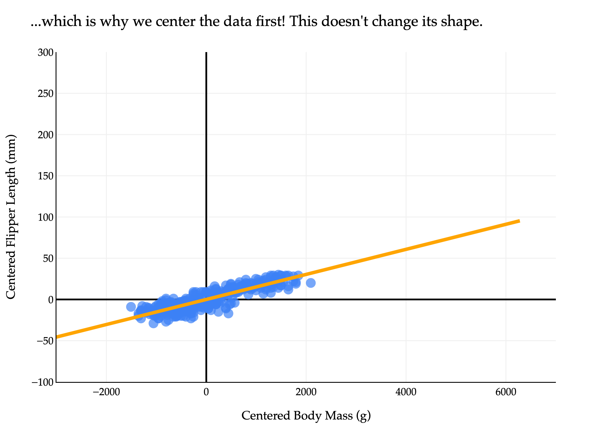
fig.update_layout(xaxis_range=[-3000, 7000], yaxis_range=[-100, 300], showlegend=False, title="...which is why we center the data first! This doesn't change its shape.")
fig.show(renderer='png', scale=3)
So, the solution is to first center the data by subtracting the mean of each column from each entry in that column. This gives us a new matrix X~.
In X~, the mean of each column is 0, which means that it’s reasonable to approximate the dataset using a line through the origin. Importantly, this doesn’t change the shape of the dataset, meaning it doesn’t change the “best direction” we’re searching for.
Now, X~ is the n×d matrix of centered data, and we’re ready to return to our goal of finding the best direction. Let x~i∈Rd refer to row i of X~. Note that I’ve dropped the vector symbol on top of x~i, not because it’s not a vector, but just because drawing a tilde on top of a vector hat is a little funky: x~i.
Our goal is to find the unit vectorv∈Rd that minimizes the mean squared orthogonal projection error. That is, if the orthogonal projection of x~i onto v is pi, then we want to find the unit vector v that minimizes
I’ve chosen the letter J since there is no standard notation for this quantity, and because J is a commonly used letter in optimization problems. It’s important to note that J is not a loss function, nor is it an empirical risk, since it has nothing to do with prediction.
How do we find the unit vector v that minimizes J(v)? We can start by expanding the squared norm, using the fact that ∥a−b∥2=∥a∥2−2a⋅b+∥b∥2:
The first term, n1∑i=1n∥x~i∥2, is constant with respect to v, meaning we can ignore it for the purposes of minimizing J(v). Our focus, then, is on minimizing the second term,
−n1i=1∑n(x~i⋅v)2
But, since the second term has a negative sign in front of it, minimizing it is equivalent to maximizing its positive counterpart,
Finding the best direction is equivalent to finding the unit vector v that maximizes the mean squared value of x~i⋅v. What is this quantity, though? Remember, the projection of x~i onto v is given by
pi=(x~i⋅v)v
All n of our original data points are projected onto v, meaning that each x~i is approximated by some scalar multiple (x~i⋅v) of v. These scalar multiples are our new feature values - that is, the values of the first principal component (first because this is the “best” direction).
import pandas as pd
import plotly.graph_objects as go
import numpy as np

# Use the same synthetic data as above, so the aspect is "fair"
np.random.seed(102)
num_points = 340
body_mass_g = np.random.uniform(2700, 6300, num_points)
m_true = 0.015
c_true = 120
noise = np.random.normal(0, 5, num_points)
flipper_length_mm = m_true * body_mass_g + c_true + noise

df = pd.DataFrame({
    'body_mass_g': body_mass_g,
    'flipper_length_mm': flipper_length_mm
})

# Standardize both columns to mean=0, std=1 for correct orthogonal aspect
df['body_mass_std'] = (df['body_mass_g'] - df['body_mass_g'].mean()) / df['body_mass_g'].std()
df['flipper_length_std'] = (df['flipper_length_mm'] - df['flipper_length_mm'].mean()) / df['flipper_length_mm'].std()
X = df[['body_mass_std', 'flipper_length_std']].values
X[:, 0] *= 2 # Scale x-axis for visual effect (as in original)

count_show = 5

# Fix the randomness: pick 25 random indices, keep correspondence for projections
rng = np.random.default_rng(51)
indices = rng.choice(len(X), replace=False, size=count_show)
X_subset = X[indices]   # shape (25, 2)

# Get best-fit direction using SVD/PCA
U, S, Vt = np.linalg.svd(X, full_matrices=False)
direction = Vt[0]
direction = direction / np.linalg.norm(direction)

# Project points in subset onto PCA line: scalar projections t_i and nearest points
ts = X_subset @ direction
proj_points = np.outer(ts, direction)  # shape (25,2)

# For labeling: pick 2 random points (from 25), annotate with their scalar times v
label_indices = rng.choice(count_show, size=count_show, replace=False)
label_indices = np.sort(label_indices)

# Plot setup with all standardized points (faded)
fig = go.Figure()
fig.add_trace(go.Scatter(
    x=X[:,0], y=X[:,1],
    mode='markers',
    marker=dict(color="#3D81F6", size=8, opacity=0.25),
    showlegend=False,
    hoverinfo='skip'
))

# Scatter for the selected 25 points (emphasized)
fig.add_trace(go.Scatter(
    x=X_subset[:,0], y=X_subset[:,1],
    mode='markers',
    marker=dict(color="#3D81F6", size=13),
    name="25 Random Points",
    showlegend=False
))

# Principal component line (covers full range)
proj_min = X @ direction
pc_min, pc_max = proj_min.min(), proj_min.max()
pc_extend = 0.20 * (pc_max - pc_min)
line_range = np.array([pc_min - pc_extend, pc_max + pc_extend])
line_pts = np.outer(line_range, direction)

fig.add_trace(go.Scatter(
    x=line_pts[:,0], y=line_pts[:,1],
    mode='lines',
    line=dict(color="orange", width=5, dash='solid'),
    opacity=0.5,
    name="Principal Component"
))

# Scatter for projection points (small orange dots)
fig.add_trace(go.Scatter(
    x=proj_points[:,0], y=proj_points[:,1],
    mode='markers',
    marker=dict(color="orange", size=13),
    name="Projections",
    showlegend=False
))

# -----------------
# New Traces for the two annotated points (highlighted)
# -----------------

# Original Points (Blue with thin black outline)
fig.add_trace(go.Scatter(
    x=X_subset[label_indices, 0], y=X_subset[label_indices, 1],
    mode='markers',
    marker=dict(color="#3D81F6", size=15, line=dict(width=1.5, color='black')),
    name="Annotated Original Points",
    showlegend=False
))

# Projection Points (Orange with thin black outline)
fig.add_trace(go.Scatter(
    x=proj_points[label_indices, 0], y=proj_points[label_indices, 1],
    mode='markers',
    marker=dict(color="orange", size=15, line=dict(width=1.5, color='black')),
    name="Annotated Projection Points",
    showlegend=False
))

# # Draw orthogonal lines from each selected point to its projection
# for i in range(count_show):
#     fig.add_trace(go.Scatter(
#         x=[X_subset[i,0], proj_points[i,0]],
#         y=[X_subset[i,1], proj_points[i,1]],
#         mode='lines',
#         line=dict(color="#d81a60", width=2, dash='dot'),
#         showlegend=False,
#         hoverinfo='skip'
#     ))

# Annotate 2 random projection points with near-label (scalar times v)
arrow_offset = -0.2 # Smaller offset for "short arrows"
for label_i, idx in enumerate(label_indices):
    ti = ts[idx]
    px, py = proj_points[idx]
    coef = np.round(ti, 2)
    # Perpendicular direction (for offset): [-v2, v1]
    perp = np.array([-direction[1], direction[0]])
    perp = perp / np.linalg.norm(perp)
    label_offset = arrow_offset * perp
    ax = px + label_offset[0]
    ay = py + label_offset[1]
    # Formatting for - sign spacing like LaTeX, e.g. "-3.2 \vec v"
    if coef >= 0:
        label = rf"$-{coef} \vec{{v}}$"
    else:
        label = rf"${abs(coef)} \vec{{v}}$"
    fig.add_annotation(
        x=ax, y=ay,
        ax=ax, ay=ay,
        text=label,
        showarrow=True,
        arrowhead=6, # Changed arrowhead to 6
        arrowsize=0.7,
        arrowcolor="orange",
        arrowwidth=1.2,
        font=dict(family="Palatino Linotype, Palatino, serif", size=17, color='darkorange'),
        bgcolor="rgba(255,255,255,0.85)",
        opacity=1
    )

# Aspect ratio 1:1 to make orthogonality look correct
all_x = np.concatenate([X[:,0], proj_points[:,0]])
all_y = np.concatenate([X[:,1], proj_points[:,1]])
margin_x = 0.2 * (all_x.max() - all_x.min())
margin_y = 0.2 * (all_y.max() - all_y.min())
fig.update_xaxes(
    title='Standardized Body Mass',
    gridcolor='#f0f0f0',
    showline=True,
    linecolor="black",
    linewidth=1,
    zeroline=True,
    zerolinewidth=3,
    zerolinecolor="black",
    range=[all_x.min()-margin_x, all_x.max()+margin_x],
    scaleanchor='y',  # lock aspect
    scaleratio=1
)
fig.update_yaxes(
    title='Standardized Flipper Length',
    gridcolor='#f0f0f0',
    showline=True,
    linecolor="black",
    linewidth=1,
    zeroline=True,
    zerolinewidth=3,
    zerolinecolor="black",
    range=[all_y.min()-margin_y, all_y.max()+margin_y]
)

fig.update_layout(
    showlegend=False,
    plot_bgcolor='white',
    paper_bgcolor='white',
    margin=dict(l=60, r=60, t=60, b=60),
    width=1000,
    height=600,
    font=dict(
        family="Palatino Linotype, Palatino, serif",
        color="black"
    ),
    xaxis_range=[-3, 2],
    yaxis_range=[-2, 1.5],
    xaxis=dict(
        title='Centered Body Mass (g)',
        tickvals=[-3, -2, -1, 0, 1, 2],
        ticktext=['', '', '', 0, '', '']
    ),
    yaxis=dict(
        title='Centered Flipper Length (mm)',
        tickvals=[-2, -1, 0, 1, 1.5],
        ticktext=['', '', 0, '', '']
    )
)
fig.show(renderer='png', scale=3)
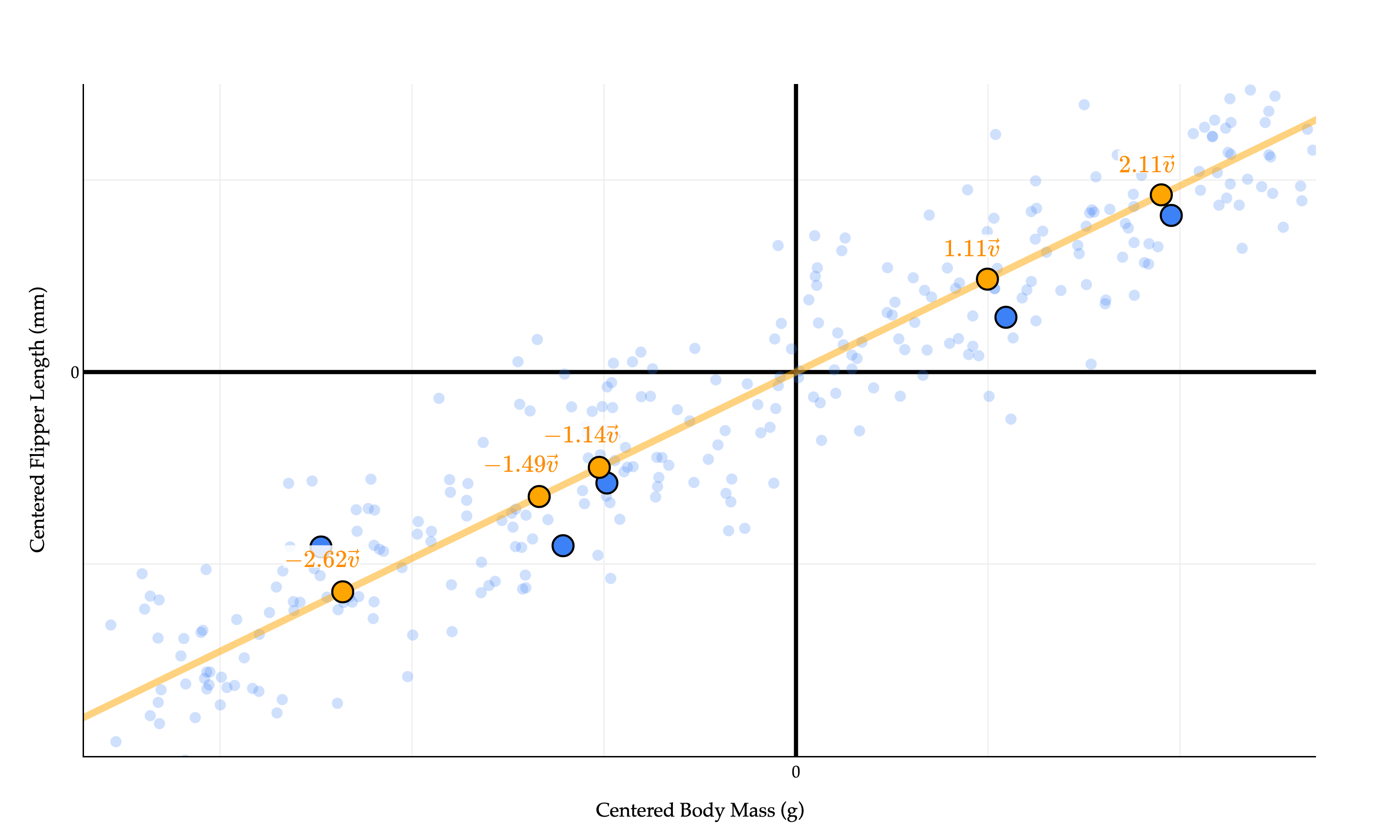
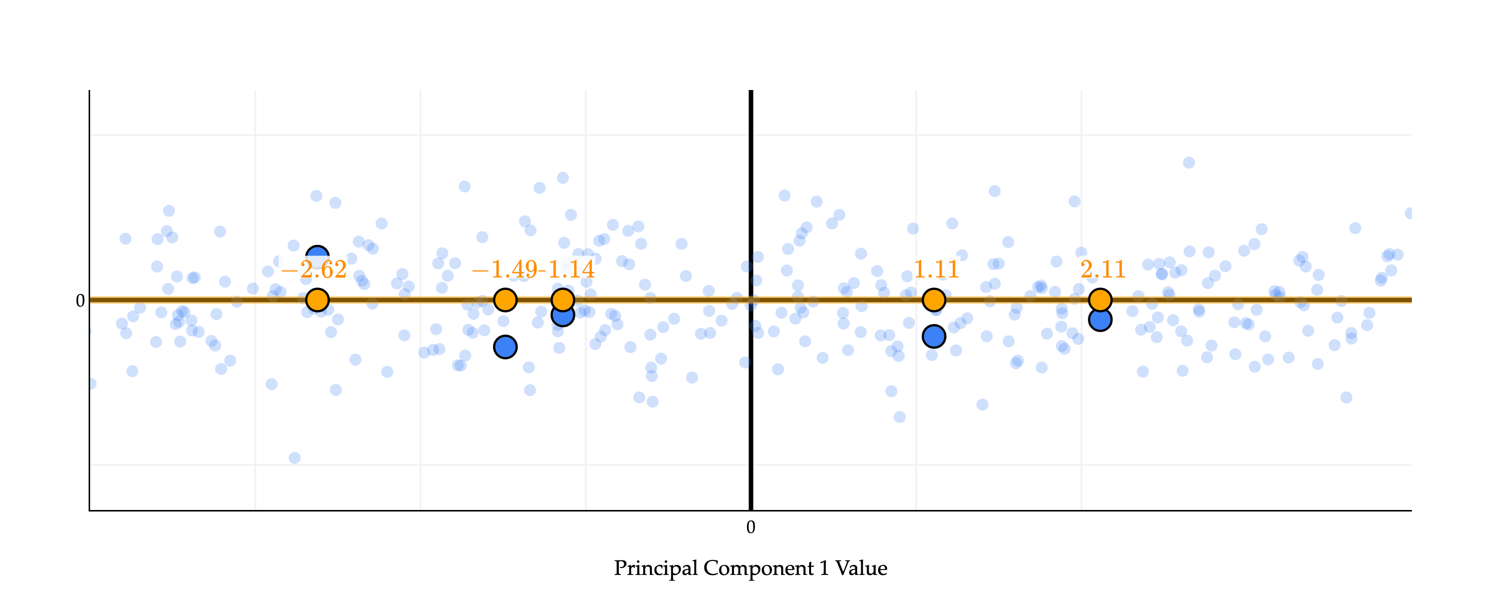
The values x~1⋅v,x~2⋅v,…,x~n⋅v - −2.62, −1.49, −1.14, −1.11, and 2.11 above - describe the position of point x~i on the line defined by v. (I’ve highlighted just five of the points to make the picture less cluttered, but in reality every single blue point has a corresponding orange dot above!)
These coefficients on v can be thought of as positions on a number line.
import pandas as pd
import plotly.graph_objects as go
import numpy as np

# Use the same synthetic data as above, so the aspect is "fair"
np.random.seed(102)
num_points = 340
body_mass_g = np.random.uniform(2700, 6300, num_points)
m_true = 0.015
c_true = 120
noise = np.random.normal(0, 5, num_points)
flipper_length_mm = m_true * body_mass_g + c_true + noise

df = pd.DataFrame({
    'body_mass_g': body_mass_g,
    'flipper_length_mm': flipper_length_mm
})

# Standardize both columns to mean=0, std=1 for correct orthogonal aspect
df['body_mass_std'] = (df['body_mass_g'] - df['body_mass_g'].mean()) / df['body_mass_g'].std()
df['flipper_length_std'] = (df['flipper_length_mm'] - df['flipper_length_mm'].mean()) / df['flipper_length_mm'].std()
X = df[['body_mass_std', 'flipper_length_std']].values
X[:, 0] *= 2 # Scale x-axis for visual effect (as in original)

count_show = 5

# Fix the randomness: pick 5 random indices, keep correspondence for projections
rng = np.random.default_rng(51)
indices = rng.choice(len(X), replace=False, size=count_show)
X_subset = X[indices]   # shape (5, 2)

# Get best-fit direction using SVD/PCA
U, S, Vt = np.linalg.svd(X, full_matrices=False)
direction = Vt[0]
direction = -direction / np.linalg.norm(direction)

# Now rotate the whole dataset so that the principal component is horizontal
theta = np.arctan2(direction[1], direction[0])
R = np.array([[np.cos(-theta), -np.sin(-theta)],
              [np.sin(-theta),  np.cos(-theta)]])
X_rot = X @ R.T
X_subset_rot = X_subset @ R.T

# The "principal component direction" after rotation is along the x-axis: [1, 0]
# So projections onto the orange line map to (tx, 0)
ts = X_subset_rot[:, 0]  # The coordinate along principal component
proj_points_rot = np.column_stack([ts, np.zeros_like(ts)])

# For labeling: pick 5 random points (from 5), annotate with their scalar times v
label_indices = rng.choice(count_show, size=count_show, replace=False)
label_indices = np.sort(label_indices)

# Plot setup with all standardized points (faded)
fig = go.Figure()
fig.add_trace(go.Scatter(
    x=X_rot[:,0], y=X_rot[:,1],
    mode='markers',
    marker=dict(color="#3D81F6", size=8, opacity=0.25),
    showlegend=False,
    hoverinfo='skip'
))

# Scatter for the selected 5 points (emphasized)
fig.add_trace(go.Scatter(
    x=X_subset_rot[:,0], y=X_subset_rot[:,1],
    mode='markers',
    marker=dict(color="#3D81F6", size=13),
    name="5 Random Points",
    showlegend=False
))

# Principal component line (horizontal, pass through origin), extended to cover full range
proj_min = X_rot[:, 0].min()
proj_max = X_rot[:, 0].max()
pc_extend = 0.20 * (proj_max - proj_min)
line_range = np.array([proj_min - pc_extend, proj_max + pc_extend])
line_pts = np.column_stack([line_range, [0, 0]])

fig.add_trace(go.Scatter(
    x=line_pts[:,0], y=line_pts[:,1],
    mode='lines',
    line=dict(color="orange", width=5, dash='solid'),
    opacity=0.5,
    name="Principal Component"
))

# Scatter for projection points (small orange dots)
fig.add_trace(go.Scatter(
    x=proj_points_rot[:,0], y=proj_points_rot[:,1],
    mode='markers',
    marker=dict(color="orange", size=13),
    name="Projections",
    showlegend=False
))

# Original Points (Blue with thin black outline)
fig.add_trace(go.Scatter(
    x=X_subset_rot[label_indices, 0], y=X_subset_rot[label_indices, 1],
    mode='markers',
    marker=dict(color="#3D81F6", size=15, line=dict(width=1.5, color='black')),
    name="Annotated Original Points",
    showlegend=False
))

# Projection Points (Orange with thin black outline)
fig.add_trace(go.Scatter(
    x=proj_points_rot[label_indices, 0], y=proj_points_rot[label_indices, 1],
    mode='markers',
    marker=dict(color="orange", size=15, line=dict(width=1.5, color='black')),
    name="Annotated Projection Points",
    showlegend=False
))

# # Draw orthogonal lines from each selected point to its projection
# for i in range(count_show):
#     fig.add_trace(go.Scatter(
#         x=[X_subset_rot[i,0], proj_points_rot[i,0]],
#         y=[X_subset_rot[i,1], proj_points_rot[i,1]],
#         mode='lines',
#         line=dict(color="#d81a60", width=2, dash='dot'),
#         showlegend=False,
#         hoverinfo='skip'
#     ))

# Annotate 5 random projection points with near-label (scalar times v)
arrow_offset = 0.2 # Smaller offset for "short arrows"
for label_i, idx in enumerate(label_indices):
    ti = ts[idx]
    px, py = proj_points_rot[idx]
    coef = np.round(ti, 2)
    # Perpendicular direction (for offset): [0,1] since the line is horizontal
    perp = np.array([0, 1])
    label_offset = arrow_offset * perp
    ax = px + label_offset[0]
    ay = py + label_offset[1]
    # Formatting for - sign spacing like LaTeX, e.g. "-3.2 \vec v"
    if coef >= 0:
        label = rf"${coef}$"
    else:
        label = rf"$-{abs(coef)}$"
    fig.add_annotation(
        x=ax, y=ay,
        ax=ax, ay=ay,
        text=label,
        showarrow=True,
        arrowhead=6, # Changed arrowhead to 6
        arrowsize=0.7,
        arrowcolor="orange",
        arrowwidth=1.2,
        font=dict(family="Palatino Linotype, Palatino, serif", size=17, color='darkorange'),
        bgcolor="rgba(255,255,255,0.85)",
        opacity=1
    )

# Aspect ratio 1:1 to make orthogonality look correct
all_x = np.concatenate([X_rot[:,0], proj_points_rot[:,0]])
all_y = np.concatenate([X_rot[:,1], proj_points_rot[:,1]])
margin_x = 0.2 * (all_x.max() - all_x.min())
margin_y = 0.2 * (all_y.max() - all_y.min())
fig.update_xaxes(
    title='Standardized Body Mass (Rotated)',
    gridcolor='#f0f0f0',
    showline=True,
    linecolor="black",
    linewidth=1,
    zeroline=True,
    zerolinewidth=3,
    zerolinecolor="black",
    range=[all_x.min()-margin_x, all_x.max()+margin_x],
    scaleanchor='y',  # lock aspect
    scaleratio=1
)
fig.update_yaxes(
    title='Standardized Flipper Length (Rotated)',
    gridcolor='#f0f0f0',
    showline=True,
    linecolor="black",
    linewidth=1,
    zeroline=True,
    zerolinewidth=3,
    zerolinecolor="black",
    range=[all_y.min()-margin_y, all_y.max()+margin_y]
)

fig.update_layout(
    showlegend=False,
    plot_bgcolor='white',
    paper_bgcolor='white',
    margin=dict(l=60, r=60, t=60, b=60),
    width=1000,
    height=400,
    font=dict(
        family="Palatino Linotype, Palatino, serif",
        color="black"
    ),
    xaxis_range=[-4, 4],
    yaxis_range=[-1, 1],
    xaxis=dict(
        title='Principal Component 1 Value',
        tickvals=[-3, -2, -1, 0, 1, 2],
        ticktext=['', '', '', 0, '', '']
    ),
    yaxis=dict(
        title='',
        tickvals=[-2, -1, 0, 1, 1.5],
        ticktext=['', '', 0, '', '']
    )
)
fig.show(renderer='png', scale=3)
Effectively, we’ve rotated the data so that the orange points are on the “new” x-axis. (Rotations... where have we heard of those before? The connection is coming.)
So, we have a grasp of what the values x~1⋅v,x~2⋅v,…,x~n⋅v describe. But why are they important?
The quantity we’re trying to maximize,
n1i=1∑n(x~i⋅v)2
is the variance of the values x~1⋅v,x~2⋅v,…,x~n⋅v. It’s not immediately obvious why this is the case. Remember, the variance of a list of numbers is
n1i=1∑n(valuei−mean)2
(I’m intentionally using vague notation to avoid conflating singular values with standard deviations.)
The quantity n1∑i=1n(x~i⋅v)2 resembles this definition of variance, but it doesn’t seem to involve a subtraction by a mean. This is because the mean of x~1⋅v,x~2⋅v,…,x~n⋅v is 0! This seems to check out visually above: it seems that if we found the corresponding orange point for every single blue point, the orange points would be symmetrically distributed around 0.
Proof that the mean of x~1⋅v,x~2⋅v,…,x~n⋅v is 0
Recall that each x~i is a vector in Rd and corresponds to a row in X~. The values x~1⋅v,x~2⋅v,…,x~n⋅v can all be computed at once through the matrix-vector product X~v (remember that to multiply a matrix by a vector, we dot product the rows of the matrix with the vector).
The columns of X~ each have a mean of 0. As we discovered in Activity 2, this means that
X~T1=⎣⎡sum of column 1 of X~sum of column 2 of X~⋮sum of column d of X~⎦⎤=⎣⎡00⋮0⎦⎤=0d
if 1∈Rn is a vector of all ones.
So, what is the mean of the values x~1⋅v,x~2⋅v,…,x~n⋅v? This mean, by definition, is n1∑i=1nx~i⋅v, but this is equal to n1((X~v)T1), once again, using the fact that the dot product with the ones vector is equivalent to summing the values of the other vector.
So, the mean of the values x~1⋅v,x~2⋅v,…,x~n⋅v is 0.
Since the mean of the values x~1⋅v,x~2⋅v,…,x~n⋅v is 0, it is true that the quantity we’re maximizing is the variance of the values x~1⋅v,x~2⋅v,…,x~n⋅v, which I’ll refer to as
PV(v)=n1i=1∑n(x~i⋅v)2
PV stands for “projected variance”; it is the variance of the scalar projections of the rows of X~ onto v. This is non-standard notation, but I wanted to avoid calling this the “variance of v”, since it’s not the variance of the components of v.
We’ve stumbled upon a beautiful duality - that is, two equivalent ways to think about the same problem. Given a centered n×d matrix X~ with rows x~i∈Rd, the most important directionv is the one that
Minimizes the mean squared orthogonal error of projections onto it,
J(v)=n1i=1∑n∥x~i−pi∥2
Equivalently, maximizes the variance of the projected values x~i⋅v, i.e. maximizes
PV(v)=n1i=1∑n(x~i⋅v)2
Minimizing orthogonal error is equivalent to maximizing variance: don’t forget this. In the widget below, drag the slider to see this duality in action: the shorter the orthogonal errors tend to be, the more spread out the orange points tend to be (meaning their variance is large). When the orange points are close together, the orthogonal errors tend to be quite large.
import pandas as pd
import plotly.graph_objects as go
import numpy as np

# Use the same synthetic data as above
np.random.seed(102)
num_points = 340
body_mass_g = np.random.uniform(2700, 6300, num_points)
m_true = 0.015
c_true = 120
noise = np.random.normal(0, 5, num_points)
flipper_length_mm = m_true * body_mass_g + c_true + noise

df = pd.DataFrame({
    'body_mass_g': body_mass_g,
    'flipper_length_mm': flipper_length_mm
})

df['body_mass_std'] = (df['body_mass_g'] - df['body_mass_g'].mean()) / df['body_mass_g'].std()
df['flipper_length_std'] = (df['flipper_length_mm'] - df['flipper_length_mm'].mean()) / df['flipper_length_mm'].std()
X = df[['body_mass_std', 'flipper_length_std']].values
X[:, 0] *= 2 # Scale x-axis for visual effect

count_show = 20

# Fix the randomness: pick 5 fixed indices
rng = np.random.default_rng(51)
indices = rng.choice(len(X), replace=False, size=count_show)
X_subset = X[indices]

# Get best-fit direction using SVD/PCA for computing optimal angle
U, S, Vt = np.linalg.svd(X, full_matrices=False)
opt_direction = Vt[0]
opt_direction = opt_direction / np.linalg.norm(opt_direction)
opt_theta = np.arctan2(opt_direction[1], opt_direction[0])  # in radians; in [-pi, pi]

# Helper for 360-degree range, always positive
def wrap_angle(theta):  # ensure [0, 2pi)
    return (theta + 2 * np.pi) % (2 * np.pi)

# For displaying the line as in plotly (a segment through the origin)
def make_line_pts(theta, vmin, vmax, extend=0.2):
    """Returns 2 points defining a line through origin with direction theta."""
    direction = np.array([np.cos(theta), np.sin(theta)])
    # Extend the min/max a bit for better plot
    range_min = vmin - extend * (vmax - vmin)
    range_max = vmax + extend * (vmax - vmin)
    xs = [range_min * direction[0], range_max * direction[0]]
    ys = [range_min * direction[1], range_max * direction[1]]
    return np.array([xs, ys]).T

# Function to project points onto a line at angle theta through (0,0)
def get_projections(X_pts, theta):
    direction = np.array([np.cos(theta), np.sin(theta)])
    direction = direction / np.linalg.norm(direction)
    ts = X_pts @ direction  # projections as scalars
    proj_points = np.outer(ts, direction)
    return proj_points

# Precompute range for line plotting (so all lines look visually similar)
vals_for_range = np.concatenate([X[:,0], X[:,1]])
vabs = np.max(np.abs(vals_for_range))
vmin, vmax = -vabs, vabs

# Slider construction
from plotly.subplots import make_subplots

# We'll build thetas so that index 0 is always the optimal, with slider ranging -360 to +360
n_steps = 181
thetas = np.linspace(-np.pi, np.pi, n_steps) + opt_theta  # centers thetas at opt_theta, from -360° to +360°
theta_labels = [f"{int(np.round(np.degrees(theta - opt_theta))):+d}°" for theta in thetas]  # ticks -360 to +360
# The optimal direction (opt_theta) is at index n_steps//2
start_ix = n_steps // 2

# Compute plot bounds
xlim = (-3, 2)
ylim = (-2, 1.5)
# axis ticks for styling
xticks = [-3, -2, -1, 0, 1, 2]
xticktext = ['', '', '', 0, '', '']
yticks = [-2, -1, 0, 1, 1.5]
yticktext = ['', '', 0, '', '']

# Make the figure with a first frame (at optimal PC direction)
def make_frame(theta):
    # Compute direction
    direction = np.array([np.cos(theta), np.sin(theta)])
    # Orange projection points for the 5
    proj_points = get_projections(X_subset, theta)
    # Line covering whole range
    line_seg = make_line_pts(theta, vmin, vmax)
    # Build traces
    traces = []
    # All standardized points, faded
    traces.append(go.Scatter(
        x=X[:,0], y=X[:,1],
        mode='markers',
        marker=dict(color="#3D81F6", size=8, opacity=0.25),
        showlegend=False,
        hoverinfo='skip'
    ))
    # Blue subset points (fixed)
    traces.append(go.Scatter(
        x=X_subset[:,0], y=X_subset[:,1],
        mode='markers',
        marker=dict(color="#3D81F6", size=13),
        name="5 Points",
        showlegend=False
    ))
    # Orange projection points
    traces.append(go.Scatter(
        x=proj_points[:,0], y=proj_points[:,1],
        mode='markers',
        marker=dict(color="orange", size=13),
        name="Projections",
        showlegend=False
    ))
    # Principal direction line
    traces.append(go.Scatter(
        x=line_seg[:,0], y=line_seg[:,1],
        mode='lines',
        line=dict(color="orange", width=5, dash='solid'),
        opacity=0.5,
        name="Direction"
    ))
    # Dashed lines for errors (one per blue point)
    for i in range(count_show):
        traces.append(go.Scatter(
            x=[X_subset[i,0], proj_points[i,0]],
            y=[X_subset[i,1], proj_points[i,1]],
            mode='lines',
            line=dict(color="#d81a60", width=2, dash='dot'),
            showlegend=False,
            hoverinfo='skip'
        ))
    return traces

# Build frames for animation
frames = []
for ti, theta in enumerate(thetas):
    traces = make_frame(theta)
    frame = go.Frame(
        data=traces,
        name=str(ti),
        traces=list(range(len(traces)))
    )
    frames.append(frame)

# Initial figure (at theta=0, so slider starts at optimal)
init_traces = make_frame(thetas[start_ix])
fig = go.Figure(data=init_traces, frames=frames)

# Set up slider to control theta, labeled -360 to +360, starting at 0
steps = []
for i, theta in enumerate(thetas):
    label = theta_labels[i]
    step = dict(
        method="animate",
        args=[
            [str(i)],
            {"mode": "immediate", "frame": {"duration": 0, "redraw": True}, "transition": {"duration": 0}}
        ],
        label=label
    )
    steps.append(step)

sliders = [dict(
    steps=steps,
    active=start_ix,
    transition={'duration': 0},
    x=0.2, y=0.01,
    currentvalue=dict(
        font=dict(size=18),
        prefix="θ (angle from optimum): ",
        visible=True,
        xanchor='center'
    ),
    len=0.75
)]

fig.update_layout(
    sliders=sliders,
    showlegend=False,
    plot_bgcolor='white',
    paper_bgcolor='white',
    margin=dict(l=60, r=60, t=60, b=60),
    width=650,
    height=525,
    font=dict(
        family="Palatino Linotype, Palatino, serif",
        color="black"
    ),
    xaxis_range=list(xlim),
    yaxis_range=list(ylim),
    xaxis=dict(
        # title='Centered Body Mass (g)',
        tickvals=xticks,
        ticktext=xticktext,
        gridcolor='#f0f0f0',
        showline=True,
        linecolor="black",
        linewidth=1,
        zeroline=True,
        zerolinewidth=3,
        zerolinecolor="black"
    ),
    yaxis=dict(
        # title='Centered Flipper Length (mm)',
        tickvals=yticks,
        ticktext=yticktext,
        gridcolor='#f0f0f0',
        showline=True,
        linecolor="black",
        linewidth=1,
        zeroline=True,
        zerolinewidth=3,
        zerolinecolor="black"
    ),
    title="The shorter the <span style='color:#d81a60'>orthogonal errors</span> are, the more spread out the <span style='color:orange'>orange points</span> are!"
)

fig.show()
Loading...
Note that the scalars x~1⋅v,x~2⋅v,…,x~n⋅v are just the components of the vector X~v! Multiplying X~ by v returns a vector that contains the dot products of each row of X~ (which are the x~i’s) with v. This means that an equivalent formula for the projected variance is
PV(v)=n1∥X~v∥2
This equivalent formulation will allow us to employ gradient rules from Chapter 8.2 to find the best direction.
I’ve dropped the constant factor of n1 for convenience; it won’t change the answer.
This is a constrained optimization problem. The constraint matters because we’re trying to find a direction, not an arbitrarily long vector: if we were allowed to scale v however we wanted, then ∥X~v∥2 could be made as large as we wanted just by multiplying v by a huge constant.
Constrained optimization problems are usually harder than unconstrained ones. In an unconstrained problem, a standard strategy is to compute a gradient and set it equal to 0. With a constraint like ∥v∥=1, that simple strategy does not apply directly, since the maximizer of ∥X~v∥2 subject to ∥v∥=1 might not have a zero gradient.
Fortunately, this particular constrained problem can be converted into an equivalent unconstrained one. Define
f(v)=∥v∥2∥X~v∥2
for all non-zero vectors v. This function is called a Rayleigh quotient, as we discussed briefly in Chapter 9.6.
Why is maximizing f(v) with no constraints equivalent to maximizing ∥X~v∥2 subject to ∥v∥=1? The short answer is that f(v) is invariant to scaling v by a constant factor. To see what I mean, suppose that c is a non-zero constant. Then,
f(cv)=∥cv∥2∥X~(cv)∥2=c2∥v∥2c2∥X~v∥2=f(v)
So f(v) depends only on direction, not on length. Equivalently, every non-zero v gives the same value as the corresponding unit vector ∥v∥v, who makes the denominator in f(v) equal to 1. That means maximizing ∥X~v∥2 subject to ∥v∥=1 is equivalent to maximizing f(v) over all non-zero vectors v.
This is easier, because once the constraint has been absorbed into the denominator, we can treat f as an ordinary vector-to-scalar function and find its critical points by setting the gradient equal to 0.
In our setting,
f(v)=∥v∥2∥X~v∥2=vTvvTX~TX~v
To find the critical points of f, it is cleaner to rewrite it as a product:
If v maximizes f(v), then it must be a critical point, so ∇f(v)=0. Therefore,
X~TX~v−f(v)v=0
which means
X~TX~v=f(v)v
This says exactly that v is an eigenvector of X~TX~, and that its eigenvalue is f(v). If v maximizes – or minimizes – f(v), then it must be an eigenvector of X~TX~.
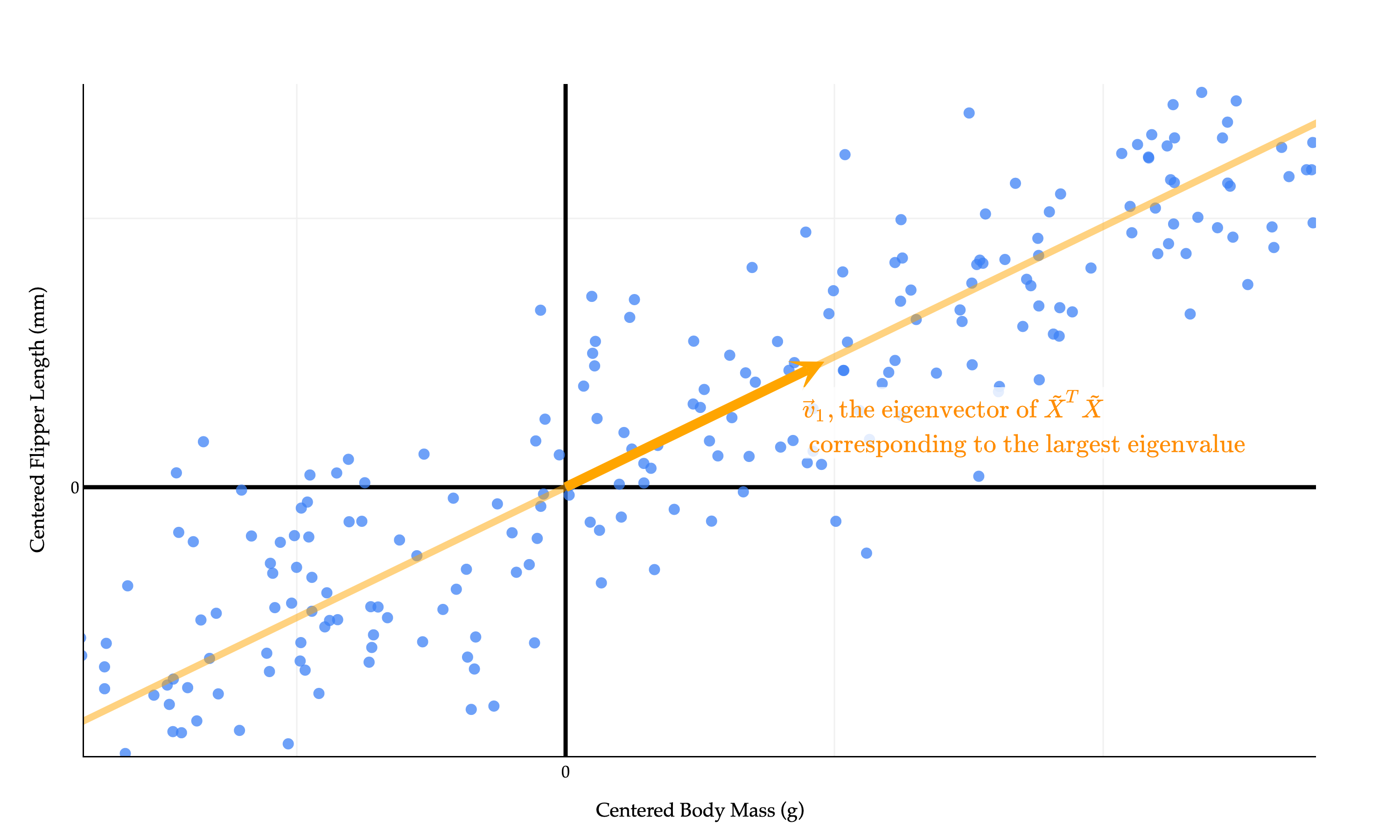
So, to make f(v) as large as possible, we should choose the eigenvector whose eigenvalue is as large as possible. In other words, the best direction is the eigenvector of X~TX~ corresponding to its largest eigenvalue!
Alternative Derivation
There is another way to prove the same result that uses the spectral theorem more directly.
Let λ1≥λ2≥⋯≥λd be the eigenvalues of X~TX~, and let v1,v2,…,vd be corresponding unit eigenvectors. Since X~TX~ is symmetric, these eigenvectors form an orthonormal basis of Rd.
Now suppose ∥v∥=1. Then
v=c1v1+c2v2+⋯+cdvd,c12+c22+⋯+cd2=1
Using the fact that X~TX~vi=λivi, we get
f(v)=vTX~TX~v=λ1c12+λ2c22+⋯+λdcd2
So f(v) is a weighted average of the eigenvalues of X~TX~. A weighted average can never be larger than the largest value being averaged, so f(v)≤λ1, with equality when v=v1 (or −v1). This again shows that the maximizing direction is the eigenvector corresponding to the largest eigenvalue.
What does this really mean geometrically?
import pandas as pd
import plotly.graph_objects as go
import numpy as np

# Use the same synthetic data as above, so the aspect is "fair"
np.random.seed(102)
num_points = 340
body_mass_g = np.random.uniform(2700, 6300, num_points)
m_true = 0.015
c_true = 120
noise = np.random.normal(0, 5, num_points)
flipper_length_mm = m_true * body_mass_g + c_true + noise

df = pd.DataFrame({
    'body_mass_g': body_mass_g,
    'flipper_length_mm': flipper_length_mm
})

# Standardize both columns to mean=0, std=1 for correct orthogonal aspect
df['body_mass_std'] = (df['body_mass_g'] - df['body_mass_g'].mean()) / df['body_mass_g'].std()
df['flipper_length_std'] = (df['flipper_length_mm'] - df['flipper_length_mm'].mean()) / df['flipper_length_mm'].std()
X = df[['body_mass_std', 'flipper_length_std']].values
X[:, 0] *= 2 # Scale x-axis for visual effect (as in original)

# Get best-fit direction using SVD/PCA
U, S, Vt = np.linalg.svd(X, full_matrices=False)
direction = Vt[0]
direction = direction / np.linalg.norm(direction)

# Plot setup with all standardized points (higher opacity)
fig = go.Figure()
fig.add_trace(go.Scatter(
    x=X[:,0], y=X[:,1],
    mode='markers',
    marker=dict(color="#3D81F6", size=8, opacity=0.75),
    showlegend=False,
    hoverinfo='skip'
))

# Principal component line (covers full range, faded)
proj_min = X @ direction
pc_min, pc_max = proj_min.min(), proj_min.max()
pc_extend = 0.20 * (pc_max - pc_min)
line_range = np.array([pc_min - pc_extend, pc_max + pc_extend])
line_pts = np.outer(line_range, direction)

fig.add_trace(go.Scatter(
    x=line_pts[:,0], y=line_pts[:,1],
    mode='lines',
    line=dict(color="orange", width=5, dash='solid'),
    opacity=0.5,
    name="Principal Component"
))

# Draw a unit vector along the principal component, centered at (0, 0)
unit_length = 1   # visibly "unit", can be adjusted if needed
vec_start = np.array([0.0, 0.0])
vec_end = -direction * unit_length

fig.add_trace(go.Scatter(
    x=[vec_start[0], vec_end[0]],
    y=[vec_start[1], vec_end[1]],
    mode="lines",
    line=dict(color="orange", width=7),
    marker=dict(color="orange", size=[0, 24]), # marker at tip
    showlegend=False
))

# Add arrowhead using annotation (to visually mark vector tip)
fig.add_annotation(
    x=vec_end[0]-0.07*direction[0], # a bit before tip, so arrow doesn't overshoot marker
    y=vec_end[1]-0.07*direction[1],
    ax=vec_start[0],
    ay=vec_start[1],
    xref="x", yref="y", axref="x", ayref="y",
    text="",
    arrowhead=3,
    arrowsize=1.3,
    arrowwidth=3,
    arrowcolor="orange",
    standoff=0,
    opacity=1,
    showarrow=True
)

# Annotate the vector with label \vec v_1
# Place label a little past the tip in the same direction
label_offset = 0.15
fig.add_annotation(
    x=vec_end[0] + label_offset * direction[0] * (-6),
    y=vec_end[1] + 3 * label_offset * direction[1],
    text=r"$\vec{v}_1, \text{the eigenvector of } \tilde X^T \tilde X \\ \text{ corresponding to the largest eigenvalue}$",
    showarrow=False,
    font=dict(
        family="Palatino Linotype, Palatino, serif",
        size=40,
        color='darkorange'
    ),
    bgcolor="rgba(255,255,255,0.82)",
    opacity=1
)

# Aspect ratio 1:1 to make orthogonality look correct
margin_x = 0.2 * (X[:,0].max() - X[:,0].min())
margin_y = 0.2 * (X[:,1].max() - X[:,1].min())
fig.update_xaxes(
    title='Standardized Body Mass',
    gridcolor='#f0f0f0',
    showline=True,
    linecolor="black",
    linewidth=1,
    zeroline=True,
    zerolinewidth=3,
    zerolinecolor="black",
    range=[X[:,0].min()-margin_x, X[:,0].max()+margin_x],
    scaleanchor='y',  # lock aspect
    scaleratio=1
)
fig.update_yaxes(
    title='Standardized Flipper Length',
    gridcolor='#f0f0f0',
    showline=True,
    linecolor="black",
    linewidth=1,
    zeroline=True,
    zerolinewidth=3,
    zerolinecolor="black",
    range=[X[:,1].min()-margin_y, X[:,1].max()+margin_y]
)

fig.update_layout(
    showlegend=False,
    plot_bgcolor='white',
    paper_bgcolor='white',
    margin=dict(l=60, r=60, t=60, b=60),
    width=1000,
    height=600,
    font=dict(
        family="Palatino Linotype, Palatino, serif",
        color="black"
    ),
    xaxis_range=[-1, 2],
    yaxis_range=[-1, 1.5],
    xaxis=dict(
        title='Centered Body Mass (g)',
        tickvals=[-3, -2, -1, 0, 1, 2],
        ticktext=['', '', '', 0, '', '']
    ),
    yaxis=dict(
        title='Centered Flipper Length (mm)',
        tickvals=[-2, -1, 0, 1, 1.5],
        ticktext=['', '', 0, '', '']
    )
)
fig.show(renderer='png', scale=3)
It says that the line that maximizes the variance of the projected data - which is also the line that minimizes the mean squared orthogonal error - is spanned by the eigenvector of X~TX~ corresponding to the largest eigenvalue of X~TX~.
So, we’ve solved the “best direction” problem. But what can we do with it? And how does this relate to the singular value decomposition, which we discussed in Chapters 10.1 and 10.2 but didn’t touch at all here? Let’s keep reading...